11 Best client reporting tools for better business insights in 2026
Not every client reporting tool is built with your client in mind. I tested dozens to find the 11 best platforms for agencies and service businesses in 2026.


Client reporting tools help you build, automate, and deliver performance reports without pulling data manually. After testing dozens of platforms for reporting depth, integrations, and client experience, here are the 11 strongest options in 2026.
11 best client reporting tools: Quick comparison
| 💻 Tool | 🎯 Best for | 💰 Starting price (billed annually) | ⚡ Strengths |
|---|---|---|---|
| Assembly | Delivering reports inside a branded client portal | $39/month | White-label portal, embeddable dashboards, and built-in client management |
| AgencyAnalytics | Full-service agency reporting across multiple channels | $59/month, includes 5 clients | Multi-channel integrations, white-label dashboards, and automated scheduling |
| Whatagraph | Visual, presentation-ready client reports | $229/month | Drag-and-drop report builder, pre-designed templates, and automated report scheduling |
| Databox | Real-time KPI and goal tracking | $159/month, includes 3 data sources | Real-time data sync, goal tracking, and broad integrations |
| DashThis | Fast setup with simple automated marketing dashboards | $42/month, includes 3 dashboards | Preset templates, automated reporting, and white-label dashboards |
| TapClicks | Large-scale agency reporting and campaign operations | Custom pricing | Extensive connectors, automated reporting, and workflow management |
| Klipfolio | Custom metrics and advanced dashboard building | $120/month | Custom formula builder, flexible visualizations, and broad integrations |
| Looker Studio | Free reporting in the Google ecosystem | Free; Pro plan starts at $9/user/project/month | Free reporting platform, interactive dashboards, and shareable reports |
| Supermetrics | Piping marketing data into existing reporting tools | $37/month | Broad source connectors, flexible destinations, and reliable data pulls |
| Tableau | Enterprise-grade data visualization and BI | $15/user/month; Creator license required at $75/user/month | Advanced dashboards, broad data connectivity, and strong BI capabilities |
| Improvado | Large-scale enterprise marketing data pipelines | Custom pricing | End-to-end ETL, AI anomaly detection, and extensive source connectors |
How I researched and tested these client reporting tools
I tested each tool using sample client data across 3 scenarios: a marketing agency sending monthly performance reports, a consultant tracking project KPIs for multiple clients, and a small firm managing client-facing dashboards.
For tools that didn’t offer direct access, I reviewed product documentation, recorded walkthroughs, and public demos to understand how the platforms work.
Here's what I looked at:
- Reporting output quality: How well each tool handles the core task of building and delivering reports clients can actually read and act on, from layout and data accuracy to how reports display across devices.
- Ease of setup and use: How fast you can go from connecting a data source to sharing a finished report, and how much technical knowledge is actually required.
- Integrations and data connectivity: How smoothly each tool pulls data from the sources agencies and service firms use every day, including Google Ads, Meta, HubSpot, and other platforms.
- Pricing relative to output: What you get at the entry-level tier compared to higher plans, and whether the jump in cost is justified by a meaningful difference in capability.
- Client experience: How the report or dashboard looks and functions on the client's end, including whether clients need their own account, how they access the data, and how much it reflects your brand.
Honestly, the reporting quality across many of these tools is closer than you might expect. The real difference is whether your client gets a destination to check progress or just another document.
1. Assembly: Best for delivering reports inside a branded client portal
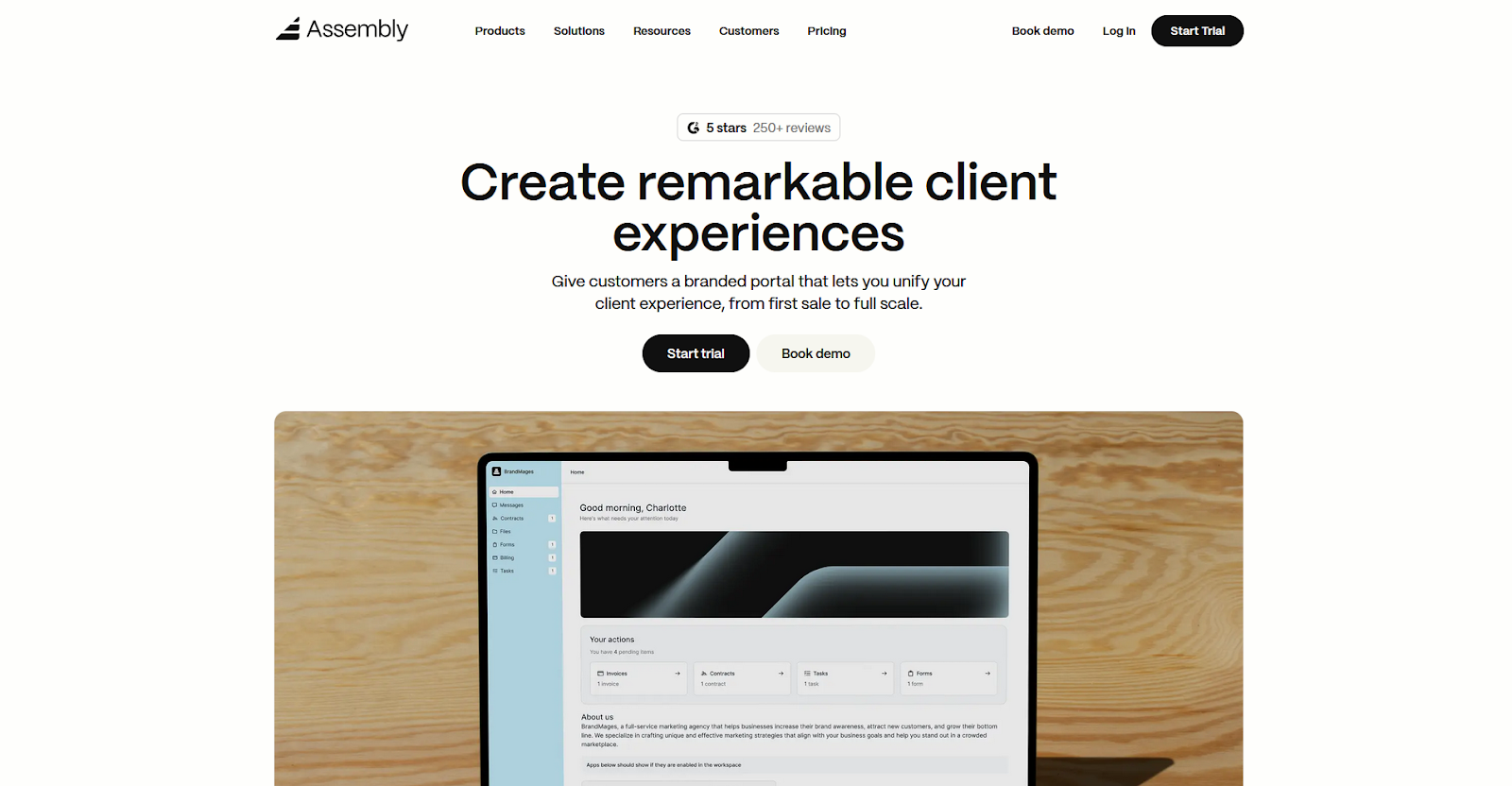
- What it does: Assembly is a client portal platform that lets service businesses deliver reports, manage client relationships, and handle billing in a single branded workspace.
- Best for: Service businesses and agencies that want clients to access dashboards, files, invoices, and project updates through a portal that reflects their brand.
We built Assembly so clients have a place to log into, not just a report link to click. You can embed dashboards from Looker Studio, Power BI, Databox, Google Sheets, and other tools directly inside each client's branded portal. Clients find their data in the same place they access everything else related to the engagement, without jumping between tools or chasing links.
Key features
- Embeddable dashboards: You can embed reports directly inside each client's portal, so clients find their analytics in one place without needing separate logins.
- Dynamic client homepages: Each client’s portal home can show different content automatically based on custom field tags, so clients with different reporting setups see what’s relevant without you manually adjusting each portal.
- Built-in client management: Track client relationships, communication history, and internal notes in a CRM where that context stays accessible across the workspace as you move between clients and reporting cycles.
- Tasks linked to client records: You can associate tasks with specific clients and control exactly what clients see, so your internal follow-ups from a reporting review stay organized without exposing that work to the client.
- Assembly Assistant: The built-in AI assistant connects to your client and workspace data to summarize recent activity, draft messages, and suggest next steps, so you can prep for reporting calls without digging through past messages and notes.
Pros and cons
| ✅ Pros | ❌ Cons |
|---|---|
| Embeds dashboards from major reporting tools directly inside a branded client portal | Portal layout options are more limited than custom-built solutions |
| Combines client management and report delivery in one workspace | Conditional form logic is not yet available, which can make complex onboarding workflows cumbersome |
| Dynamic homepages let different clients see relevant content automatically |
What users say
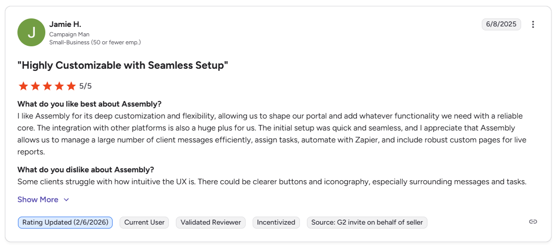
Pro: “I like Assembly for its deep customization and flexibility, allowing us to shape our portal and add whatever functionality we need with a reliable core. … Assembly allows us to manage a large number of client messages efficiently, assign tasks, automate with Zapier, and include robust custom pages for live reports.” - Jamie H., G2
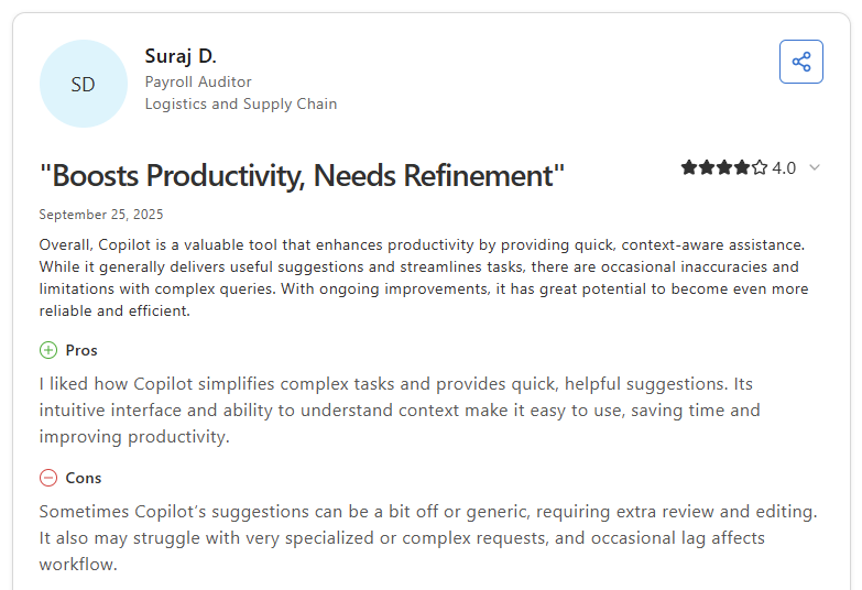
Con: “Sometimes Copilot [Assembly] … suggestions can be a bit off or generic, requiring extra review and editing. It also may struggle with very specialized or complex requests, and occasional lag affects workflow.” - Suraj D., Capterra
Pricing
| 💻 Pricing plans | 💰 Price billed annually | 💰 Price billed monthly |
|---|---|---|
| Starter | $39/month | $59/month |
| Professional | $149/month | $189/month |
| Advanced | $399/month | $499/month |
| Enterprise | Starts at $2,000/month | Starts at $2,400/month |
Bottom line
Assembly connects client reporting to a full client management layer, so the portal your clients log into for dashboards also holds their communication history, invoices, and files. If you need a dedicated dashboard builder with deep native marketing integrations, AgencyAnalytics might be a better fit.
2. AgencyAnalytics: Best for full-service agency reporting across multiple channels
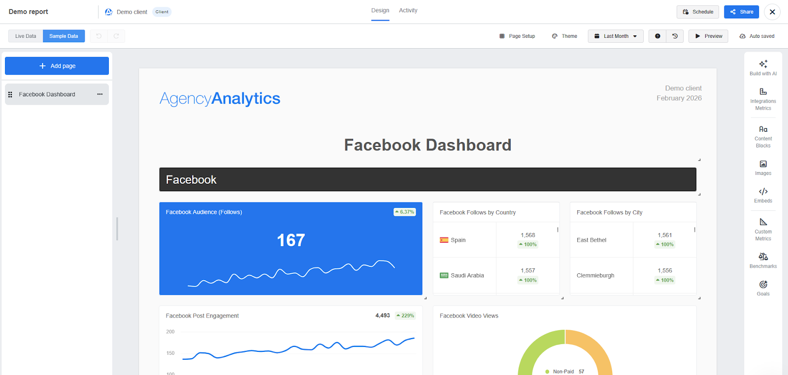
- What it does: AgencyAnalytics is a client reporting platform that lets marketing agencies pull data from 80-plus integrations into dashboards and scheduled reports.
- Best for: Marketing agencies managing multiple client campaigns across SEO, PPC, and social channels that need white-label reporting with automated delivery.
AgencyAnalytics is built around a single agency reporting workflow. You connect your client's data sources, set a report schedule, and then the platform handles recurring delivery. I tested it with a sample multi-channel setup and had a shareable client report ready without much configuration. Pushing beyond the standard templates reveals limits in custom metric configuration and report dimension flexibility.
Key features
- Multi-channel dashboards: Pull data from 80+ integrations into a single client dashboard, covering SEO, PPC, social, and email performance in one view.
- Automated report scheduling: Set reports to generate and deliver to clients on a weekly or monthly schedule.
- White-label client portal: Clients log into a branded portal under your agency's domain to view live dashboards and access their reports.
Pros and cons
| ✅ Pros | ❌ Cons |
|---|---|
| 80+ integrations cover the core channels most marketing agencies report on | Data discrepancies between AgencyAnalytics and native platform analytics can be difficult to explain to clients |
| Automated report scheduling reduces manual work on recurring reporting cycles | Report customization has limits at lower tiers, making complex multi-metric reports harder to configure |
| White-label client portal gives clients a branded place to view live dashboards |
What users say
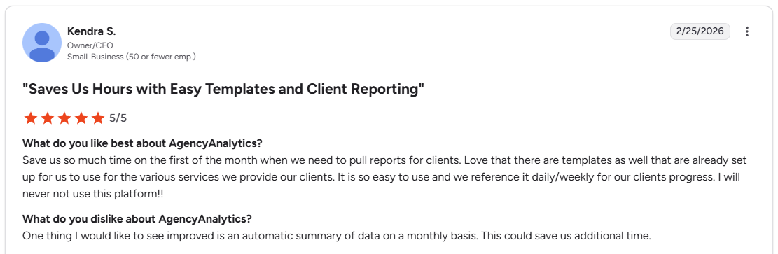
Pro: “Save us so much time on the first of the month when we need to pull reports for clients. Love that there are templates as well that are already set up for us to use for the various services we provide our clients.” - Kendra S., G2
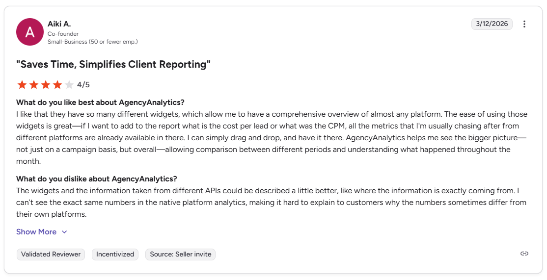
Con: “I can't see the exact same numbers in the native platform analytics, making it hard to explain to customers why the numbers sometimes differ from their own platforms.” - Aiki A., G2
Pricing
AgencyAnalytics starts at $59 per month, which includes 5 clients.
Bottom line
AgencyAnalytics includes roll-up dashboards that let you view performance across all clients in a single view. If you want clients to access reports inside a portal that also handles invoices, files, and project communication, Assembly might be a better fit.
3. Whatagraph: Best for visual, presentation-ready client reports
- What it does: Whatagraph is a client reporting platform that lets agencies build and automate visually formatted reports from 60+ data sources.
- Best for: Agencies that send regular performance reports to clients and want reports that are visually polished enough to share without additional formatting work.
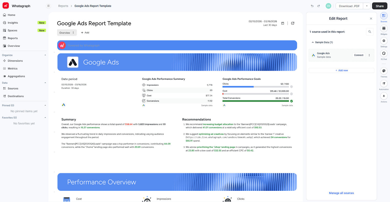
What stood out most when I tested Whatagraph was how finished the reports look straight out of the builder. Whatagraph's templates are structured around how a client actually reads a report, though the platform is built for report delivery instead of live dashboards that clients can check on demand.
Key features
- Drag-and-drop report builder: Build reports by placing widgets, charts, and data blocks onto a canvas, with pre-designed templates available as a starting point.
- Automated report scheduling: Set reports to deliver automatically on a recurring schedule via email or live link.
- Multi-source data connections: Pull data from 60+ marketing platforms into a single report, covering paid, organic, social, and email performance.
Pros and cons
| ✅ Pros | ❌ Cons |
|---|---|
| Pre-designed templates produce client-ready reports without additional formatting | Simultaneous editing by multiple users can cause widgets to glitch or break |
| Automated scheduling removes manual effort from recurring report delivery | X Ads (Twitter) is not supported, limiting coverage for full-funnel campaign reporting |
| Visual report layout is structured around how clients read performance data |
What users say
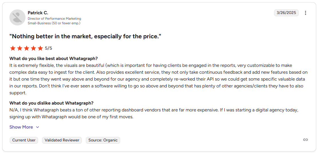
Pro: “It is extremely flexible, the visuals are beautiful … very customizable to make complex data easy to ingest for the client.” - Patrick C., G2
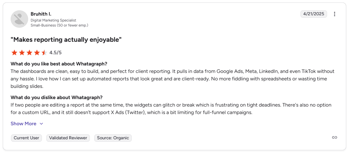
Con: “If two people are editing a report at the same time, the widgets can glitch or break, which is frustrating on tight deadlines. There's also no option for a custom URL, and it still doesn't support X Ads (Twitter), which is a bit limiting for full-funnel campaigns.” - Bruhith I., G2
Pricing
Whatagraph starts at $229 per month.
Bottom line
Whatagraph includes AI-generated summaries and recommendations in its reporting workflow, so clients receive context alongside the data rather than raw numbers alone. If you need real-time KPI tracking with goal monitoring, Databox might be a better fit.
4. Databox: Best for real-time KPI and goal tracking
- What it does: Databox is a dashboard and KPI tracking platform that lets teams pull data from 100+ sources into real-time dashboards with goal monitoring built in.
- Best for: Marketing teams and agencies that need live KPI dashboards with goal tracking across multiple data sources, for both internal reporting and client-facing output.
Databox centers reporting around live dashboards rather than scheduled delivery, which sets it apart from many tools on this list. I connected multiple data sources and found the goal-tracking feature useful for showing client progress against targets, not just raw numbers. Integration coverage is wide, though gaps in niche industries can surface once you move beyond the major platforms.
Key features
- Real-time dashboards: Build dashboards that pull live data from connected sources for up-to-date performance tracking.
- Goal tracking: Set targets against specific metrics and track progress toward them directly inside each dashboard.
- 100+ integrations: Connect data from marketing, CRM, ecommerce, and analytics platforms into a single dashboard view.
Pros and cons
| ✅ Pros | ❌ Cons |
|---|---|
| Real-time data means clients can check performance at any time without waiting for a report | Integration coverage is limited in certain niche industries beyond the major platforms |
| Goal tracking lets you show clients progress against targets rather than just raw data | White-label functionality is only available on higher-tier plans |
| Wide integration library covers most common marketing and CRM platforms |
What users say
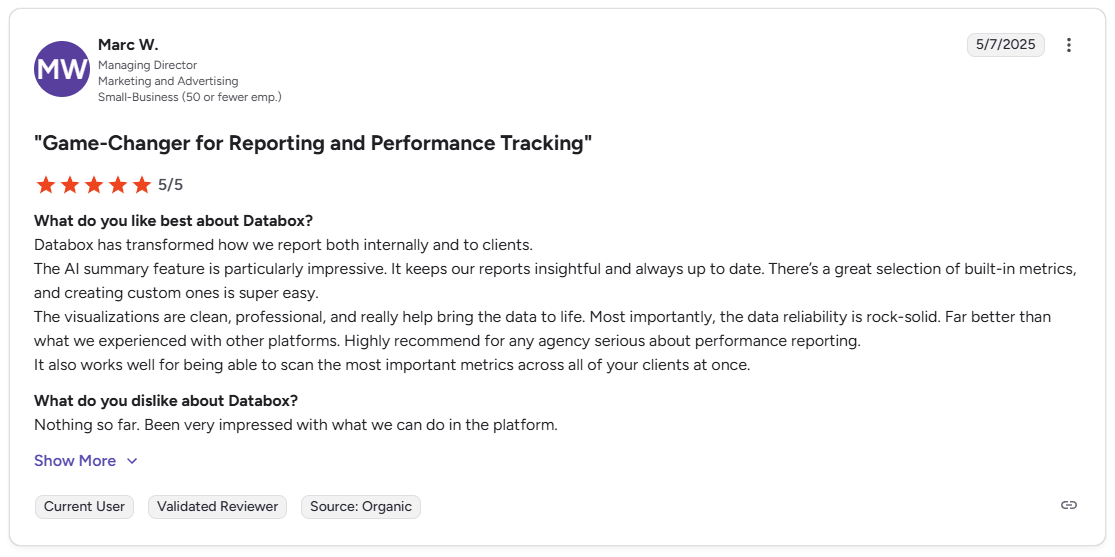
Pro: “Databox has transformed how we report both internally and to clients. … The visualizations are clean, professional, and really help bring the data to life. … The data reliability is rock-solid.” - Marc W., G2
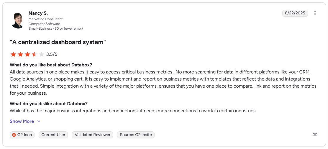
Con: “While it has the major business integrations and connections, it needs more connections to work in certain industries.” - Nancy S., G2
Pricing
Databox starts at $159 per month, which includes 3 data sources.
Bottom line
Databox includes industry benchmarking data that lets you show clients how their performance compares to similar businesses, a feature not every tool on this list offers. If you want polished, presentation-ready reports with automated scheduled delivery, Whatagraph might be a better fit.
5. DashThis: Best for fast setup with simple automated marketing dashboards
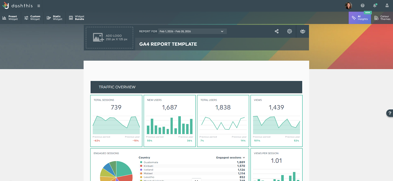
- What it does: DashThis is a marketing dashboard tool that lets agencies and freelancers build client reports using preset widgets and templates.
- Best for: Small agencies and freelancers managing a limited number of clients who need automated marketing dashboards without a steep learning curve or complex setup.
I tested DashThis with a Google Analytics 4 (GA4) data source and had a working dashboard ready in a few minutes, since the preset widgets handle most of the setup work. The template-based approach means you're not building reports from scratch, though the available metrics are more limited than in more advanced tools on this list. Client access controls also take more effort to configure than expected.
Key features
- Preset widget library: Build dashboards by selecting from a library of pre-configured widgets tied to common marketing metrics.
- Automated dashboard updates: Connect data sources and set dashboards to update automatically as new data comes in.
- White-label dashboards: Apply your agency branding to dashboards and reports before sharing them with clients.
Pros and cons
| ✅ Pros | ❌ Cons |
|---|---|
| Preset templates and widgets make dashboard setup fast with minimal manual setup | Available reporting metrics are narrower than more advanced tools on this list |
| Automated data refresh keeps client dashboards current without manual updates | Setting up granular client access to specific dashboard sections can be difficult |
| White-label branding is available across dashboards and reports |
What users say
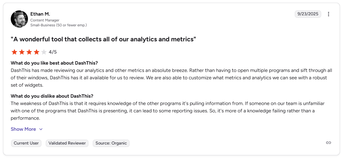
Pro: “DashThis has made reviewing our analytics and other metrics an absolute breeze. Rather than having to open multiple programs and sift through all of their windows, DashThis has it all available for us to review. We are also able to customize what metrics and analytics we can see with a robust set of widgets.” - Ethan M., G2
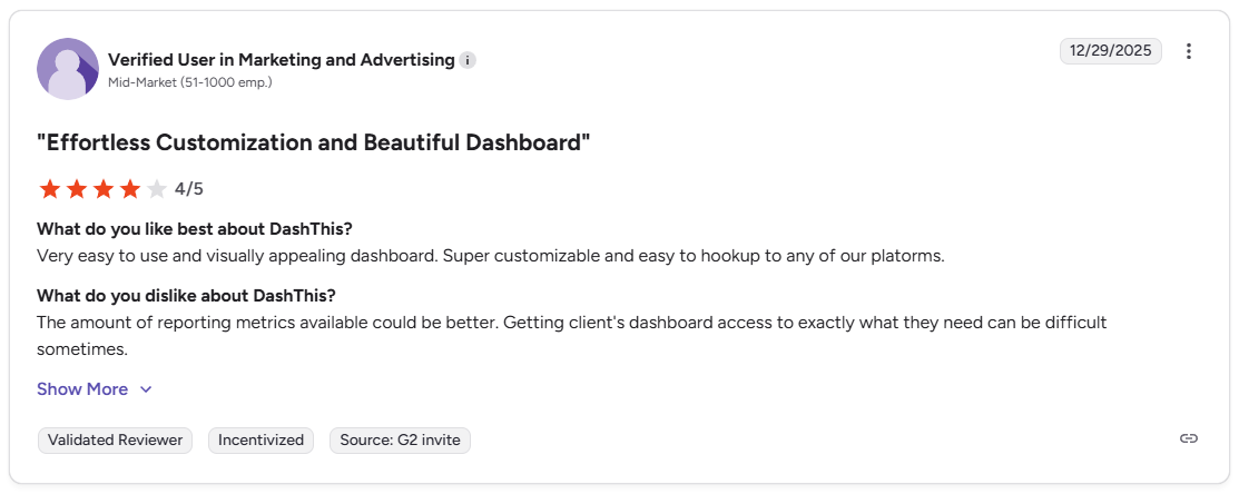
Con: “The amount of reporting metrics available could be better. Getting [clients'] dashboard access to exactly what they need can be difficult sometimes.” - Verified User, G2
Pricing
DashThis starts at $42 per month, which includes 3 dashboards.
Bottom line
DashThis pricing is structured around the number of dashboards rather than the number of clients, so costs stay predictable as your client count grows within that dashboard limit. If you need deeper metric customization and more granular client access controls, Klipfolio might be a better fit.
6. TapClicks: Best for large-scale agency reporting and campaign operations
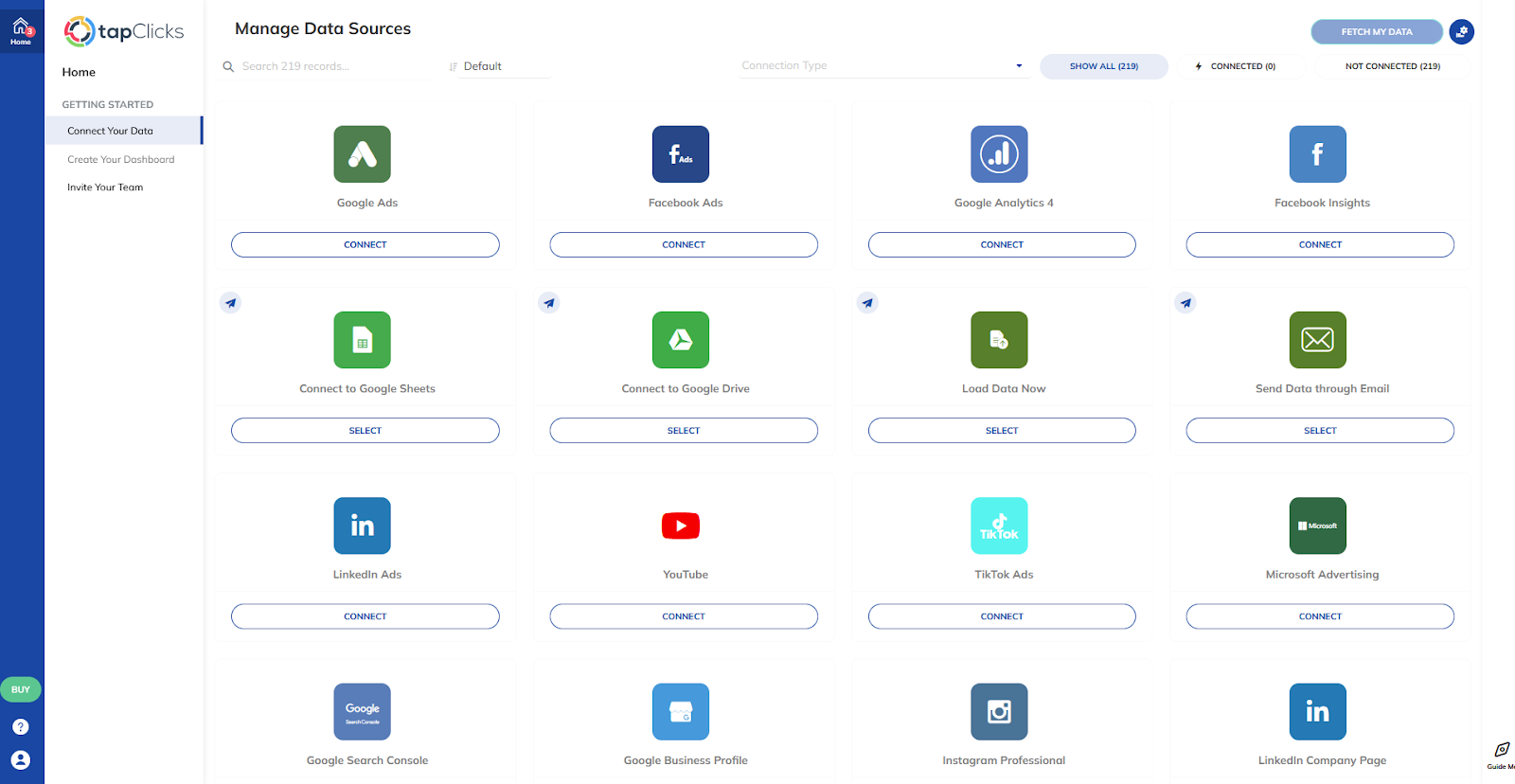
- What it does: TapClicks is a marketing operations platform that lets large agencies connect 200+ data sources into dashboards, reports, and campaign workflow management.
- Best for: Large agencies and media companies that need to manage reporting, campaign operations, and workflow automation from a single platform across a high volume of clients.
I tested TapClicks by walking through the data source setup and report configuration to see how quickly an agency could get client reporting running. Campaign order management and workflow operations are built in alongside reporting, though visualization options are more limited than expected at this scale.
Key features
- 200+ data source connectors: Pull data from a wide range of marketing, advertising, and analytics platforms into a unified reporting view across all clients.
- Automated reporting: Schedule reports to generate and deliver automatically on a recurring basis.
- Campaign workflow management: Manage order intake, campaign execution, and reporting from within the same platform.
Pros and cons
| ✅ Pros | ❌ Cons |
|---|---|
| 200+ integrations cover a wide range of marketing and advertising platforms | Visualization options are more limited than expected for a platform at this scale |
| Combines campaign workflow management and reporting in one platform | New data source connections can take up to 24 hours to populate, which slows initial setup |
| Automated reporting handles recurring delivery across large client volumes |
What users say
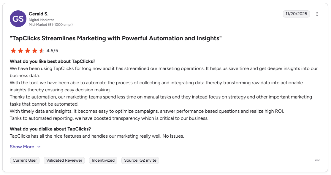
Pro: “We have been able to automate the process of collecting and integrating data, thereby transforming raw data into actionable insights … our marketing teams spend less time on manual tasks and they instead focus on strategy and other important marketing tasks that cannot be automated.” - Gerald S., G2
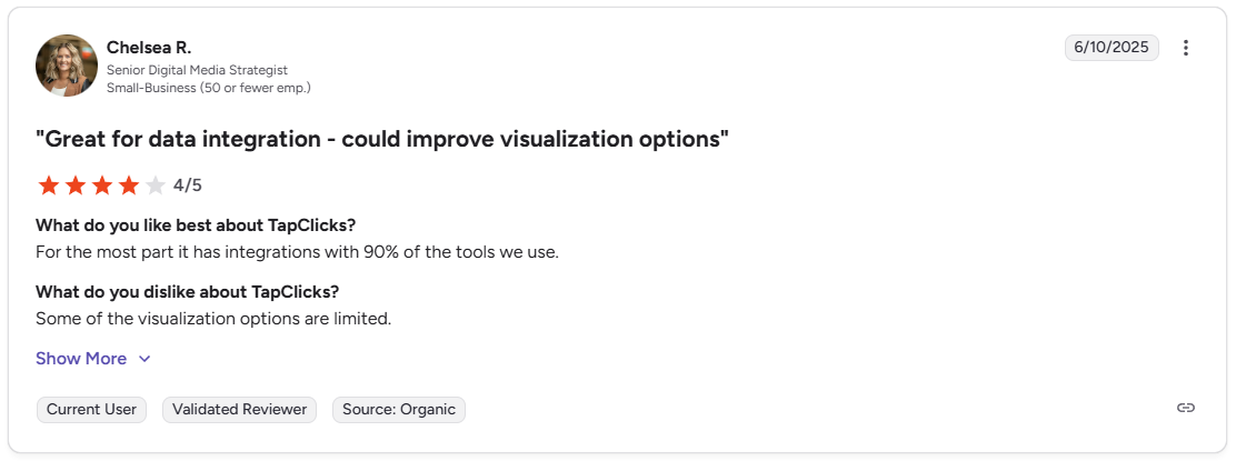
Con: “Some of the visualization options are limited.” - Chelsea R., G2
Pricing
TapClicks offers custom pricing.
Bottom line
TapClicks is one of the few tools on this list that connects reporting directly to campaign order and workflow management, making it relevant for agencies that run most of their operations in one platform. If you need transparent pricing and a self-serve setup without a sales process, AgencyAnalytics might be a better fit.
7. Klipfolio: Best for custom metrics and advanced dashboard building
- What it does: Klipfolio is a dashboard and KPI tracking platform that lets teams build custom metrics and visualizations from 100+ connected data sources.
- Best for: Analytics-oriented teams that need formula-based custom metrics and flexible dashboard building beyond what standard reporting templates offer.
Klipfolio sits closer to a BI tool than a client reporting platform, and that distinction matters when you're evaluating it for reporting. I tested it with a sample dashboard setup and found the custom formula builder powerful for teams that need to define their own metrics instead of relying on preset options. The tradeoff is that chart options are more limited than in tools like Power BI or Looker Studio.
Key features
- Custom formula builder: Define your own metrics using formula-based calculations to track KPIs beyond what preset platform metrics cover.
- 100+ data source connections: Pull data from cloud services, databases, and file sources into a unified dashboard view.
- Flexible dashboard layouts: Build and arrange dashboard components using a range of chart types, tables, and gauges.
Pros and cons
| ✅ Pros | ❌ Cons |
|---|---|
| Formula-based custom metrics let you build KPIs that standard templates don't support | Chart options are more limited than dedicated BI tools like Power BI or Looker Studio |
| Connects to 100+ data sources across marketing, finance, and operations | Dashboard load times can slow down with larger data volumes or complex queries |
| Clean interface makes navigating complex dashboards easier |
What users say
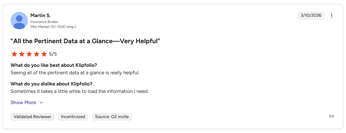
Pro: “Seeing all of the pertinent data at a glance is really helpful.” - Martin S., G2
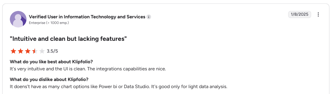
Con: “It doesn't have as many chart options like Power BI or Data Studio. It's good only for light data analysis.” - Verified User, G2
Pricing
Klipfolio starts at $120 per month.
Bottom line
Klipfolio's PowerMetrics feature extends the platform into a self-serve analytics layer that team members can query independently without editing dashboards. If you need enterprise-grade data visualization with broader chart options and deeper BI capabilities, Tableau might be a better fit.
8. Looker Studio: Best for free reporting in the Google ecosystem
- What it does: Looker Studio is a free data visualization and reporting tool from Google that lets you build interactive dashboards and shareable reports from connected data sources.
- Best for: Freelancers, in-house teams, and small agencies that work primarily within the Google ecosystem and need a free, customizable reporting tool they can share with clients via link.
Looker Studio is often the starting point for a lot of agencies and consultants, since it costs nothing to use with Google's native data sources. I tested it with GA4 and Google Ads connected and had a shareable dashboard ready without much setup. Costs add up once you need data sources outside the Google ecosystem, since those require paid third-party connectors.
Key features
- Free reporting with Google sources: Build and share dashboards using GA4, Google Ads, Google Sheets, and other Google products at no cost, with no limits on dashboards or users.
- Interactive dashboard controls: Add date range selectors, filters, and drill-down options to dashboards so clients can explore the data themselves.
- Broad connector library: Connect data from non-Google sources through third-party connectors to expand coverage beyond the native Google integration set.
Pros and cons
| ✅ Pros | ❌ Cons |
|---|---|
| Free to use with Google data sources, with no limits on dashboards or users | Connecting data outside the Google ecosystem requires paid third-party connectors |
| Highly flexible dashboard builder with interactive controls for client-facing reports | Dashboard load times can slow down on complex reports with multiple data sources |
| Wide adoption means plenty of templates and community resources are available |
What users say
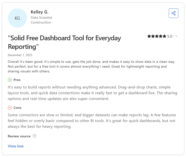
Pro: “It’s easy to build reports without needing anything advanced. Drag-and-drop charts, simple layout tools, and quick data connections make it really fast to get a dashboard live.” - Kelley G., Capterra
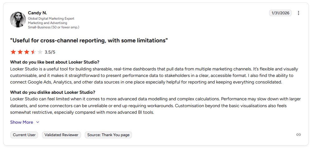
Con: “Looker Studio can feel limited when it comes to more advanced data modeling and complex calculations. Performance may slow down with larger datasets, and some connectors can be unreliable or end up requiring workarounds.” - Candy N., G2
Pricing
Looker Studio is free, then the Pro plan starts at $9 per user per project per month.
Bottom line
Looker Studio is the only free option on this list that produces interactive, shareable dashboards without a set dashboard or user cap. If you want reports delivered inside a branded portal your clients log into, Assembly might be a better fit.
9. Supermetrics: Best for piping marketing data into existing reporting tools
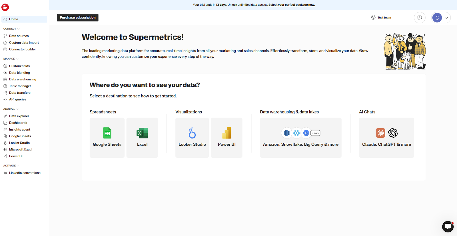
- What it does: Supermetrics is a data connector platform that pulls marketing data from 100+ sources into reporting destinations like Google Sheets, Looker Studio, Power BI, and data warehouses.
- Best for: Marketing teams and agencies that already have a reporting tool in place and need a reliable way to pipe data from multiple ad platforms and analytics sources into it automatically.
Supermetrics takes a different approach from most tools on this list. It acts as a connector layer that moves data from your sources into tools like Google Sheets or Looker Studio, instead of building reports on its own. I tested it with a few ad platform connectors, and the data pulls were reliable and quick to set up. However, queries can slow down on larger datasets, and the learning curve is quite steep.
Key features
- 100+ source connectors: Pull data from marketing, advertising, CRM, and analytics platforms into your reporting destination of choice.
- Automated data refresh: Schedule data pulls to run automatically so reports and dashboards stay current without manual exports.
- Multiple reporting destinations: Route data to Google Sheets, Looker Studio, Power BI, Excel, BigQuery, and other warehouses.
Pros and cons
| ✅ Pros | ❌ Cons |
|---|---|
| Reliable automated data pulls remove manual export work from recurring reporting workflows | Queries can slow down noticeably when working with large datasets |
| Connects to 100+ sources and routes data to multiple reporting destinations | There is a learning curve for new users unfamiliar with query-based data connectors |
| Works alongside your existing reporting tools instead of replacing them |
What users say
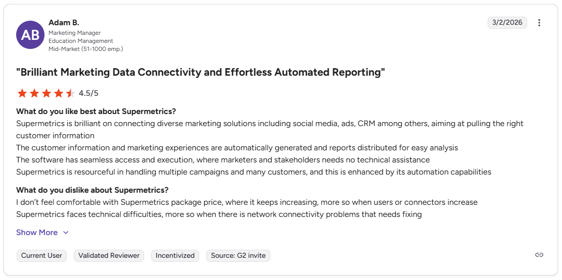
Pro: “Supermetrics is brilliant [at] connecting diverse marketing solutions, including social media, ads, CRM, among others, aiming at pulling the right customer information. The customer information and marketing experiences are automatically generated, and reports [are] distributed for easy analysis.” - Adam B., G2
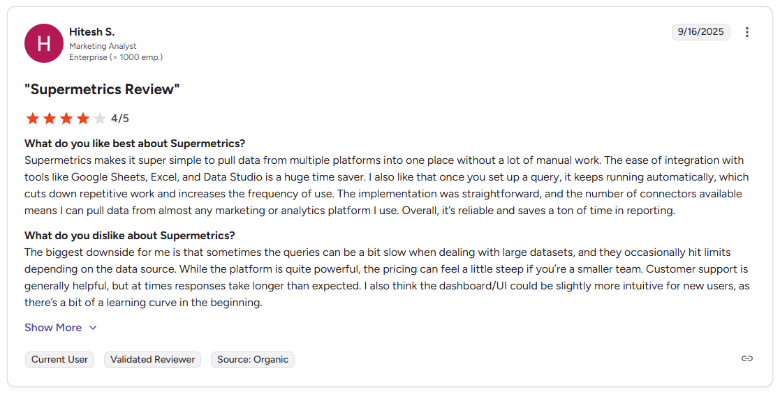
Con: “Sometimes the queries can be a bit slow when dealing with large datasets, and they occasionally hit limits depending on the data source. … the dashboard/UI could be slightly more intuitive for new users, as there's a bit of a learning curve in the beginning.” - Hitesh S., G2
Pricing
Supermetrics starts at $37 per month.
Bottom line
Supermetrics is the only tool on this list focused purely on acting as a connector layer, which means it adds value on top of whatever reporting tool you already use instead of replacing it. If you want a standalone reporting platform that builds and delivers dashboards without a separate destination tool, Looker Studio might be a better fit.
10. Tableau: Best for enterprise-grade data visualization and BI
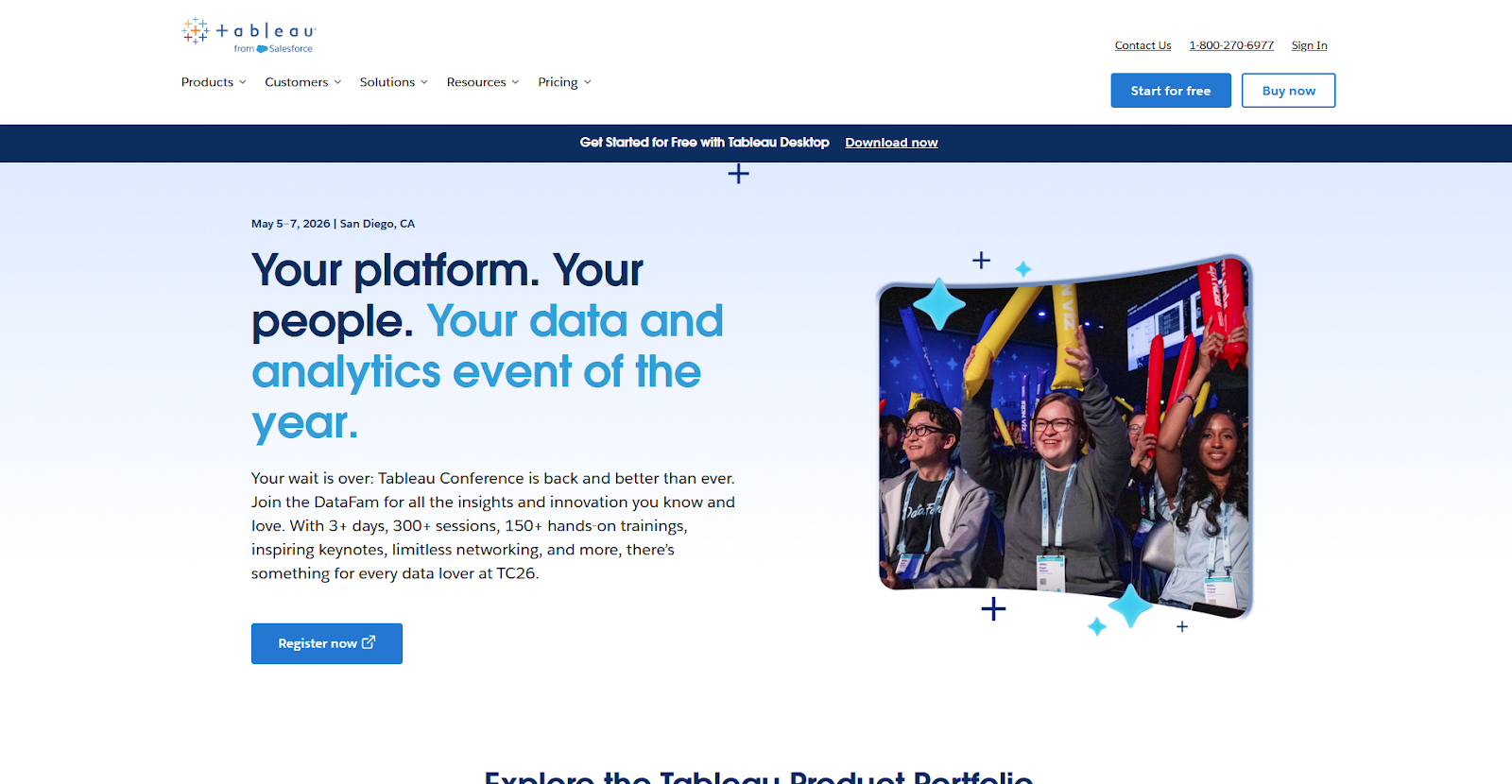
- What it does: Tableau is a business intelligence platform that lets teams connect, analyze, and visualize large datasets through interactive dashboards and reports.
- Best for: Enterprise teams and data analysts that need advanced data visualization and BI capabilities across large, complex datasets that go beyond standard marketing reporting.
I tested Tableau by connecting a sample dataset and building a client-facing dashboard from scratch. The platform gives you more control over how data is presented than many reporting tools. But I found that the time investment is significant, and it assumes more technical knowledge than most marketing teams have.
Key features
- Advanced data visualization: Build complex, interactive dashboards using a wide range of chart types and analytical views.
- Broad data connectivity: Connect to databases, cloud platforms, spreadsheets, and marketing data sources across multiple business functions.
- Interactive dashboard controls: Add filters, drill-downs, and dynamic parameters to dashboards so clients and analysts can explore data independently.
Pros and cons
| ✅ Pros | ❌ Cons |
|---|---|
| Visualization depth and chart options go further than many tools on this list | Setup and configuration require a higher level of data fluency than most marketing teams have |
| Handles large, complex datasets across multiple business functions beyond marketing | Licensing is structured per user, with a required Creator license alongside other user roles |
| Interactive dashboards let clients and analysts explore data without additional report builds |
What users say
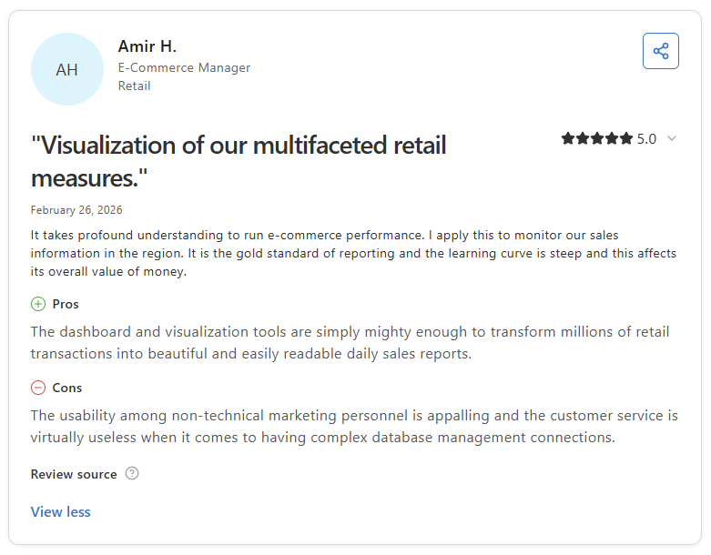
Pro: “The dashboard and visualization tools are simply mighty enough to transform millions of retail transactions into beautiful and easily readable daily sales reports.” - Amir H., Capterra
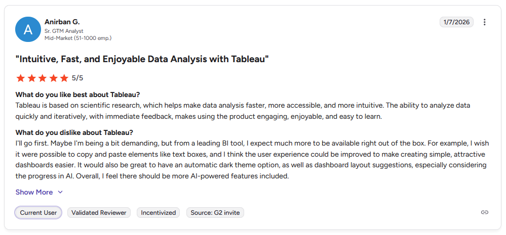
Con: "I wish it were possible to copy and paste elements like text boxes, and I think the user experience could be improved to make creating simple, attractive dashboards easier. … Overall, I feel there should be more AI-powered features included.” - Anirban G., G2
Pricing
Tableau starts at $15 per user per month, and a Creator license is also required at $75 per user per month.
Bottom line
Tableau is built for reporting across multiple business functions, not just marketing or client delivery. If you need a purpose-built marketing reporting tool without the setup complexity or licensing overhead, DashThis might be a better fit.
11. Improvado: Best for large-scale enterprise marketing data pipelines
- What it does: Improvado is an enterprise marketing data platform that extracts, transforms, and loads data from 500+ sources into dashboards, data warehouses, and BI tools.
- Best for: Enterprise marketing teams and large agencies with dedicated data teams that need end-to-end extract, transform, load (ETL) pipelines across a high volume of data sources and destinations.
Improvado sits closer to a data infrastructure platform than a traditional reporting tool. I went through the demo and found the ETL pipeline management to be the clear strength, giving data teams a single place to manage how marketing data flows from sources into warehouses and BI tools. However, some teams report inconsistent data delivery depending on how pipelines are configured.
Key features
- 500+ source connectors: Extract data from advertising, CRM, ecommerce, and analytics platforms into a central pipeline for transformation and distribution.
- ETL pipeline management: Automate the full extract, transform, and load process so clean, structured data reaches your reporting destinations.
- AI anomaly detection: Set up automated monitoring that flags unusual patterns in your marketing data before they affect client-facing reports.
Pros and cons
| ✅ Pros | ❌ Cons |
|---|---|
| ETL pipelines cover the full data lifecycle from extraction through to reporting destinations | Analytics features are less developed than the core ETL functionality |
| 500+ connectors cover a wide range of enterprise data sources | Data delivery can be inconsistent depending on the settings and connectors configured |
| New data connectors can be built on request when a needed source isn't available |
What users say
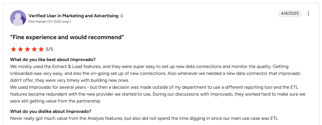
Pro: “We mostly used the Extract and Load features, and they were super easy to set up new data connections and monitor the quality. Getting onboarded was very easy, and also the on-going set up of new connections. Also, whenever we needed a new data connector that Improvado didn't offer, they were very timely with building new ones.” - Verified User, G2
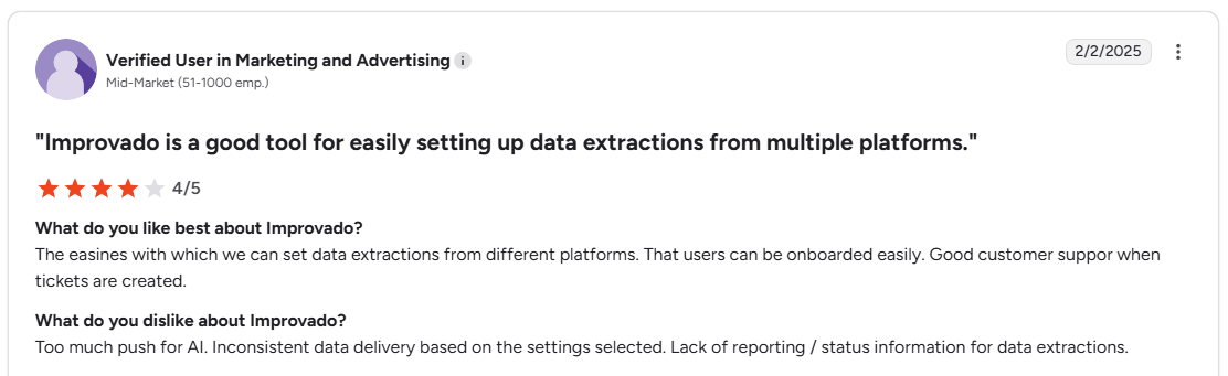
Con: “Inconsistent data delivery based on the settings selected. Lack of reporting and status information for data extractions.” - Verified User, G2
Pricing
Improvado is available at custom pricing.
Bottom line
Improvado is built for teams that need a data infrastructure layer before reporting can happen. If you need a connector that moves data into your reporting tools without a full data engineering setup, Supermetrics might be a better fit.
Which client reporting tool should you choose?
The right client reporting tool depends on what you need to do with reports once they're built, and who's on the receiving end.
Choose Assembly if you:
- Want clients to log into a branded portal where reports, files, invoices, and messages all live in one place
- Use Looker Studio, Databox, Power BI, or another reporting tool, and want to embed those dashboards directly into each client's workspace
- Run a professional service firm and need client management and report delivery on the same platform
Choose AgencyAnalytics if you:
- Run a marketing agency and need multi-channel reporting with automated scheduling across 80+ integrations
- Want white-label dashboards with client logins without building a full portal
- Manage 5 or more clients and want a purpose-built agency reporting workflow out of the box
Choose Whatagraph if you:
- Need polished, presentation-ready reports clients can read without any data background
- Want drag-and-drop report building with pre-designed templates and automated delivery
- Prioritize visual report design over deep dashboard customization
Choose Databox if you:
- Need real-time KPI tracking with goal-setting across multiple data sources
- Want a reporting tool that works as well for internal teams as it does for client-facing output
- Need benchmarking data to show clients how their performance compares to industry averages
Choose DashThis if you:
- Want automated marketing dashboards with minimal setup time
- Manage a small number of clients and want a simple, affordable starting point
- Need white-label reports without the complexity of a full agency reporting platform
Choose TapClicks if you:
- Operate a large agency and need reporting tied into campaign workflow and order management
- Need a platform that handles the full campaign operations lifecycle, not just dashboards
- Need enterprise-level connectors across hundreds of marketing platforms
Choose Klipfolio if you:
- Need to build custom metrics using formula-based calculations not available in other tools
- Want granular control over how your dashboards look and what data they display
- Work across multiple business functions beyond marketing, like finance or operations
Choose Looker Studio if you:
- Already work primarily in the Google ecosystem and want free, shareable dashboards
- Have some technical comfort and want a highly flexible, customizable reporting tool at no cost
- Need a place to display data pulled from connectors like Supermetrics or other sources
Choose Supermetrics if you:
- Already have a reporting tool like Looker Studio, Google Sheets, or Power BI and need reliable data piped into it
- Connect data from multiple ad platforms and want clean, scheduled pulls without manual exports
- Want a connector layer instead of a standalone reporting platform
Choose Tableau if you:
- Need enterprise-grade data visualization with deep BI capabilities across large datasets
- Have a dedicated data team and want a platform that handles complex, multi-source analysis
- Need reporting that goes well beyond marketing into company-wide business intelligence
Choose Improvado if you:
- Manage marketing data at enterprise scale across 500 or more data sources
- Need end-to-end ETL pipelines with data governance and AI anomaly detection
- Have a dedicated data engineering team and want a data infrastructure layer, not just a reporting tool
Final verdict
AgencyAnalytics, Whatagraph, and Databox are strong client reporting tools if your primary need is building and sending reports across marketing channels. But if you're running a service business that needs to deliver those reports inside a branded experience your clients actually log into, most tools on this list stop short of that.
Assembly brings those pieces together in one place:
- Give clients a branded portal: Clients log into a space that reflects your brand to access contracts, invoices, files, and project updates without email back-and-forth.
- Embeddable dashboards: You can embed reports from Looker Studio, Databox, Power BI, Google Sheets, and other tools directly inside each client's portal, so clients don't need a separate login to see their data.
- Dynamic client homepages: Different clients automatically see different content based on custom field tags, so each client's portal reflects their specific reporting setup without manual changes.
- Organized report delivery: App Folders let you group dashboards, analytics tools, and external links into named folders inside the portal, so clients find their reports without digging around.
- Keep tasks, messages, and files together: Client communication, shared files, and project tasks stay connected to each client record instead of being scattered across separate tools.
- Prep faster for meetings: The AI Assistant summarizes recent client activity and communication, helping you walk into calls with a clear picture of what’s been discussed and what’s outstanding.
- Built-in client management: Track client relationships, communication history, and project status in one place so nothing gets lost between reporting cycles.
Assembly is built for service businesses that want every client to log into their own tailored portal, where their reports, messages, and invoices stay connected. If that's the gap you're trying to close, it's worth a look. Start your free Assembly trial today.
Frequently asked questions
What are the best client reporting tools for marketing agencies?
AgencyAnalytics, Whatagraph, and Assembly are the best client reporting tools for marketing agencies. Each covers a distinct need: multi-channel reporting, presentation-ready reports, and branded portal delivery. Assembly is the right fit if you want clients to access reports inside a branded portal alongside invoices, files, and messages.
What should a client report include?
A client report should include a results summary against agreed goals, key metrics for the channels or services you manage, and a clear next-steps section. Keep the focus on outcomes your client cares about, not every data point your tools track. A short written summary explaining what the numbers mean adds context that raw data alone doesn't provide.
What is the difference between a client report and a client dashboard?
A client report is a static snapshot of performance over a set time period, while a client dashboard is a live view of metrics that updates in real time. Reports work well for structured reviews sent on a set schedule, such as weekly or monthly. Dashboards give clients on-demand access to current data without waiting for a delivery.