20+ best law firm websites and examples to learn from
Looking for some inspiration for your law firm website? We put together a list of examples you can learn from. Discover the best law firm websites!

Let’s be honest, there aren’t a ton of great law firm websites out there.
Old, cookie-cutter designs and generic stock photos speak more to a lack of taste than unique value. Underwhelming sites simply checking a box do little to inspire potential clients to engage, never mind establishing trust and confidence in precious expertise honed for years.
Yet in 2024 and beyond, digital presence makes or breaks brand perception and discoverability. With 81% of companies claiming that customer experience is a competitive differentiator, having a compelling brand is a non-negotiable.
So, I sourced over 20 different law firm websites that I believe are doing it right. In this article, we’ll explore why your law firm needs a website, the types of website builders you can use to build one, and examples from real law firms out there in the wild.
Alright, let’s get into it!
Why should a law firm have a website?
It’s pretty obvious that law firms need an online presence. While most large firms rely on referrals and word-of-mouth to grow their clientele, many smaller firms need a way to differentiate themselves and look trustworthy in front of potential clients.
An exceptional website that delivers 24/7 visibility can do just that — by conveying credibility and expertise to continuously acquire new clients.
Here are some other reasons why you’d want a website for your law firm:
- Showcase services: Detail practice areas, achievements, attorney bios, and past results to establish qualifications in competitive legal specialties. Visitors should quickly grasp wide-ranging capabilities.
- Share informative content: Published guides, case studies, trends analysis, and commentary build reputation while informing and attracting site visitors through search and shares.
- Highlight media features: Display media logos, outlet links, attorney quotes, and videos to highlight third-party validation and prominence.
- Enable contact and lead intake: Embedding contact forms, chatbots, and other conversion points let visitors seamlessly engage for consultations. CRM integrations track leads.
- Establish authority and trust: Professional design, best-practice UX, and personal touches like attorney photos convey competence to earn business from visitors.
- Drive referrals: Optimized sites garner referral traffic, citations, and backlinks, compounding visibility and conversion potential through aggregator listings.
Without an online presence at the caliber modern clients expect, firms can disappear from consideration and discovery. An exceptional site amplifies your brand and builds you as a thought leader in your niche.
Website builders used by law firms
When looking for a way to build a law firm website, there are a few crucial things you need to consider. Well, really, there are three main pillars: security, scalability, and customization. And after going through dozens of law firm websites, I noticed a common pattern in the tools they used to build their sites.
I discovered that most rely on either custom code or WordPress — with occasional usage of Webflow and Squarespace emerging as well.
- Custom code: High-end firms often invest in entirely custom-built sites to maximize security, branding control, and advanced integrations while future-proofing growth. Total customization comes at the expense of heavier development costs and build times.
- WordPress: Mid-size to large firms gravitate towards WordPress given the balance of branding capabilities, scalability through plugins, and lower build costs compared to pure custom code. However, WordPress typically requires more maintenance and internal expertise to secure sites.
- Webflow: As a leading no-code web builder, I'm starting to find examples of boutique and modern law firms leveraging Webflow for increased speed to market matched with design flexibility. The visual builder accelerates launch times and simplifies revisions.
While heavier reliance rests on custom code and WordPress, competitive differentiators exist by embracing modern no-code builders like Webflow promising higher velocity, built-in CMS functionality, and more. Pair this up with a law firm client portal tool like Assembly, and you’ll set yourself apart from most law firms out there.
20 best law firm websites to inspire yours
Here are some of the best law firm websites:
- SimVisa
- Aulich
- Counsel for Creators
- Skadden
- Vogel LLP
- Venable LLP
- DKM Law Group
- Reese Marketos LLP
- HopgoodGanim Lawyers
- Foot Anstey
- Kirkland & Ellis LLP
- Hagestad Law Group
- YLaw Group
- Paul Hastings
- Lipsky Lowe LLP
- Hansford McDaniel
- Horne Coupar Lawyers
- Barr & Douds Attorneys
- Bick Law LLP
- AMS Advocaten
Alright, let’s take a look at each law firm's website.
1. SimVisa
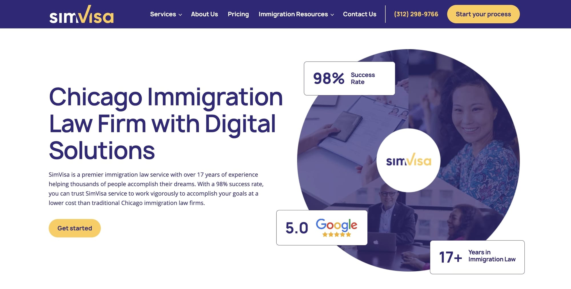
- Website built with: Webflow
- Services offered: Immigration services
SimVisa has a design that's both modern and user-friendly, which I think is really cool to see in this space. The site almost feels like a SaaS website, compared to a traditional, outdated law firm website.
The first thing you notice is how clean and organized everything looks, making it easy to find what you need, like services for visas or green cards. They use colors and images in a way that feels professional but also welcoming, which is great for a law firm.
What I like most is how the site makes complex information easy to understand, which is super helpful for anyone not familiar with legal stuff. They've got this section where you can get to know the lawyers, which adds a personal touch and builds trust. Plus, the site works well on both desktop and mobile, so you can check it out from anywhere.
2. Aulich
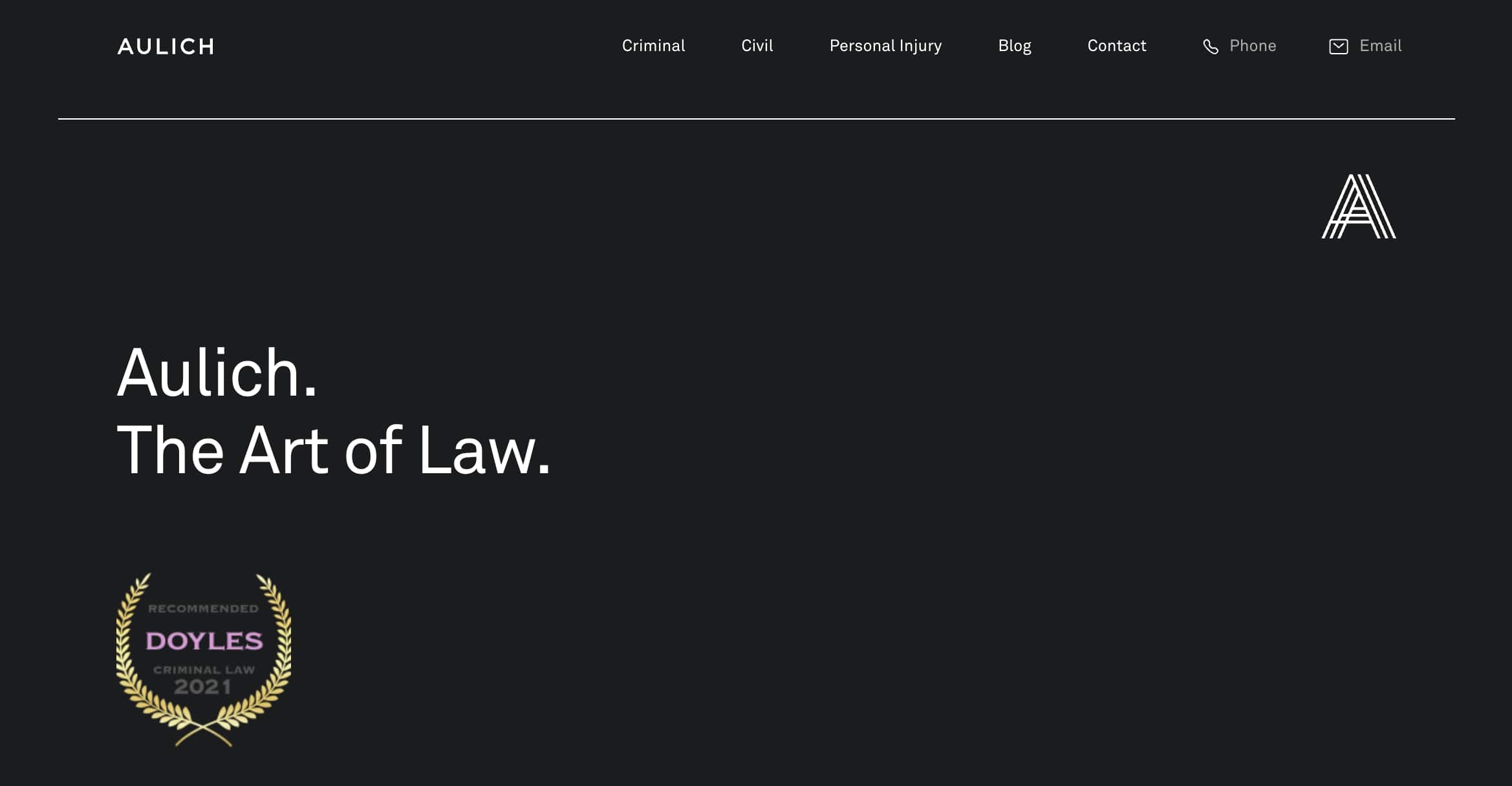
- Website built with: WordPress
- Services offered: Criminal law, personal injury, and more
Aulich, characterized by their motto "The Art of Law," demonstrates a profound commitment to making sure that legal outcomes favor their clients, specializing in areas such as Criminal Law and Civil Law.
Their website is super sleek and modern, with great typography. The site also has a large navbar that goes over all of their services, contact information, and blog.
They provide insightful updates and articles on pertinent legal issues and cases, reflecting their expertise and proactive engagement in current legal landscapes. Testimonials, like the one from a client represented by Peter Woodhouse, highlight the firm's dedication to justice and client welfare, emphasizing personalized, cost-aware legal support that profoundly impacts clients' lives.
3. Counsel for Creators
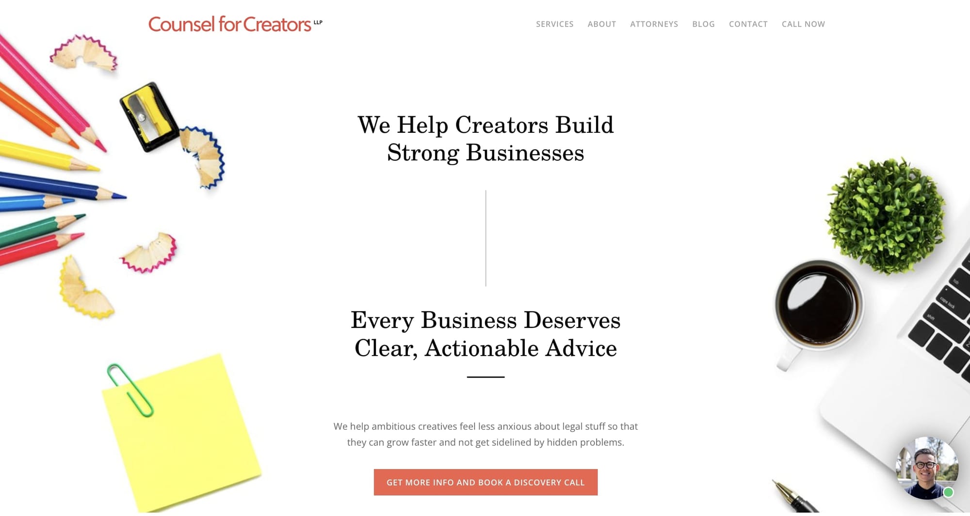
- Website built with: WordPress
- Services offered: Business setup, trademarks, and more.
Finding an attorney who actually understands the hurdles of running a modern creative business is tough. But the team at Counsel for Creators speaks your language — literally. Their recently refreshed website says it all through a sleek, visual design that feels more agency than an old-school firm.
As pioneers in subscription legal services for creators and digital businesses, Counsel for Creators caters to innovators looking to turn passion into profitable ventures legally and safely. That means assistance in forming your business properly, registering vital trademarks, reviewing dangerous contracts, and avoiding hazardous copyright issues.
The best part is that their services work for creative ventures at any stage without unrealistic hourly legal fees. Plus the Counsel for Creators site makes exploring offerings simple through practical content focused on empowering entrepreneurs, not confusing them in legal jargon. I'd expect nothing less from legal counsel purpose-built to champion LA’s vibrant creator ecosystem.
4. Skadden
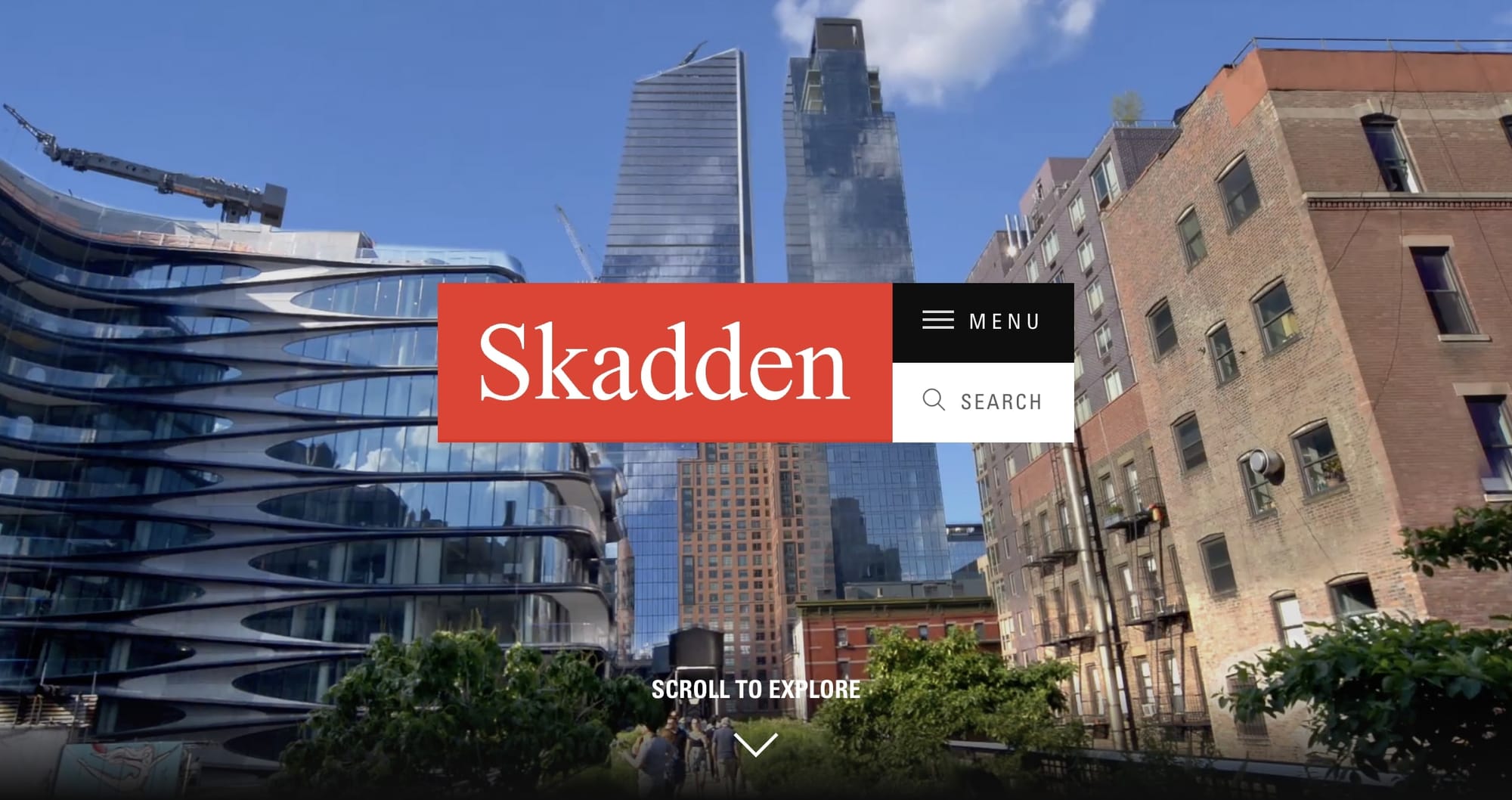
- Website built with: Sitecore
- Services offered: Accounting, AI, media, and more
Skadden's achievements as a top international law firm with decades of history come through immediately when visiting their website. The sleek and professional yet inviting design reinforces this firm's prestige — balancing rich heritage with modernity.
From the sleek landing highlighting impactful leaders, deals making waves, and evolving insights to intuitive navigation guiding you through expertise, the Skadden site balances storied tradition with accessible modernity. The design seems to focus on user experience, offering easy access to information about the firm's services, professionals, and thought leadership.
5. Vogel LLP
- Website built with: WordPress
- Services offered: Personal injury and family law
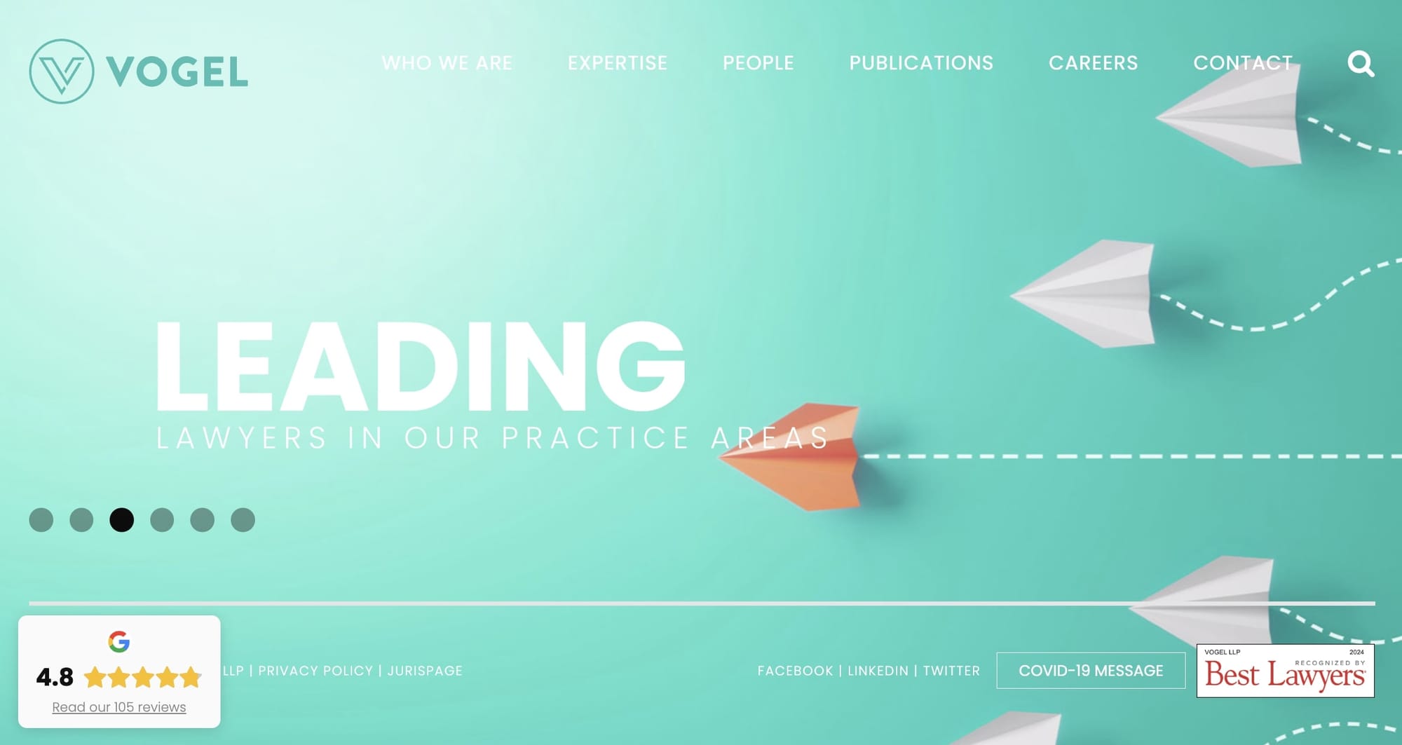
Vogel Lawyers, a law firm specializing in personal injury and family law, has a simple yet content-rich website. At first glance, the website seems like a simple homepage with no real substance. But, once you hover over the navigation, you’ll notice that they’ve grouped all of their services under individual landing pages.
This is a great approach if you run a law firm that services clients all across the country (or even the world). With multiple landing pages across different verticals, you can improve the SEO of your website while also having assets to use in Google PPC ads.
If you’re looking for a law firm website with inspiration for how to set up your service landing pages, you definitely want to check this one out.
6. Venable LLP

- Website built with: Sitecore
- Services offered: Bankruptcy, IP, and more
Navigating the Venable LLP website, it's instantly apparent this isn't your typical stuffy law firm site. With sleek but inviting graphics and friendly modular content, they strike the right balance between professionalism and approachability.
The website also features sections on their services, insights, community involvement, and firm information. The design also includes interactive elements, thought leadership content, and resources to engage visitors. It's structured to highlight the firm's expertise, news, and contributions to the legal field, reflecting their commitment to client success and community support.
7. DKM Law Group
- Website built with: Squarespace
- Services offered: Financial, insurance, and real estate
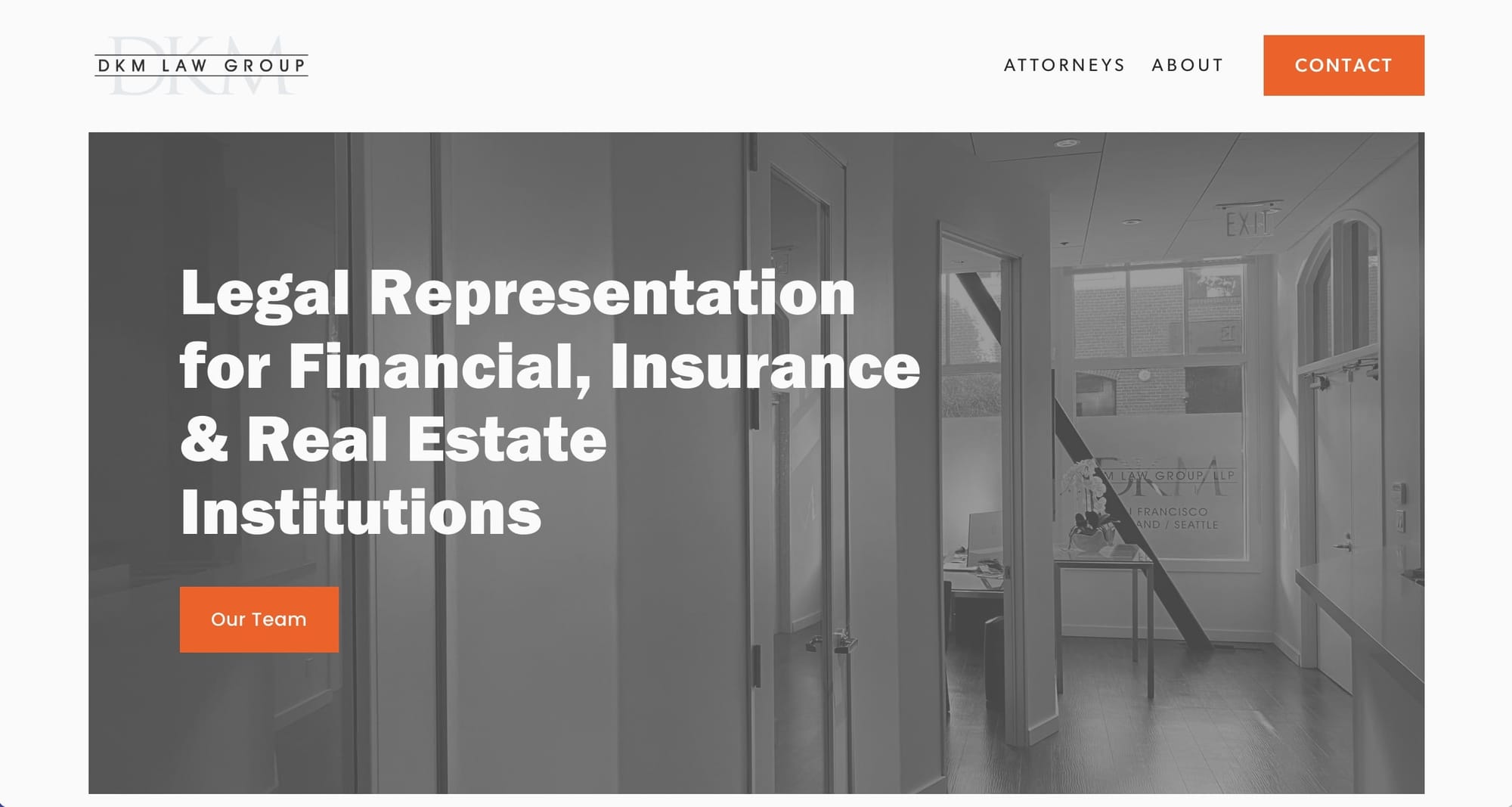
DKM Law Group showcases a professional and minimal design that's focused on serving financial, insurance, and real estate institutions. The site's layout is straightforward and user-friendly, making it easy for visitors to navigate through the pages and find the information they need. It emphasizes the law firm's areas of expertise, highlighting their specialized services in complex commercial matters.
What stands out about the website is its balance between simplicity and informative content. It's not cluttered with too much information, which can be overwhelming, but it provides enough detail to understand the firm's capabilities and the sectors they serve. If you’re looking for a simple law firm website example, this is one you should check out.
8. Reese Marketos LLP
- Website built with: WordPress
- Services offered: High-stakes commercial litigation
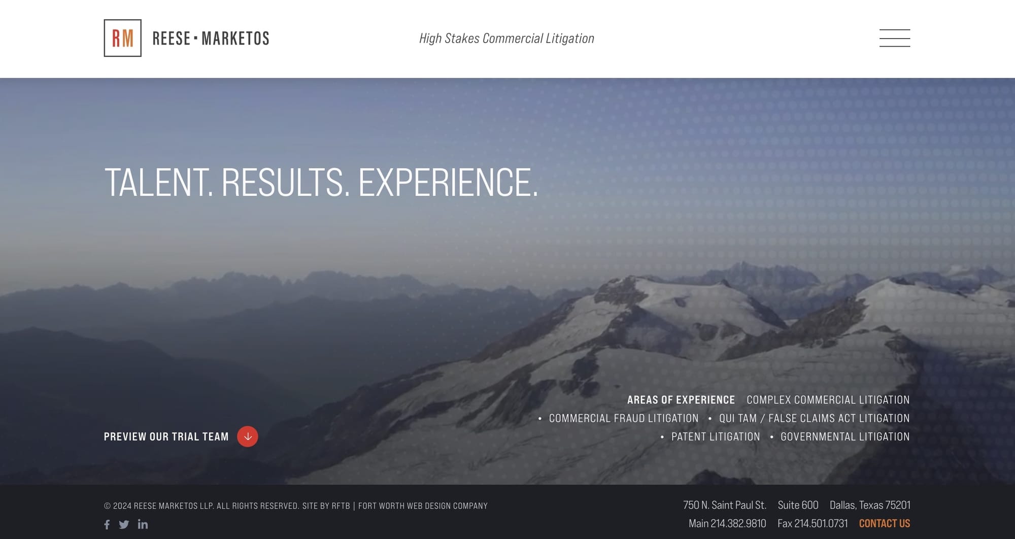
The website for Reese Marketos LLP focuses on high-stakes commercial litigation and presents a professional, sleek design emphasizing their expertise in complex legal areas.
The site features sections on their legal talent, notable results, and extensive experience, which are crucial for portraying their proficiency in the field.
The design is clean and straightforward, making it easy for users to explore their services, attorney profiles, and contact information. Overall, the site instills confidence in potential clients by showcasing their successful litigation history and specialized team.
9. HopgoodGanim Lawyers
- Website built with: Custom code
- Services offered: Buying/selling businesses, real estate, and more
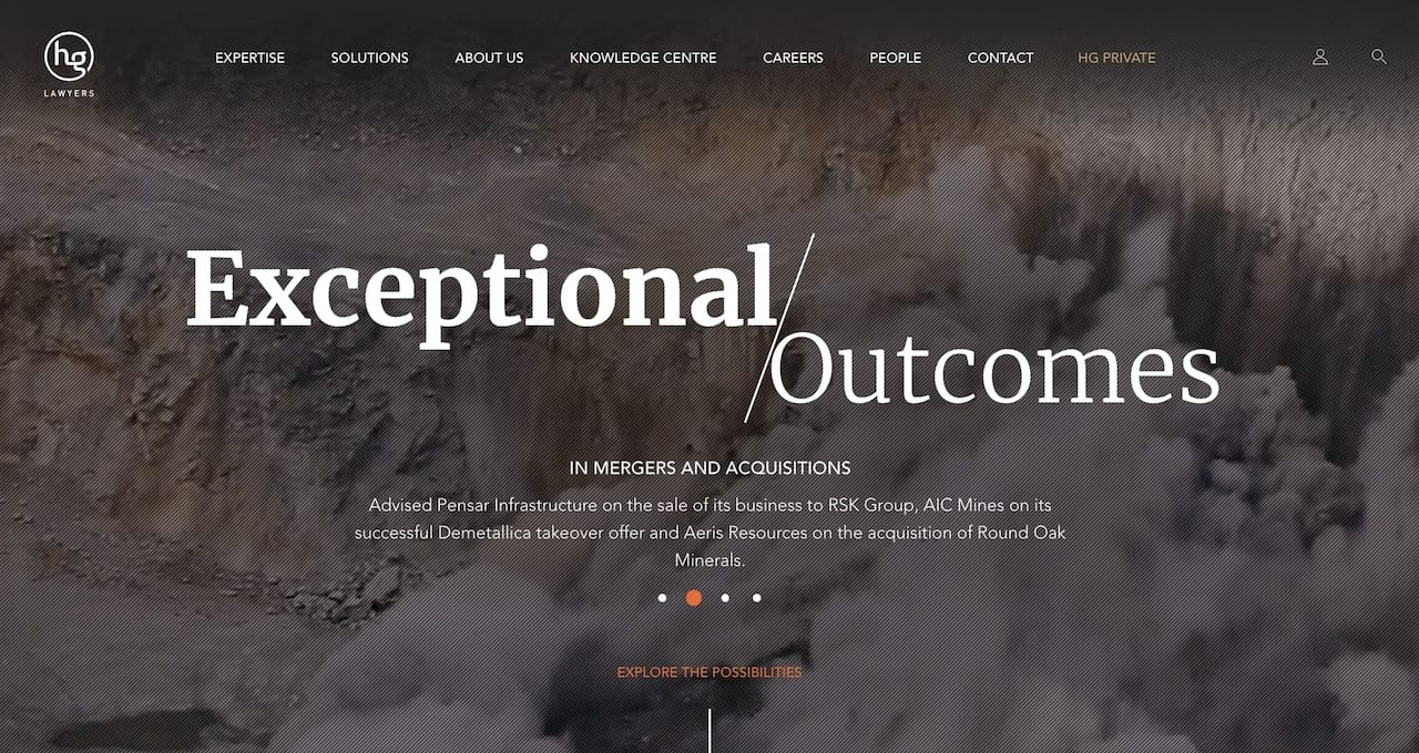
HopgoodGanim Lawyers clearly spent time considering first digital impressions — their website balances sleek aesthetics with smart UX for easy discovery of legal guidance.
Rather than overloading visitors with stuffy language, HopgoodGanim keeps things exceptionally clean highlighting strengths across key industries from financial services to real estate development.
For Australian enterprises requiring a formidable yet approachable ally able to translate legal implications into growth possibilities, HopgoodGanim deserves a close look.
10. Foot Anstey
- Website built with: WordPress
- Services offered: Banking, employment, and more
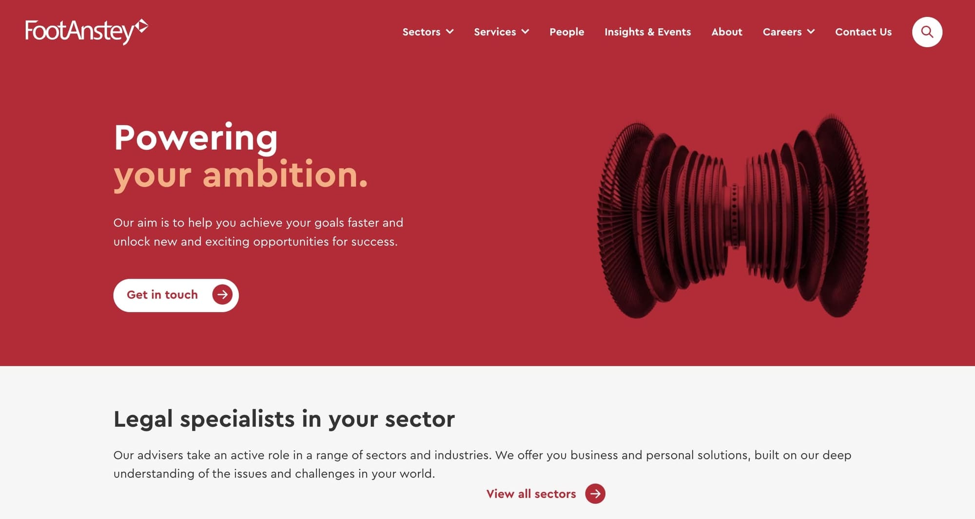
Going through Foot Anstey’s website, it’s clear they aim to create an inviting window into the full breadth of tailored expertise this prestigious firm offers. Their sleek layout pairs bright red hues with crisp, welcoming content that balances professionalism and warmth.
It's organized in a way that makes it easy to find information, whether you're looking for details on their services, sectors they specialize in, or insights and events. The site also prioritizes user experience by having clear navigation and accessible content. Also, the inclusion of client testimonials and the latest news updates adds to the site's credibility and keeps visitors informed.
11. Kirkland & Ellis LLP

- Website built with: Custom code
- Services offered: Media, copyright, product liability, and more
The Kirkland & Ellis website showcases a professional and sleek design that reflects the firm's place in the legal industry. The site's layout is user-friendly, making it easy for visitors to navigate through the various sections, such as services, news, and career opportunities. The use of clean lines, a monochromatic color palette, and high-quality images contributes to the overall sophisticated and modern aesthetic.
What stands out is the site's functionality and the way it efficiently presents a vast array of information, from detailed descriptions of their legal services to the latest firm news and insights. The design prioritizes user experience, making sure that clients and potential hires can easily access the information they need. The overall impression is one of a law firm that is both authoritative and forward-thinking, mirroring its reputation for delivering high-caliber legal solutions.
12. Hagestad Law Group
- Website built with: Custom code
- Services offered: Estates and trusts
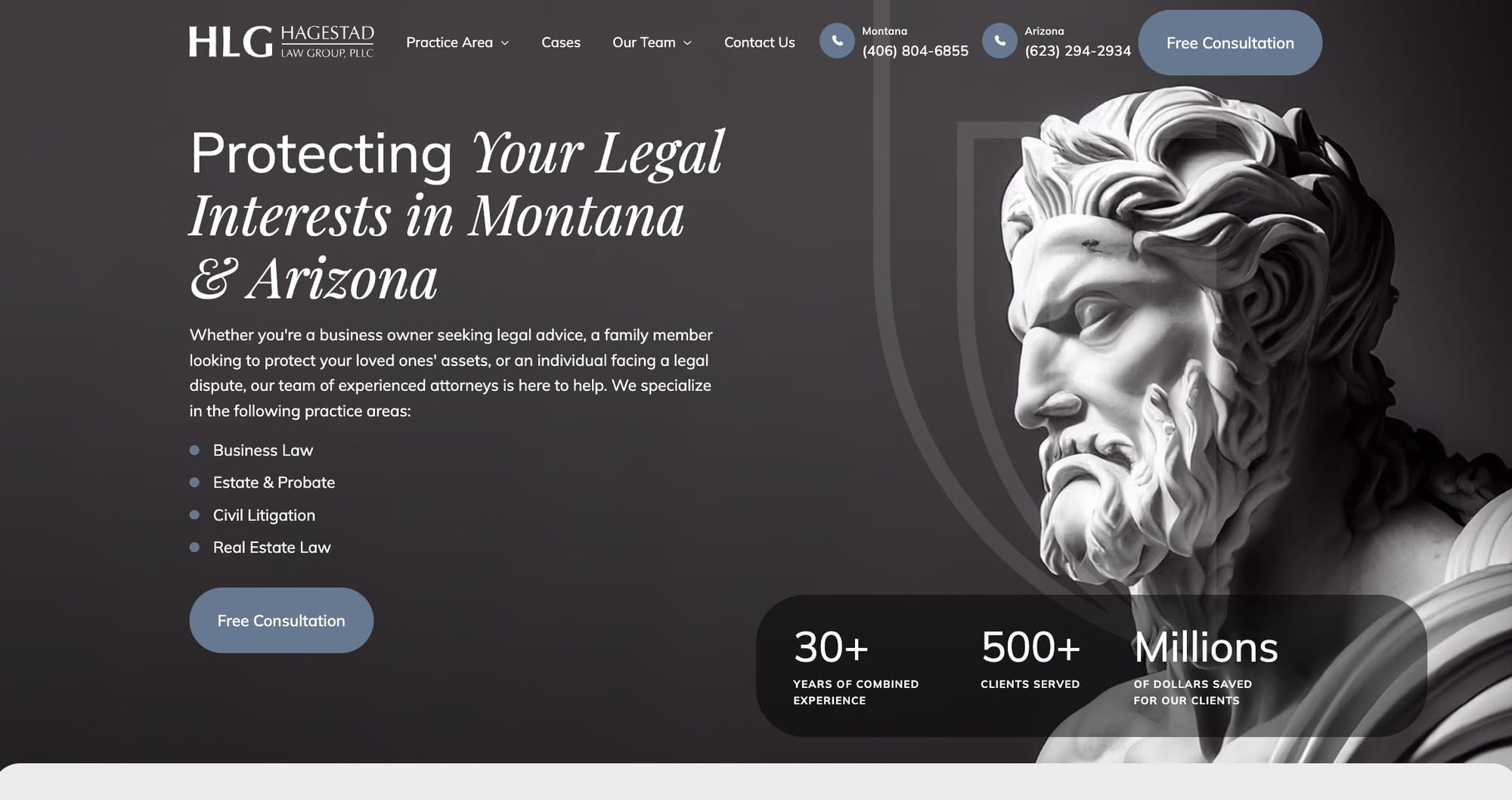
The website of Hagestad Law Group presents a professional and sleek design tailored to showcase their legal services effectively. The homepage clearly highlights their areas of expertise, including estate & probate law, civil litigation, business law, and real estate law, ensuring that potential clients can easily find the information they're looking for. The use of engaging imagery, client testimonials, and concise content contributes to a user-friendly experience that emphasizes the firm's commitment to their clients.
What stands out about the design is its straightforward, clean layout that enables easy navigation, allowing visitors to quickly access different sections of the site, like attorney profiles, service descriptions, and contact information. The inclusion of a free consultation offer prominently displayed invites engagement, and the overall aesthetic is professional yet inviting, reflecting the firm's blend of experience and approachability.
13. YLaw Group
- Website built with: WordPress
- Services offered: Family law and more
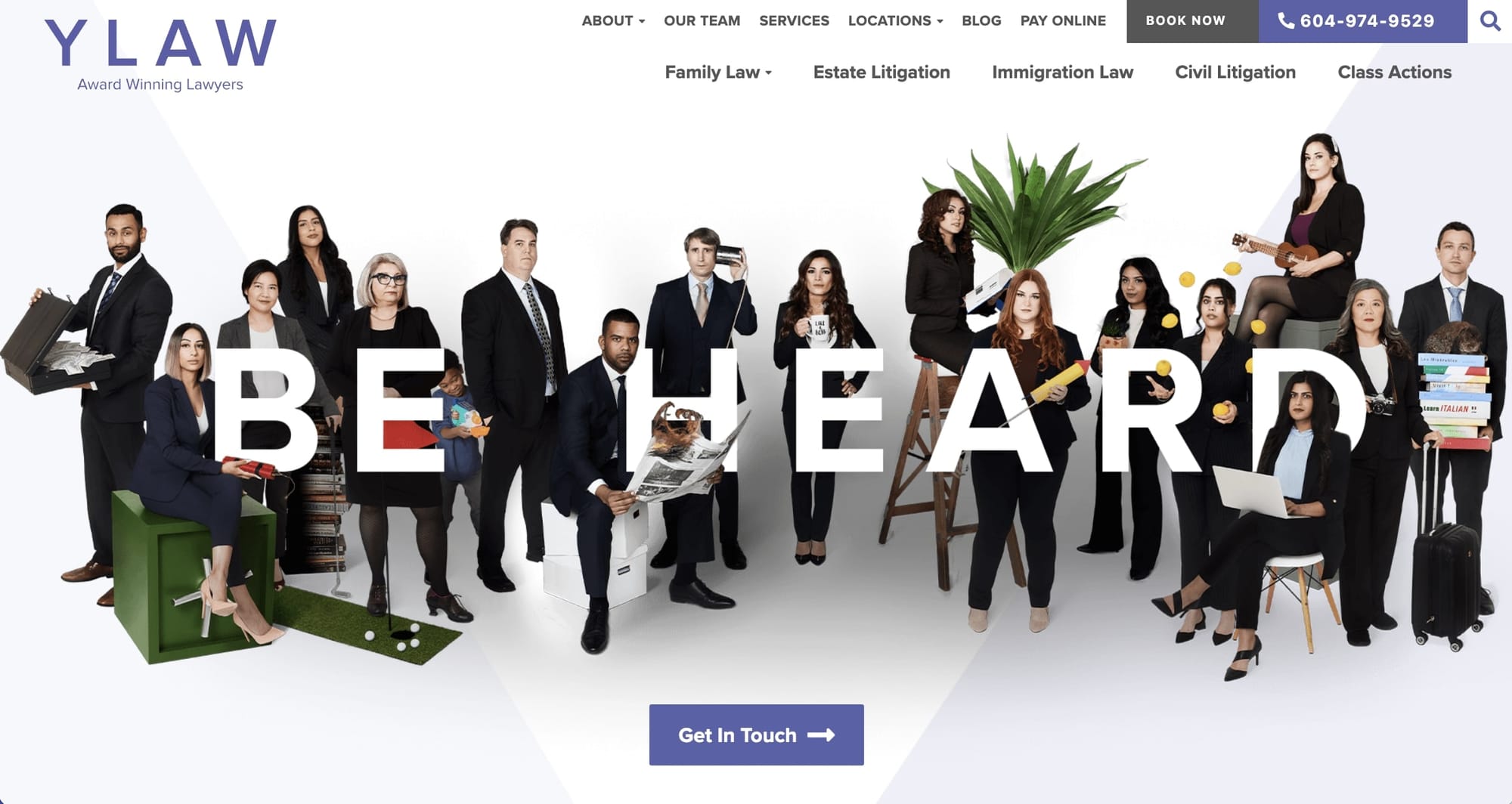
The YLaw Group website showcases a modern, user-friendly design tailored to their legal services in family, estates, immigration, and civil law. The site uses a clean, professional layout that combines accessibility with elegance, making sure that visitors can easily navigate through their services, team profiles, and legal resources. What stands out is the site's focus on clear, concise information presented in a visually appealing manner, alongside compelling calls to action that guide users seamlessly through their legal journey. The design effectively balances professionalism with a welcoming tone, making legal information approachable without compromising on sophistication.
I appreciate the website's strategic use of visuals and text, which together create a reassuring environment for potential clients. The incorporation of testimonials and case victories lends credibility and trust, which are crucial for a law firm's online presence. The overall design aligns well with the firm's branding, emphasizing their commitment to providing great legal support while also showcasing their innovative approach to law.
14. Paul Hastings
- Website built with: Custom code
- Services offered: Data privacy, employment law, and more
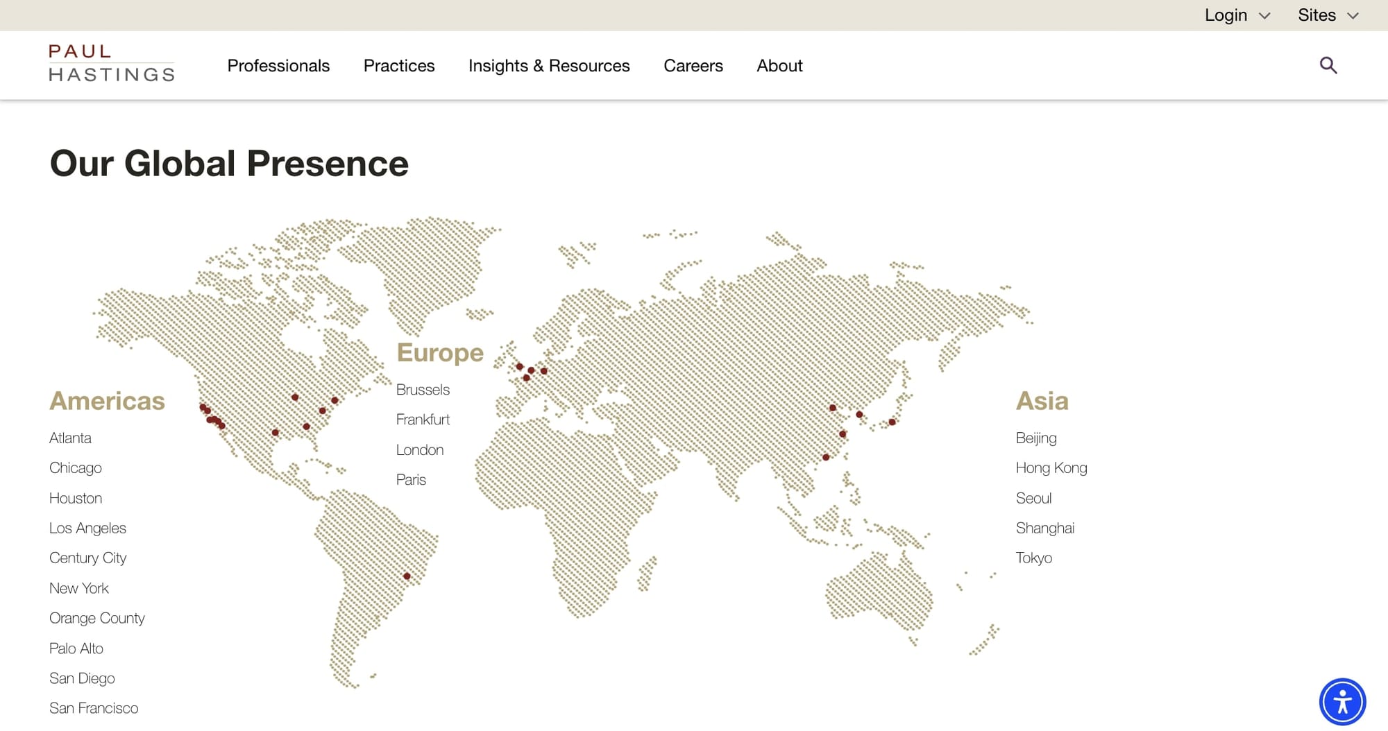
The Paul Hastings website has a clean, professional design that reflects the global scope of their law firm. It's clear they've focused on making the site easy to navigate, making sure that clients and visitors can quickly find the information they need — whether it's about their services, lawyer profiles, or recent firm news. The use of bold visuals and a clean layout also gives the site a modern feel, while the organized structure aids in finding specific areas of practice or locations efficiently.
What I like about the site is its sophisticated yet user-friendly interface. It balances informative content with an elegant design, avoiding overwhelming visitors with too much information at once. This approach helps convey their reputation for thoroughness and professionalism, important qualities for a law firm.
15. Lipsky Lowe LLP
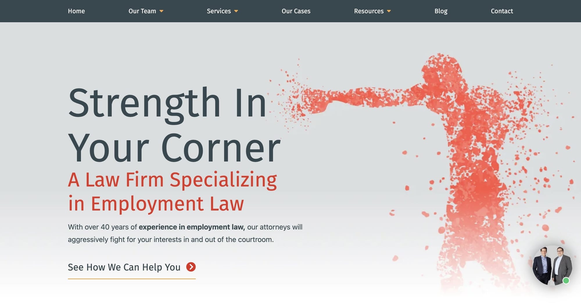
- Website built with: WordPress
- Services offered: Employment law
Lipsky Lowe LLP, a New York City employment law firm, showcases a professional and clean design that reflects the firm's expertise in employment law. The homepage immediately presents a strong, confident image, emphasizing their commitment to fighting for their clients' rights. The use of bold typography, a coherent color scheme, and high-quality images contribute to a sense of authority and trustworthiness.
Navigating the site is straightforward, with a clear menu that directs visitors to various sections like attorney profiles, services, and contact information. This ease of navigation ensures that users can quickly find the information they need. The inclusion of client testimonials and detailed descriptions of their practice areas further establishes their credibility and showcases their specialization in employment law.
16. Hansford McDaniel
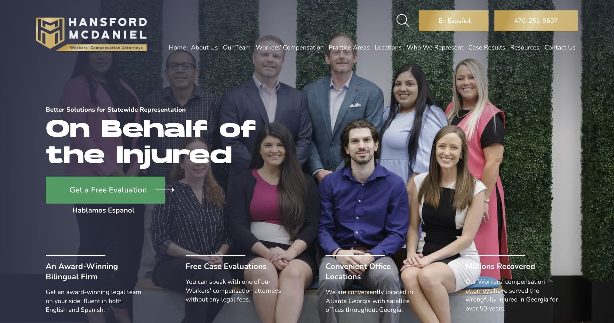
- Website built with: WordPress
- Services offered: Workers compensation
The Hansford Law Firm website presents a professional and user-friendly interface focused on workers' compensation law in Georgia. The design is clean and straightforward, making it easy for visitors to navigate through the different sections like practice areas, attorney profiles, and client testimonials. The use of engaging visuals and a consistent color scheme enhances the site's readability and overall aesthetic appeal.
What stands out about the website is its clear communication of the firm's expertise and success in handling workers' compensation cases, showcased through their case results and client reviews. The site also emphasizes the firm's commitment to their clients with features like free case evaluations and detailed information on workers' rights and legal processes. This approach not only provides valuable resources for potential clients but also establishes trust and credibility.
17. Horne Coupar Lawyers
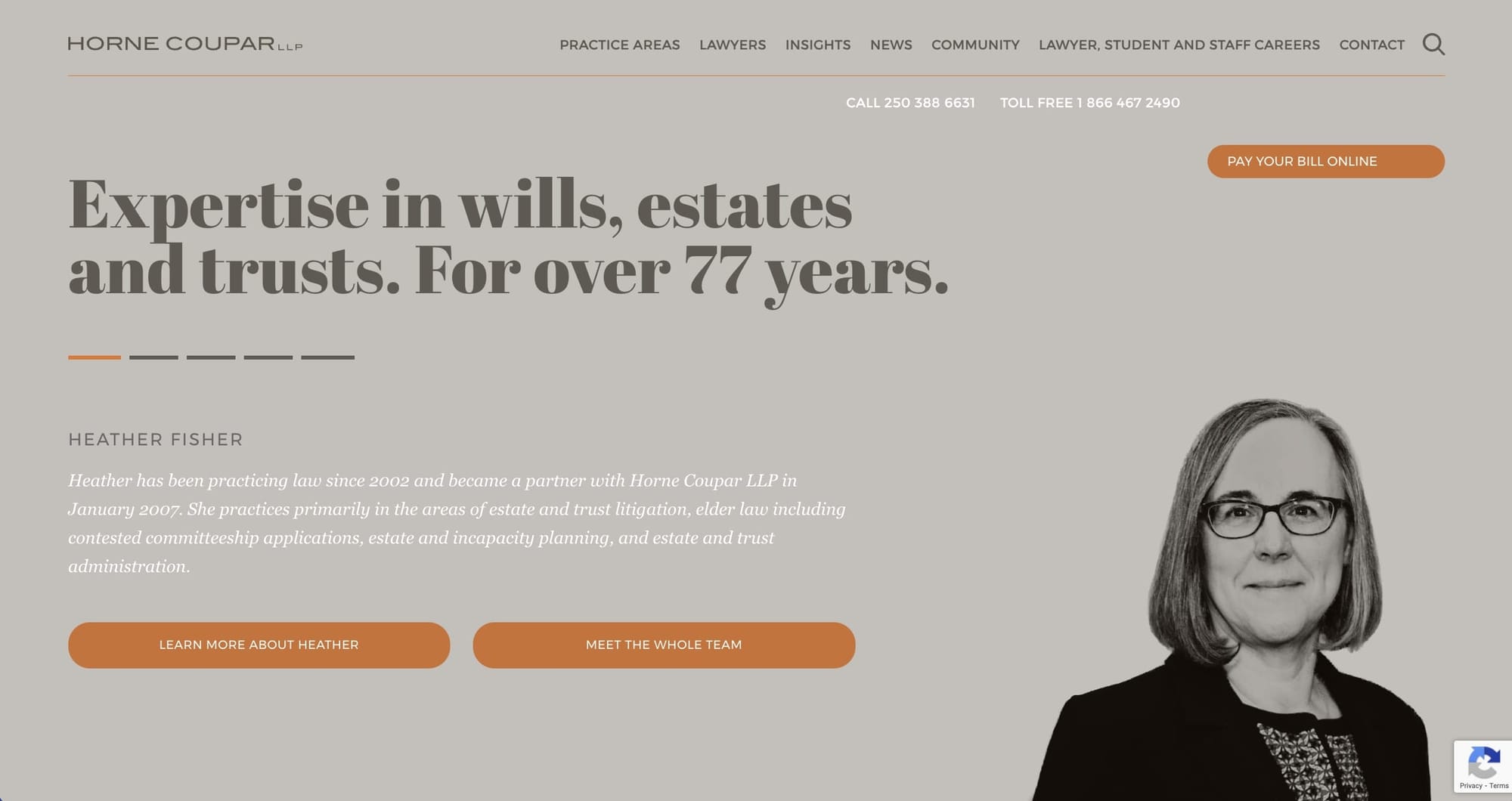
- Website built with: WordPress
- Services offered: Wills and estate planning
Horne Coupar, a law firm located in Victoria, Canada, has a design that feels both professional and welcoming. It likely uses a clean layout that makes it easy for visitors to find what they need, like services, lawyer bios, and contact information.
The site balances text with visuals, possibly showcasing the team's professionalism and the firm's long-standing history in a visually appealing way. The design is also mobile-friendly — crucial for accessibility and reaching a broader audience.
18. Barr & Douds Attorneys
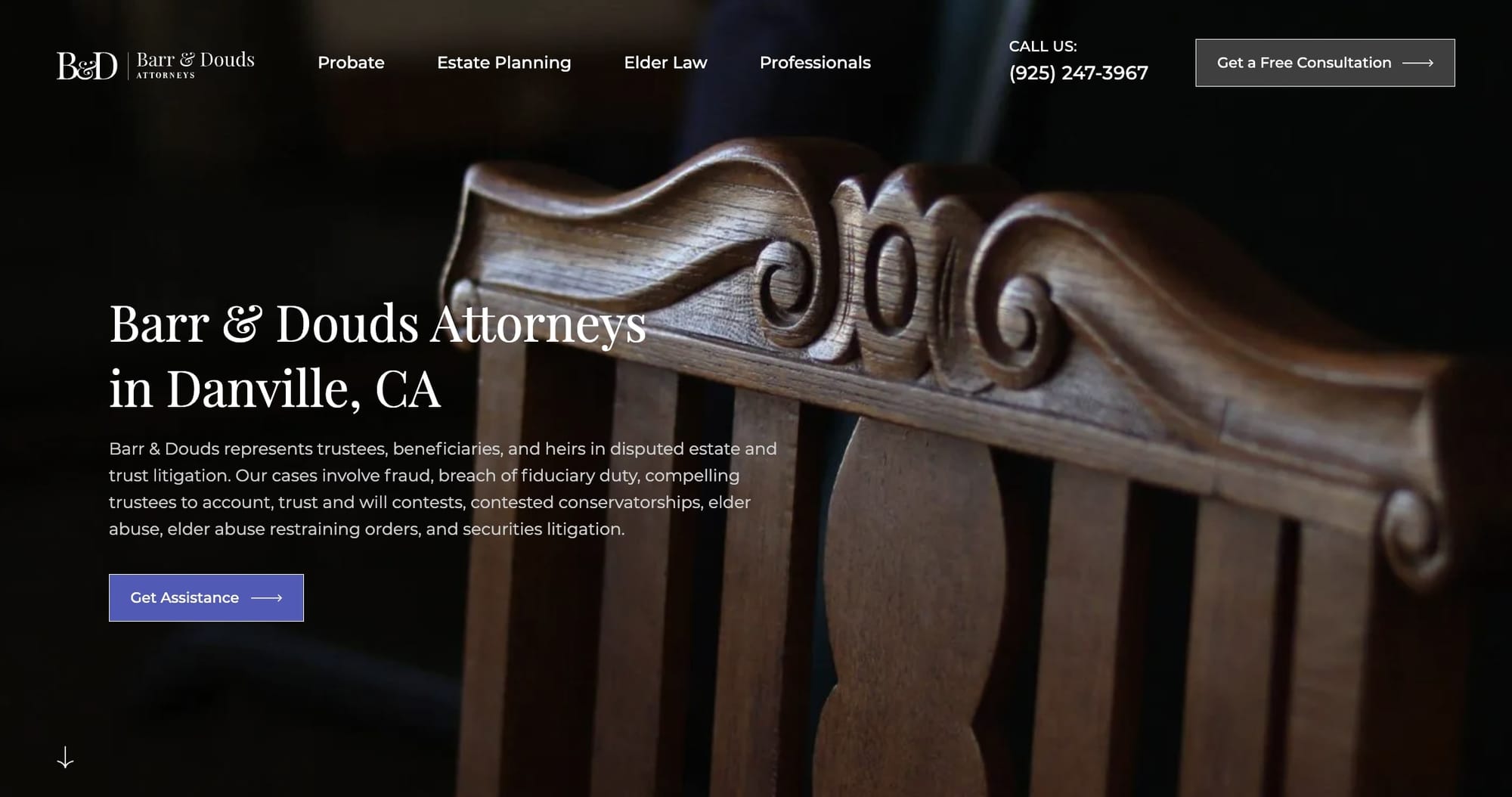
- Website built with: WordPress
- Services offered: Estate planning and more
Barr & Douds, a law firm specializing in trust and estate litigation, showcases a professional and straightforward design that reflects their area of expertise. The site's layout is clean and user-friendly, making it easy for visitors to navigate and find the information they need quickly. What stands out about this website is its clarity in presenting the firm's services, highlighting their experience in the field, and offering easy access to contacting the firm or learning more about their team and practice areas.
I appreciate the website's focus on providing essential information upfront, such as their practice areas, attorney profiles, and contact details. This approach helps potential clients understand the firm's capabilities and how they can assist with specific legal needs. The inclusion of testimonials and case results adds a personal touch, building trust by showcasing their success and client satisfaction. Overall, the design aligns well with the professional image of the law firm, emphasizing their expertise and commitment to their clients.
19. Bick Law LLP
- Website built with: WordPress
- Services offered: Environmental litigation
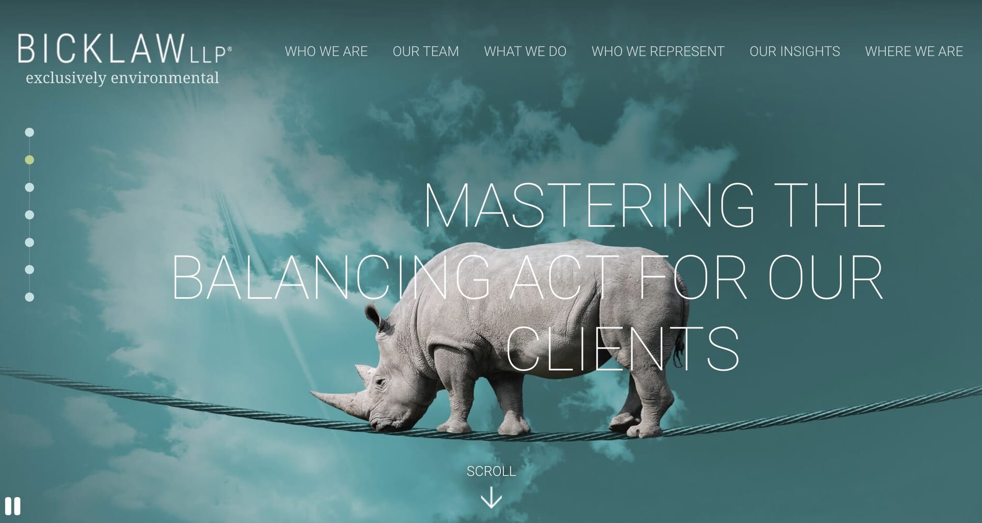
Bick Law LLP, a firm specializing in environmental law, showcases a professional and colroful design that reflects their expertise in this field. The design uses a clean, modern layout with easy navigation, making sure visitors can quickly find information about the firm's services, team, and areas of expertise. The use of high-quality images, consistent branding, and a color scheme that complements their environmental focus adds to the site's visual appeal.
What I like about the website is its user-friendly interface that combines functionality with aesthetics. The homepage effectively communicates the firm's mission and areas of practice, while also highlighting their commitment to providing tailored solutions to their clients.
20. AMS Advocaten
- Website built with: Custom code
- Services offered: Dutch civil law
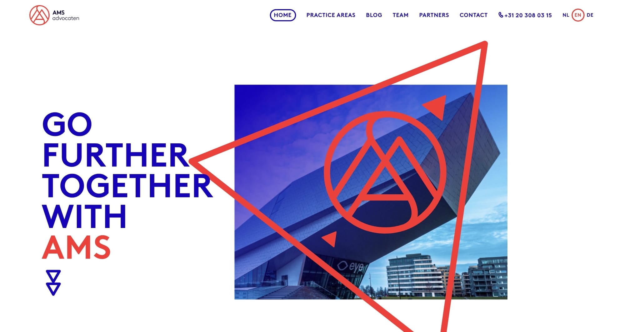
AMS Advocaten, a Dutch law firm, showcases a professional design that's both inviting and informative. The homepage presents a clear message of collaboration and expertise, encouraging visitors to explore their legal services. The layout is clean, emphasizing ease of navigation with well-organized sections like practice areas, team information, and contact details. The use of images, likely representing Amsterdam, adds a local touch while maintaining a polished look.
What stands out about this website is its straightforward approach to presenting information. The practice areas are clearly listed, making it easy for potential clients to understand the firm's specialties. The inclusion of a blog section suggests they provide valuable insights and updates, which is great for keeping visitors engaged and informed. The contact information is prominently displayed, making sure that prospective clients can easily reach out. Overall, the design balances professionalism with approachability, reflecting the firm's commitment to serving their clients effectively.
Building a client portal for your law firm website
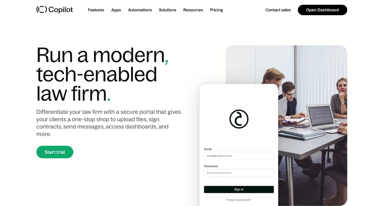
Having a website for your law firm is great. But, giving your clients a place to log in on your website is even better.
When you add a client portal from Assembly to your law firm's website, it's like giving your clients a key to their own secure section of your website. They can easily upload documents, sign contracts, and chat with you, all in one private, secure spot.
It's designed to keep things straightforward and safe, respecting the need for privacy and compliance, especially in the legal world. Think of it as enhancing your firm's approachability and modernizing how you connect with clients, making everyone's life a bit easier. If you’re ready to take your law firm to the next level, be sure to play around with the law firm client portal.

