13 unique consulting website examples to inspire yours
Learn what makes a great consulting website and discover over 13 different consulting websites and examples to gain inspiration for your own site.

Building a successful career as a consultant requires two things.
One of those is to be exceptionally great at what you do, and the other is how you position yourself in the market.
There are a lot of consultants out there who are great at their craft — tons of them that may offer the exact same services as you do.
So how do you stand out and be different? How do you impress potential clients on their first impression of you? And how do retain clients and make them stick around?
One way to do this: have a great consulting website and online presence.
In this article, I’ll show you what makes a great website for your consulting business. I’ll also go over 13 examples of real consulting websites so you can see what some successful businesses are doing.
Alright, let’s get into it!
What is a consulting website?
A consulting website is a website that a consultant uses to build an online presence, showcase their services, and offer visitors a way to get in touch with them. A consultant’s website serves as the pivotal digital storefront — the first point of contact where potential clients interact with and evaluate the firm's offerings.
An effective consulting website goes beyond an online brochure. Rather, it is a strategic asset that allows companies to attract clients and highlight their unique value proposition.
Specifically, the website offers a platform to clearly communicate niche expertise, showcase specialized services, and demonstrate how the consulting firm's methodology enables them to solve client challenges. By articulating the approach in detail and providing proof points like client testimonials and case studies, the website establishes credibility and authority in the field.
Also, great website design humanizes a consulting firm by featuring leadership biographies that allow prospects to connect with experience-driving solutions. This can build trust and confidence in a consultant's capabilities. The website content should also flaunt thought leadership, whether through blogs, guides, or resources that position a consultant as an industry adviser.
In essence, the consulting firm website is where meaningful first impressions are shaped and brand narratives come alive. An impactful digital presence is no longer optional — it is essential for communicating differentiation, engaging clients, and sustaining visibility and relevance in a competitive marketplace. The website sits at the core of an integrated marketing and client acquisition strategy. By showcasing niche expertise and value on a bespoke platform, consulting firms can maximize their influence across the sector.
Website builders used by consultants
Choosing the right website builder is key for showcasing your brand and providing a great first impression to potential clients. The goal here is to make a site that looks professional but also lets people find information easily. Consultants often pick platforms that are flexible for design, good for search engines, and easy to use.
A consultant's site should give the facts about their skills clearly and simply. Popular builders make this possible without needing a lot of tech skills. They also let consultants showcase their brand's style.
Here are a few popular options consultants use to build their websites:
- Wix
- Squarespace
- Webflow
- WordPress
- Framer
The great thing about these website builders is that make make it easy to build a website that fits your brand. Some builders, like Webflow, let you be more flexible with designs but are also a bit harder to use if you’re a beginner. For those not so tech-savvy, Wix or Squarespace are also great options.
When it comes to customizability, colors, fonts, and layout very much affect a brand's image. Customizable consulting website templates from top builders can help you make sites that match your branding. These tools also improve search engine results so more potential clients can find the site.
Additionally, ideal platforms for consultants have features like mobile responsiveness, fast speeds, and contact forms. Whether highlighting case studies, blogging, or listing services, these sites show consultants are leaders in their field. But, most website builders, like the ones I mentioned above, have all of these basic features.
In summary, picking the right website builder can make a big impact on your consulting business — especially if you plan on creating content and want to drive organic traffic to your website. By selecting the right tool, you can build sites that impress and represent your amazing services.
Now, let’s look at some consulting website examples so you can see how other firms and individual consultants approach their online presence.
13 unique consulting website examples to inspire your own
Here are our top picks for the best consulting websites:
- Laura Busche
- Samantha Alice
- Jansen Bordinhao
- Jeremy Malcolm
- Kevin Indig
- Timothy Financial
- Olivine
- Josh Fechter
- Ninia Azzopardi
- Fidus Information Security
- Adam Durrant
- Brendan Hufford
- Dara Denney
Let’s look at each one.
1. Laura Busche

- Website built with: WordPress
- Service offered: Brand consulting
Laura Busche's personal consulting website is a fantastic example of great web design and branding. As an expert in brand strategy, Laura's site reflects her skills by showcasing her work.
Right away, the clean, simple homepage design draws attention. It focuses on Laura's projects and successes, avoiding clutter. The professional color scheme is sophisticated yet inviting.
A key asset is Laura's site's smooth functionality. The navigation has clear sections for services, blog posts, books, and bio. Each part neatly presents comprehensive info about her offerings. Also, the easy-to-use interface helps visitors quickly find what they need.
Overall, Laura leverages strong visuals and organization on her website to feature her consultant brand impressively. The result is an engaging platform that reflects her expertise in strategy.
2. Samantha Alice

- Website built with: Squarespace
- Services offered: Creative, Shopify, & VA
Samantha Alice's website excellently shows how consultants can build appealing online presences. Her vibrant site displays her digital marketing and branding expertise.
Landing on Samantha’s site, you’re invited with bold colors and big photos that grab your attention. The modern, energetic design reflects Samantha's creative approach.
The thoughtful layout enables easy browsing. Services, projects, and other sections offer seamless access, letting visitors explore offerings and work. This simplicity provides a smooth experience so people further engage.
One major asset is Samantha's projects and testimonials focus — showcasing diverse projects that demonstrate her skills and successes. This establishes credibility and gives potential clients a glimpse of her work.
Overall, Samantha leverages dynamic visuals and organization to showcase her consultant talents. The result is an engaging platform emphasizing her digital marketing specialty.
3. Jansen Bordinhao
- Website built with: Squarespace
- Services offered: Financial services
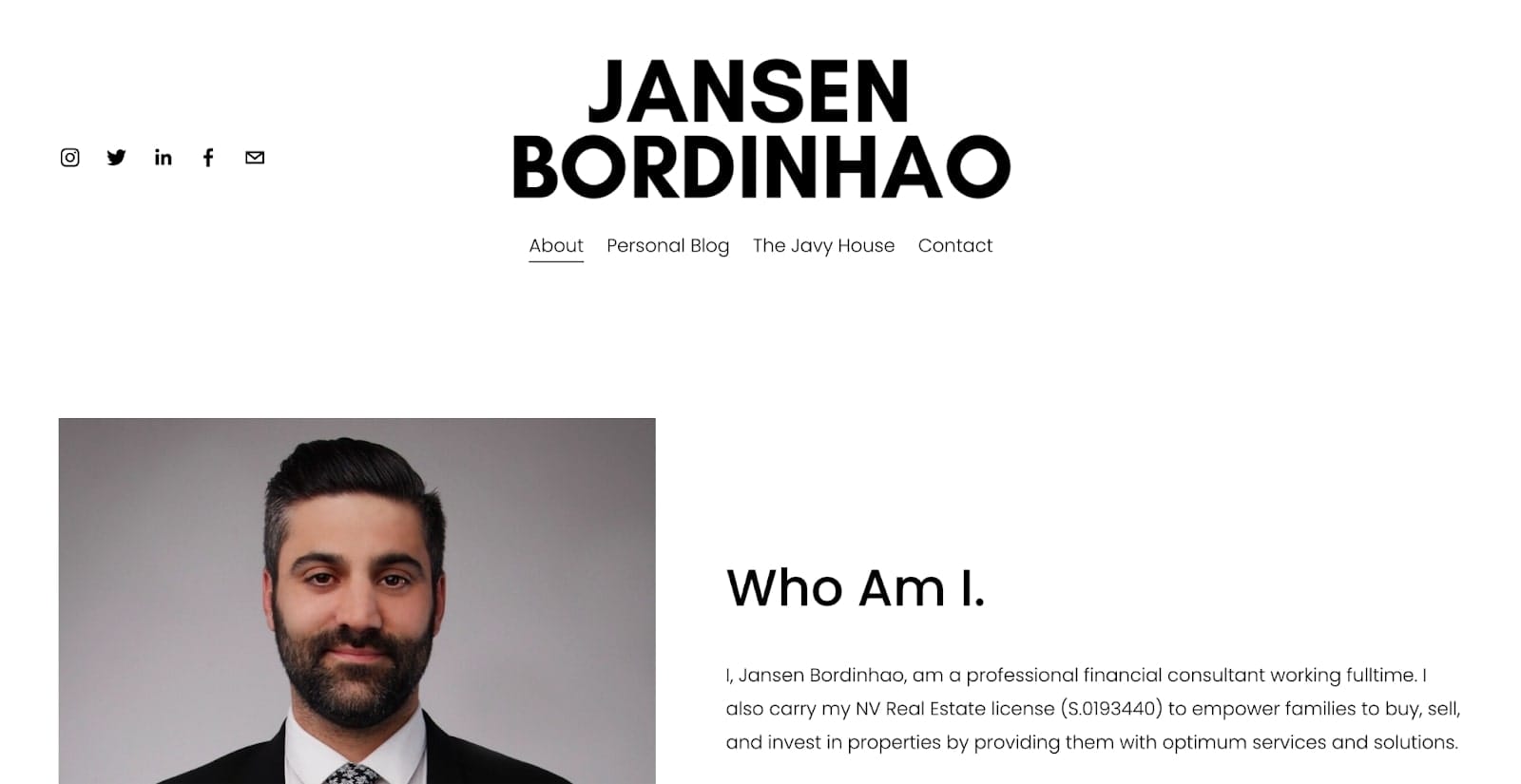
Jansen Bordinhao's site shows how simplicity can work for consultants' websites. Visiting JansenBordinhao.com introduces a clean interface highlighting his business and leadership expertise.
The sleek design smartly spotlights his core services upfront with a focused message. This quickly communicates offerings without overwhelming details. Lots of whitespace promotes readability and style, driving a polished look.
Navigation is straightforward for browsing the blog, social media profiles, contact page, and more. This ease of use helps visitors easily access what they need — critical for any business site.
A personal touch also makes Jansen's website distinct. The homepage section shares his journey and vision, establishing an audience connection. This rapport and trust are key, letting clients understand Jansen's motivations.
In summary, Jansen leverages minimalism and transparency effectively. The result is an approachable platform emphasizing his consulting abilities.
4. Jeremy Malcolm

- Website built with: WordPress
- Services offered: Trust & safety, compliance & law
Jeremy Malcolm's personal site uniquely captures his tech policy and digital rights expertise. His website translates his professional brand digitally with creative flair.
The modern homepage interface welcomes visitors with Jeremy's photo. This instantly makes the site relatable while projecting his smart persona. Such personal branding is key for consultants who rely on client relationships and trust.
Simple yet thorough navigation covers services, articles, contact, and more. Each part organizes content for easy access to Jeremy's extensive work and influence. This enables visitors to smoothly explore his accomplishments.
One asset is the site's abundant content. The articles flaunt Jeremy's academic and policy contributions — proving his leadership to prospective consulting clients. Showcasing these outcomes is an excellent tactic for consultants to demonstrate niche thought leadership.
Overall, Jeremy leverages great visuals and organization to feature a personalized portal full of industry insights. His website sets a standard for bringing consultant expertise online.
5. Kevin Indig
- Website built with: Wix
- Services offered: Growth & SEO
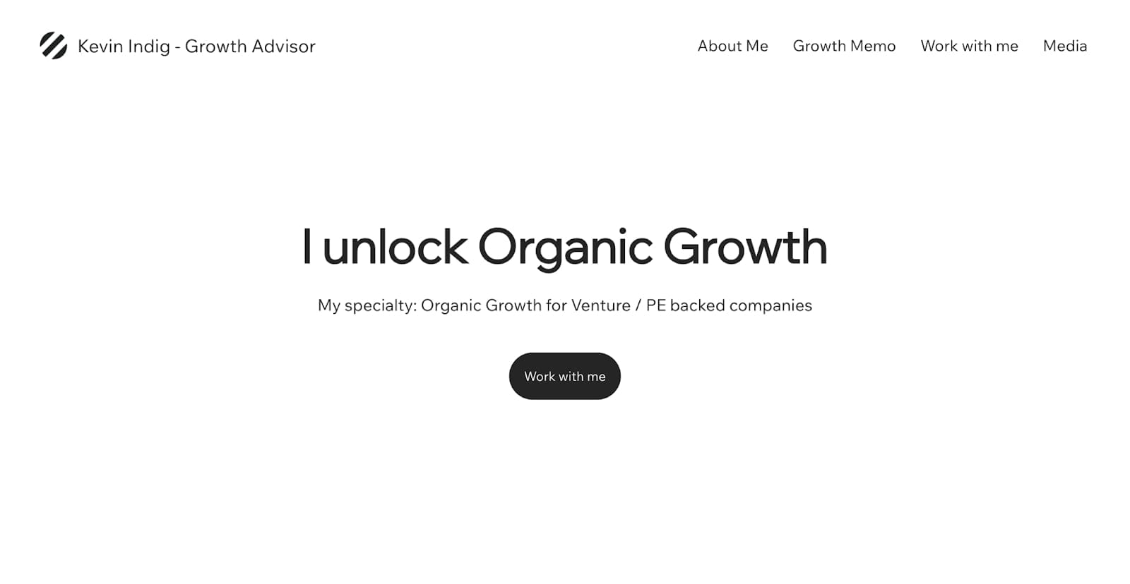
Kevin Indig's website excellently represents his SEO and digital marketing consultant skills. He merges industry knowledge with smooth design for an ideal user experience.
The clean, contemporary homepage immediately displays Kevin's strengths. It organizes his offerings, achievements, and background to instantly convey expertise — critical for consulting sites.
One major highlight is the content-rich Blog. Packed with in-depth articles, it reflects Kevin's thought leadership while serving as an SEO boost. This draws more organic traffic by providing value and rankings punch.
Overall, Kevin builds an accessible hub demonstrating his specialized talents. Leveraging great presentation and optimization, his website sets the standard for SEO consultant digital presences.
6. Timothy Financial
- Website built with: WordPress
- Services offered: Financial services
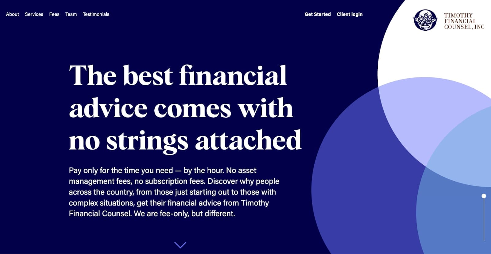
Timothy Financial Counsel excellently presents financial consulting services online. It has a professional and reliable vibe — just what financial firms should aim for.
The site welcomes visitors with a polished, easy-to-navigate interface. The homepage quickly communicates core values and offerings for instant understanding. Financial consulting clients want to quickly see expertise and dependability.
Visually, quality images and calm colors convey professionalism. This look matches the financial sector, where stability and trustworthiness are essential.
Another feature is the clear service outlines. Each listing provides enough details without overcomplicating with financial jargon. This keeps visitors engaged to learn offerings without losing interest.
Overall, Timothy Financial's website has an accessible design that markets services with care. The site sets the standard for showcasing financial advisory expertise digitally.
7. Olivine
- Website built with: Squarespace
- Services offered: Product marketing
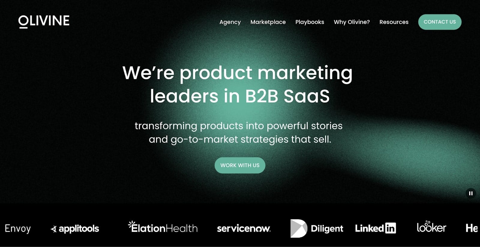
Olivine showcases a prime example of how a marketing consulting firm can effectively present itself online. The site demonstrates expertise while engaging visitors with visual appeal and interactivity.
Landing on the homepage, bold colors and graphics make a vibrant first impression. This creative energy suits marketing consulting, where innovation is key. Dynamic visuals grab potential clients seeking fresh ideas from consultants.
Site navigation is designed for ease of use so visitors can quickly find information. Menus lead to key sections like Agency, Playbooks, Why Olivine, and Contact. This convenience aids discovery of offerings without hassle — vital for consulting sites.
Overall, Olivine has an accessible website that emphasizes their talents. With compelling visuals and organization, they set the standard for showcasing marketing advisory abilities.
8. Josh Fechter

- Website built with: WordPress
- Services offered: Growth & marketing
Josh Fechter uniquely positions himself as a consulting brand online. His website design centers on highlighting his marketing and business growth authority to attract clients.
Visiting the clean, focused homepage directly spotlights accomplishments, offerings, and published works showcasing his expertise. Minimalist styling keeps attention on content emphasizing Josh's professional journey, skills, and services. This quickly conveys his value to potential clients.
Abundant blogs, guides, and books power the site's content plan. This establishes Josh as an industry resource while instantly providing visitor value. Testimonials and case studies also offer further proof to boost credibility.
Overall, Josh builds an authoritative site leveraging great visuals, content, and layout to feature his thought leadership talents prominently. The result is an engaging platform perfect for showcasing consultant skills.
9. Ninia Azzopardi

- Website built with: Webflow
- Services offered: Marketing services
Ninia Azzopardi is a marketing consultant with an absolutely stellar personal website. Its warm, engaging layout and clear service display make it very pleasing to scroll through — especially with the clever scroll animations. As a digital marketing pro, Ninia leverages her site design talents to create an accessible online space.
The website's simple yet intuitive structure helps visitors easily discover Ninia's background, offerings, and value proposition. The homepage efficiently showcases her digital marketing expertise alongside client reviews and work samples. This instantly communicates capabilities while also building visitor trust.
Overall, Ninia builds an approachable website that highlights her skills prominently. Her site sets the standard for creating an engaging platform to attract consulting clients.
10. Fidus Information Security

- Website built with: WordPress
- Services offered: Cyber security
Fidus Information Security is a fantastic example of a cybersecurity consulting website. The polished homepage instantly establishes a professional presence, which is key for an information security firm. It uses a sophisticated design and color palette that reflects technological skills. The orange tones align with themes of trust and security while giving off a clean corporate aesthetic.
The site's simple yet logical structure makes browsing straightforward. The main menu clearly leads visitors to key sections like Services, Industries, Company, and Contact. This organization makes sure clients can easily discover offerings and credentials. The Services section particularly impresses, explaining complicated cybersecurity solutions like penetration testing clearly and thoroughly.
Overall, Fidus Information Security builds an accessible website that convinces visitors of their skills while also driving organic traffic. Their platform sets the standard for cybersecurity consultants' online presence.
11. Adam Durrant
- Website built with: Custom JavaScript
- Services offered: SEO & web development
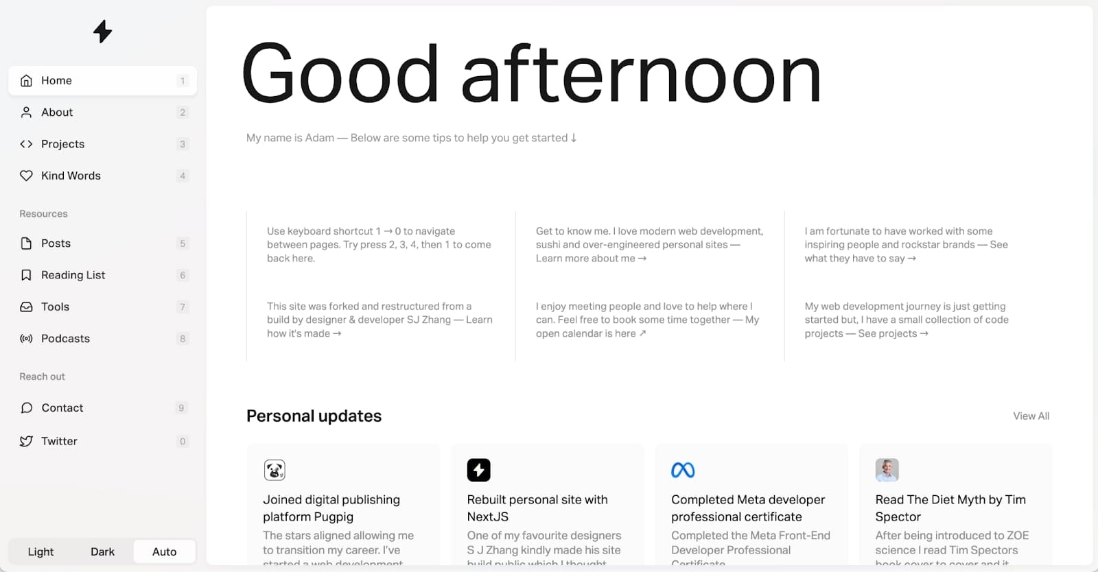
Adam Durrant's website is one of my favorites on this list. His talents in web development and SEO show perfectly on his site. The website balances professionalism and personal branding to reflect Adam's industry expertise.
The intuitive layout features a clear sidebar navigation with key sections like About, Projects, and testimonials (as Kind Words). The homepage efficiently introduces Adam's background, communicating his specializations so visitors understand his consulting value.
One big asset is the content and thought leadership focus. Adam's blog shares perspectives on digital and tech subjects, establishing him as an insider while engaging visitors. This dynamic, evergreen content builds clout and repeat traffic.
Additionally, posted client testimonials reinforce Adam's capabilities. By showing endorsements, the site convinces potential clients of Adam’s consulting impact.
Overall, Adam Durrant's website leverages great design, optimization, and content to showcase his web development consultant talents online effectively.
12. Brendan Hufford
- Website built with: WordPress
- Services offered: Saas SEO
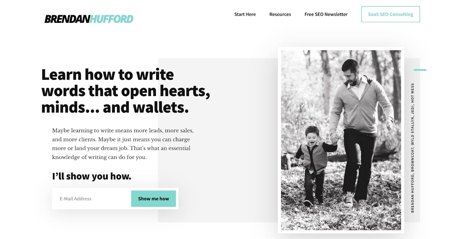
Brendan Hufford is an SEO consultant who primarily works with SaaS companies. His clean website design enables easy navigation so visitors can find what they need. Right on the homepage, Brendan shares his background, building an instant connection with visitors. This personal touch is key.
One major asset is the focus on educational content through the blog and resources section. By providing valuable SEO and marketing advice, Brendan proves his in-depth knowledge while establishing himself as an industry leader.
Overall, Brendan leverages great web design, valuable insights, and personal connections to present his consultant abilities genuinely. His website platform serves as a sterling model for showcasing specialized expertise.
13. Dara Denney
- Website built with: Squarespace
- Services offered: Ecommerce paid advertising
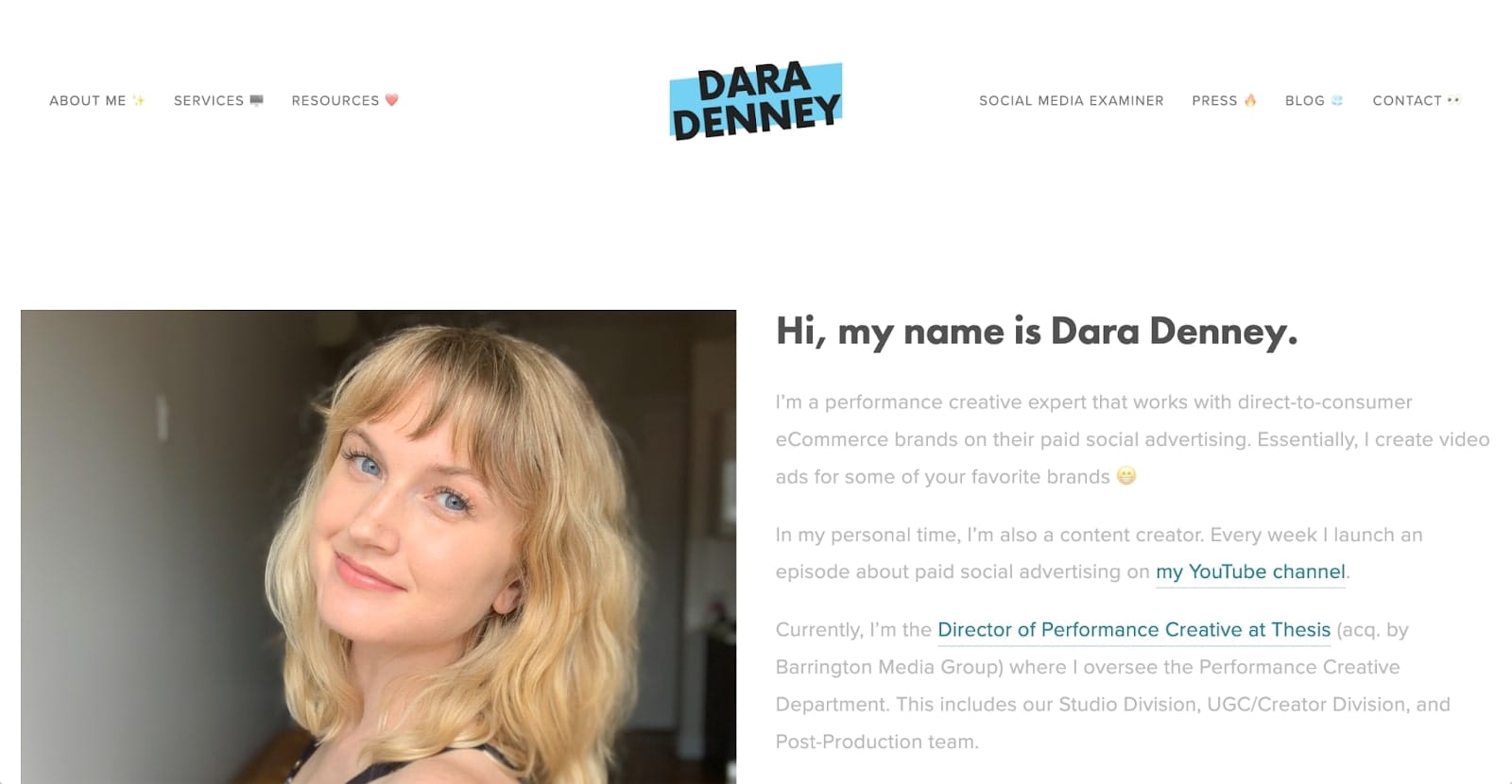
Dara Denney is a DTC ecommerce paid ads consultant with a simple but effective website. Visiting the site, Dara greets visitors with an upbeat logo and bold typography — conveying her focus on efficiency with a personal flair. This vibrant branding aligns with helping individuals and businesses streamline processes and maximize productivity.
The website is neatly organized for easy access to Dara's one-on-one consulting, workshops, resources, and other services. Descriptions clearly detail each offering so potential clients can understand the tailored solutions and benefits available. This transparency is key for setting expectations and attracting the ideal audience.
Overall, Dara Denney leverages an accessible, results-oriented website to genuinely communicate her passion for productivity optimization. Her website sets the standard for showcasing specialized advertising services.
What makes a good consulting website?
Creating a good consulting website goes beyond having just an online presence. It's about establishing your consulting company as a high-quality, professional entity that resonates with your target audience. Whether you're a small business or a larger firm, several key elements contribute to making your website both effective and engaging.
- Professional website aesthetics: The overall look and feel of your website play a critical role in first impressions. Modern design with a professional touch not only reflects the quality of your services but also reassures potential clients of your credibility. Ensure your website features a clean, user-friendly layout with an appealing header and design elements that align with your brand.
- High-quality copywriting: The power of words cannot be underestimated. Effective copywriting on your company website should clearly communicate who you are, what you do, and how you can help your clients. It should be concise yet compelling, guiding visitors through your site and encouraging them to take action.
- Strategic call-to-action: A well-placed call-to-action (CTA) is crucial for converting website visitors into potential leads. Whether it's to schedule a consultation, download a resource, or contact you for more information, your CTAs should be clear, persuasive, and easy to find.
- Responsive and user-friendly: Having a website that is responsive and easy to navigate on any device is non-negotiable. Your consulting website should offer a seamless experience, whether accessed from a desktop, tablet, or smartphone.
- Showcasing your services: Your consulting website design should effectively showcase the services you offer. This includes detailed descriptions of your services, how you work, and what clients can expect when they choose to work with you. Providing this clarity upfront can help set the right expectations and attract the right clientele.
- Displaying contact information: Make it easy for potential clients to reach you. Your contact information should be visible, ideally in the header or footer of every page, so visitors don't have to search for it.
- Incorporating design elements: The visual elements of your website, such as images, colors, and fonts, should complement your brand and message. These elements can help make your website more engaging and memorable.
- Leveraging website features: Integrate useful features like blogs, client testimonials, case studies, and a portfolio of your work. These features can provide valuable insights into your expertise and success stories, helping to build trust with potential clients.
In the end, a good consulting website is one that embodies the essence of your consulting company. It should be professional, informative, user-friendly, and reflective of the high-quality services you provide.
By paying attention to these key aspects, you can create a consulting website that not only looks great but also effectively communicates your value proposition and helps grow your business.
Supercharge your consulting business with Assembly
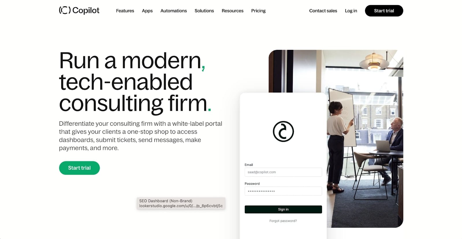
Consulting can be a highly competitive space, and staying ahead means leveraging the right tools. That's where Assembly comes in — offering a dynamic solution to elevate your consulting business to new heights.
Assembly's consulting client portal is designed to streamline your operations, providing an all-in-one platform for managing client interactions, documents, billing, and more. With this powerful tool, you can offer your clients a seamless, professional experience that aligns with your business's high standards.
Some features of Assembly include:
- Efficient client management: Assembly allows you to effortlessly keep track of client projects, ensuring that everything is on schedule and communication is clear and consistent.
- Secure file sharing and billing: Share important documents securely and manage billing with ease, saving time and reducing errors.
- Customized client portals: Tailor the client portal to reflect your brand, offering a personalized and engaging user experience.
- Automations and integrations: Assembly's automation capabilities help reduce repetitive tasks, allowing you to focus on what you do best. Plus, its integration features make sure that it works smoothly alongside other third-party tools you may already be using.
As you conclude your journey through creating an outstanding consulting website, remember that Assembly is more than just a tool — it's a partner in your success. By choosing Assembly, you're not just enhancing your online presence; you're also making a more streamlined, efficient, and client-focused business operation.
Ready to take your consulting business to the next level? Play around with the consulting demo portal and experience the difference it can make.

