
16 best dashboard software for small businesses in 2026
Find the best dashboard software for small businesses compared by price, features, and ease of use. I tested dozens of tools to find what's worth it in 2026.


The best dashboard software for small businesses pulls your sales, marketing, and operations data into one visual view, so you don't have to hop between 5 different tools to check on your numbers.
I researched and tested dozens of dashboard tools for this list, and honestly, most of them do the same handful of things with a different coat of paint. Here are the 16 best options for 2026, with pricing, standout features, and honest pros and cons for each.
16 best dashboard software for small businesses: TL;DR
- Data Studio: Best for small businesses already using Google Analytics and Sheets who want free reporting.
- Zoho Analytics: Best for small businesses already running on Zoho Books, Zoho CRM, or other Zoho apps.
- Power BI: Best for small businesses built around Microsoft 365 and Excel.
- Airtable: Best for small teams who want a flexible database and dashboard in one tool.
- Tableau: Best for small businesses that need more advanced, custom visualizations.
- Google Sheets: Best for small businesses that want a free, no-setup dashboard option.
- Excel: Best for small businesses that already track everything in spreadsheets.
- Zite: Best for small businesses that want a custom, branded dashboard built with AI.
- Klipfolio: Best for small businesses tracking marketing KPIs across several channels.
- Grafana: Best for small tech teams monitoring product or infrastructure metrics.
- Metabase: Best for small businesses with some technical skill who want a free, self-hosted option.
- Whatagraph: Best for small marketing teams and agencies reporting to clients.
- Domo: Best for growing small businesses that need enterprise-level reporting.
- Mixpanel: Best for small SaaS businesses tracking product usage and user behavior.
- Qlik Sense: Best for small businesses with complex data that need advanced analytics.
- Sisense: Best for small businesses that want to embed analytics into their own product.
How I researched and tested these dashboard tools
I built a sales pipeline view, a marketing funnel pulling from three platforms, and a bare-bones expense tracker to see how each tool handled setup and day-to-day use. Each build used sample data to reflect a task that a small business owner would need to track.
Here's what I looked at:
- Features: How well a tool turns raw data into a usable dashboard, including chart types, filters, and drill-down options.
- Usability: Whether someone without a data background can build a working dashboard without a lot of trial and error.
- Integrations: How easily a tool connects to common small business tools like QuickBooks, Google Analytics, and CRMs.
- Use Cases: How each tool performs for common small business needs like sales tracking, marketing reporting, or client reporting.
The tools with the most customization options were consistently the ones that took me longest to get a chart on screen.
16 best dashboard software for small businesses: quick comparison
| 💻 Tool | 🎯 Best for | 🔥 Starting price | ⚡ Strengths |
|---|---|---|---|
| Data Studio (Looker Studio) | Google Analytics users needing free reports | Free (Pro: $9/user/project/month) | Free, strong Google integrations, easy sharing |
| Zoho Analytics | Zoho ecosystem users | $24/month | Affordable, AI assistant, strong integrations |
| Microsoft Power BI | Teams using Microsoft 365 | $14/user/month | Strong modeling, wide connectors, enterprise security |
| Airtable | Flexible database + dashboard workflows | $20/seat/month | No-code database, automation builder, collaboration |
| Tableau | Advanced data visualizations | $75/user/month | Deep customization, powerful analytics, large ecosystem |
| Google Sheets | Simple, no-setup dashboards | Free | Familiar interface, easy sharing, zero cost |
| Microsoft Excel | Spreadsheet-based reporting | $179.99 one-time | Powerful pivot tables, offline access, widely used |
| Zite | AI-powered custom dashboards | $15/month | No-code AI builder, unlimited users, custom domains |
| Klipfolio | Marketing KPI tracking | $120/month | Real-time data, custom metrics, flexible dashboards |
| Grafana | Infrastructure and DevOps monitoring | $19/month + usage | Open source, real-time monitoring, strong ecosystem |
| Metabase | Self-hosted BI for technical teams | $1,080/year | Free self-hosted option, simple queries, open source |
| Whatagraph | Agency client reporting | $812/month | White-label reports, templates, automated delivery |
| Domo | Enterprise reporting | Usage-based | Many connectors, mobile dashboards, executive reporting |
| Mixpanel | SaaS product analytics | Custom pricing | Event tracking, funnels, retention analysis |
| Qlik Sense | Advanced data analytics | $300/month | AI insights, associative engine, enterprise scale |
| Sisense | Embedded analytics | Custom pricing | Embeddable dashboards, APIs, scalable architecture |
1. Data Studio: Best for Google Analytics users needing free reports
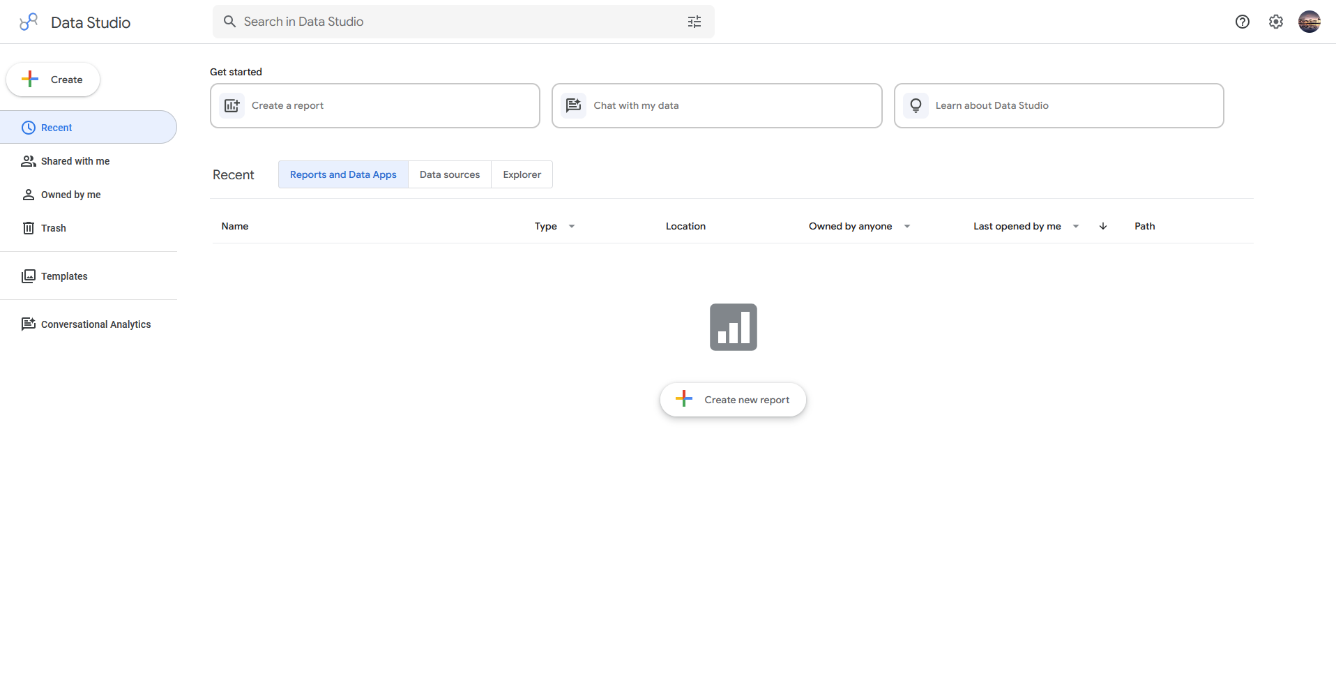
- What it does: Data Studio turns data from Google products and other connected sources into visual reports and dashboards you can share with a link.
- Best for: Small businesses that already track traffic and ad performance through Google Analytics or Google Ads.
I connected a sample Google Analytics account to test the setup for a non-technical user. The native connector pulled in traffic sources, conversions, and channel breakdowns from a ready-made template, and adding a Sheets tab for revenue took one extra step. Once I blended 3 sources onto a single page, the report loaded noticeably slower.
Key features
- Data blending: Combine data from multiple connected sources, like Analytics and Sheets, into a single chart or table.
- Prebuilt templates: Start from a report template built for Google Analytics, Google Ads, or Search Console, skipping the blank page most tools start you with.
- Shareable links: Send a report through a link with view or edit permissions, similar to sharing a Google Doc.
Pros and cons
| ✅ Pros | ❌ Cons |
|---|---|
| Free to use with no per-user cost | Reports with blended data sources can load slowly |
| Strong native integration with Google Analytics and Google Ads | Limited chart customization compared to advanced BI tools |
| Reports update automatically with real-time data changes | Limited advanced data modeling capabilities |
What users say
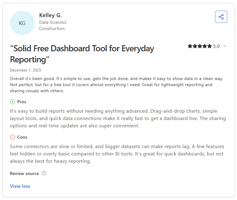
Pro: “It’s easy to build reports without needing anything advanced. Drag-and-drop charts, simple layout tools, and quick data connections make it really fast to get a dashboard live.” - Kelley G., Capterra
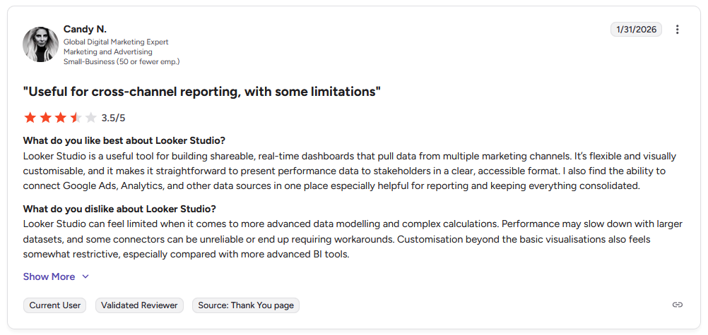
Con: “[Data] Studio can feel limited when it comes to more advanced data modeling and complex calculations. Performance may slow down with larger datasets, and some connectors can be unreliable or end up requiring workarounds.” - Candy N., G2
Pricing
Data Studio is free to use, with a Pro plan available at $9 per user, per project, per month, billed monthly.
Bottom line
Data Studio's biggest advantage is how naturally it fits into a workflow already built around Google Analytics and Ads, since there's no separate connector to configure. If you need more advanced customization for non-Google data sources, Tableau might be a better fit.
2. Zoho Analytics: Best for Zoho ecosystem users
- What it does: Zoho Analytics pulls data from your business tools into dashboards and reports, with a built-in AI assistant to help build them.
- Best for: Small businesses already running on Zoho Books, Zoho CRM, or other apps in the Zoho suite.
Since Zoho Analytics is built for the Zoho ecosystem, I connected a sample Zoho Books account to test how much its AI assistant, Zia, could handle. Asking it everyday questions about revenue and invoices returned working charts without a query builder. Anything outside standard chart types needed a manual pass through the report builder.
Key features
- Zia AI assistant: Ask questions in plain language and get back a chart or summary pulled from your connected data.
- Native Zoho integrations: Connect directly to Zoho Books, Zoho CRM, and other Zoho apps without a separate connector setup.
- Custom report builder: Build reports and dashboards manually using drag-and-drop tables, charts, and filters.
Pros and cons
| ✅ Pros | ❌ Cons |
|---|---|
| Built-in AI assistant reduces the need for manual reporting setup | Advanced customization often still requires manual report building |
| Seamless integration across the Zoho ecosystem | Interface can feel unintuitive for first-time users |
| Flexible report builder covers most advanced use cases | Performance may slow with large or complex datasets |
What users say
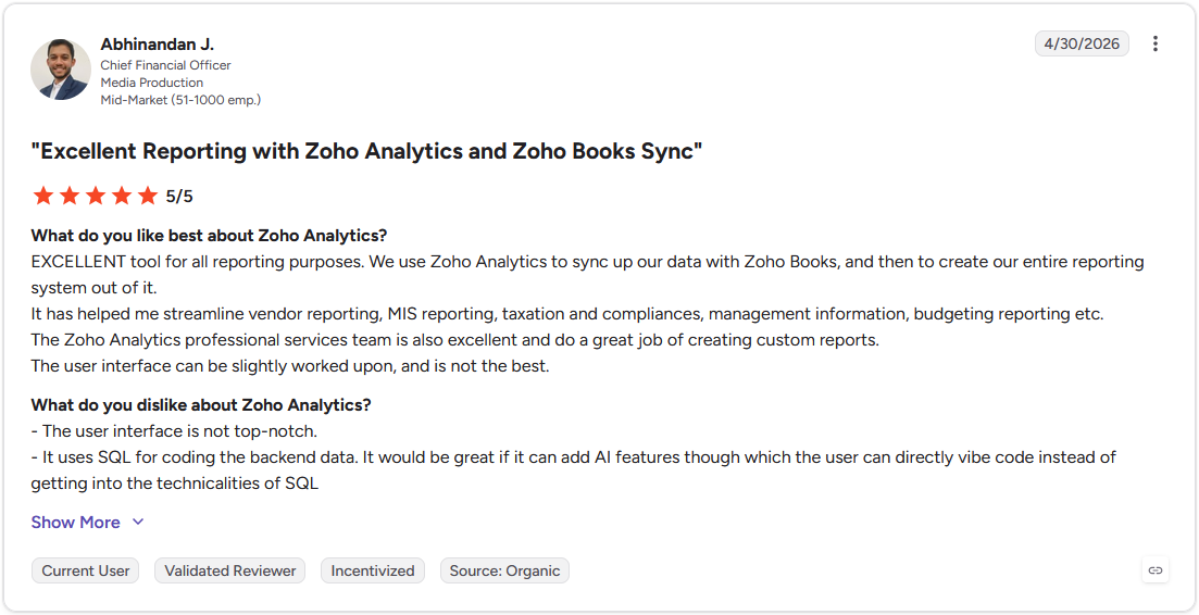
Pro: "Excellent tool for all reporting purposes. We use Zoho Analytics to sync up our data with Zoho Books, and then to create our entire reporting system out of it." - Abhinandan J., G2
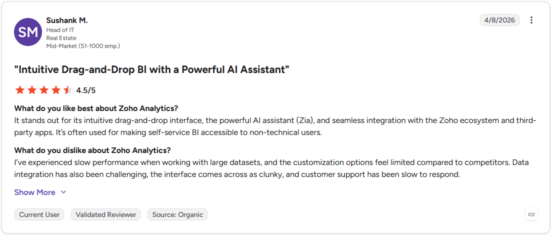
Con: "I've experienced slow performance when working with large datasets, and the customization options feel limited compared to competitors. Data integration has also been challenging, the interface comes across as clunky, and customer support has been slow to respond." - Sushank M., G2
Pricing
Zoho Analytics starts at $24 per month.
Bottom line
Zoho Analytics earns its spot mainly for businesses already inside the Zoho ecosystem, where the native integrations skip a setup step that other tools require. If your business runs on Microsoft tools instead, Power BI could be worth a look.
3. Power BI: Best for teams using Microsoft 365
- What it does: Power BI connects to your business data and turns it into interactive reports and dashboards built on Microsoft's data modeling tools.
- Best for: Small businesses already running day-to-day operations through Excel, SharePoint, or other Microsoft 365 apps.
I connected a sample Excel workbook to test how Power BI handled relationships between sales and expense tables. The relationship view let me link tables by customer ID without a formula, and the dashboard updated both together when I changed a filter. Learning DAX, the formula language for custom calculations, took me longer than building the dashboard itself.
Key features
- Data modeling engine: Build relationships between multiple tables so filters and calculations apply consistently across your data.
- DAX formulas: Write custom calculations and measures using Microsoft's formula language for more advanced reporting needs.
- Wide connector library: Connect to hundreds of data sources, including Excel, SQL databases, and cloud services like Salesforce.
Pros and cons
| ✅ Pros | ❌ Cons |
|---|---|
| Strong data modeling handles relationships without manual formulas | DAX has a steep learning curve for new users |
| Wide connector library covers most business data sources | Interface can feel overwhelming for first-time dashboard builders |
| Tight integration with Excel and Microsoft 365 tools | Performance can slow with very large or complex datasets |
What users say
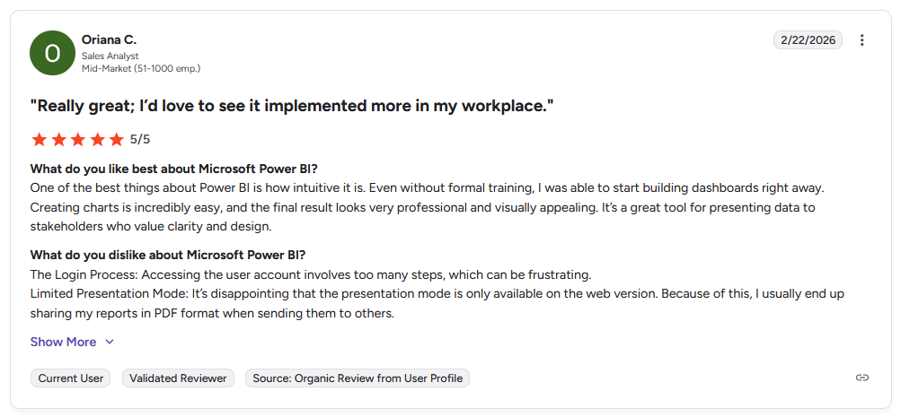
Pro: “One of the best things about Power BI is how intuitive it is. Even without formal training, I was able to start building dashboards right away.” - Oriana C., G2
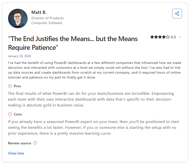
Con: “If you already have a seasoned [Power BI] expert on your team, then you’ll be positioned to start seeing the benefits a lot faster. However, if you or someone else is starting the setup with no prior experience, there is a pretty massive learning curve.” - Matt B., Capterra
Pricing
Power BI starts at $14 per user per month.
Bottom line
Power BI's real strength is the data modeling underneath it, which handles relationships between tables that would otherwise need manual formulas elsewhere. Airtable is worth a look if you want something more flexible for teams without a dedicated data person.
4. Airtable: Best for teams needing a flexible database and dashboard combo
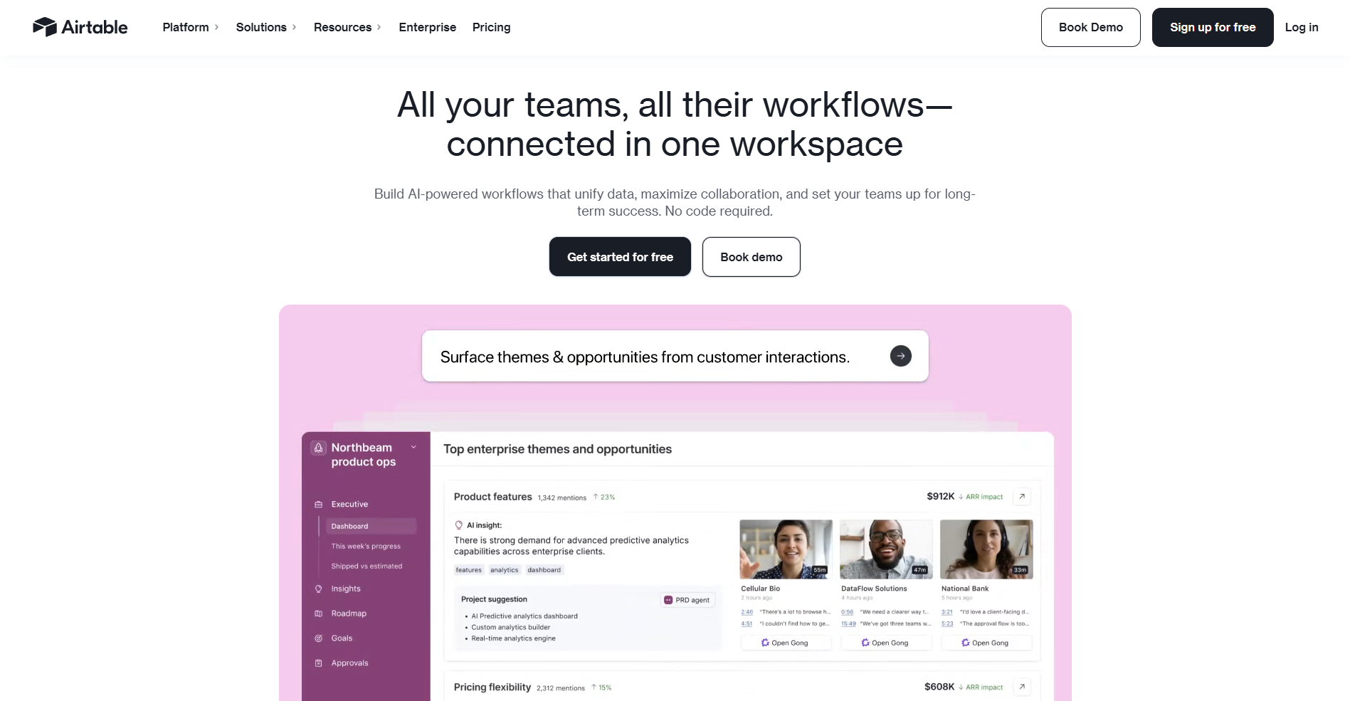
- What it does: Airtable combines a spreadsheet-style database with dashboard views, so you can organize records and visualize them in the same tool.
- Best for: Small teams that want to build custom workflows around their data without writing code.
Airtable is the odd one out here since tools like Zite build dashboards on top of it, but it also works standalone. I built a client project tracker to test the linked records feature, and linking a projects table to a clients table meant I never had to re-enter client details by hand. Adding a third table for invoices meant rebuilding half my links so invoices could pull from both tables.
Key features
- Linked records: Connect rows across separate tables so related data stays in sync without manual entry.
- Multiple views: Switch between grid, kanban, calendar, and gallery views of the same underlying data.
- Automation builder: Set up no-code automations that trigger actions like notifications or record updates based on changes in your data.
Pros and cons
| ✅ Pros | ❌ Cons |
|---|---|
| Linked records reduce duplicate data across tables | Managing relationships across multiple tables requires planning |
| Multiple views make the same data usable across workflows | Per-seat pricing becomes expensive as teams scale |
| No-code automation builder handles repetitive tasks | Performance can slow with very large or complex bases |
What users say
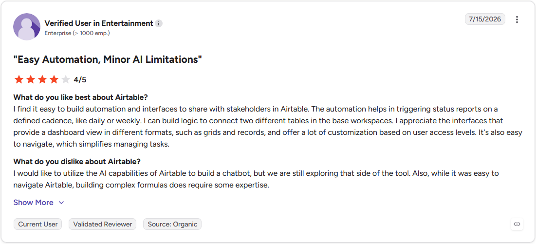
Pro: "I find it easy to build automation and interfaces to share with stakeholders in Airtable. The automation helps in triggering status reports on a defined cadence, like daily or weekly." - Verified User in Entertainment, G2
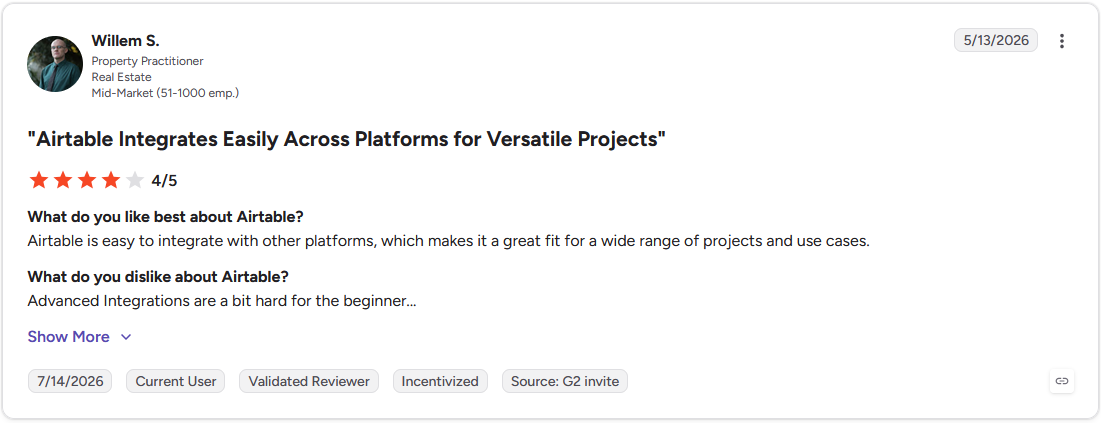
Con: "Advanced Integrations are a bit hard for the beginner…" - Willem S., G2
Pricing
Airtable starts at $20 per seat per month.
Bottom line
Airtable's linked records make it useful as a lightweight database on top of a dashboard tool, which matters if you're tracking relationships between clients, projects, and invoices. If you'd rather build reports around data you already keep in Zoho apps, Zoho Analytics is worth a look.
5. Tableau: Best for advanced, custom visualizations
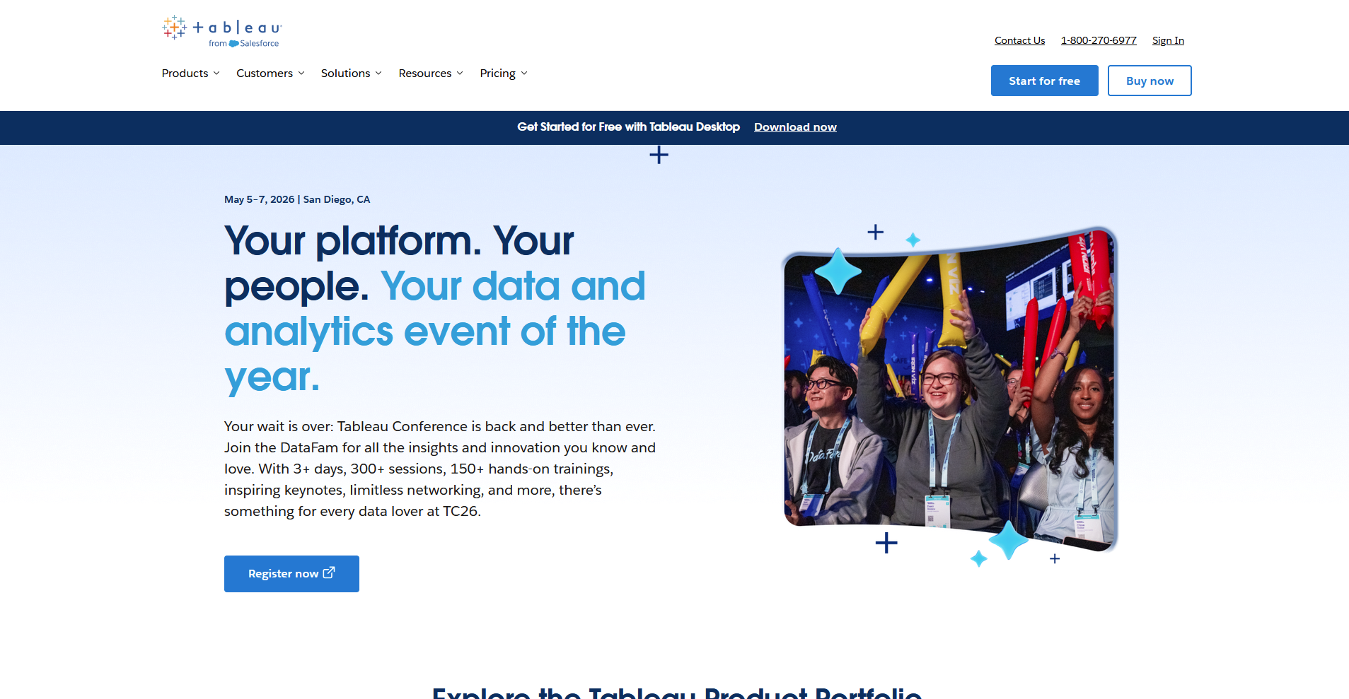
- What it does: Tableau turns data from multiple sources into interactive, highly customizable visualizations and dashboards.
- Best for: Small businesses with complex data that needs more visual flexibility than standard chart types allow.
I built a sales dashboard combining a regional map with a trend line panel to test Tableau's customization. The drag-and-drop canvas placed both on one screen without plugins, and I could adjust each element's colors, fonts, and size independently. Getting them to filter together took a few attempts, since each panel needed its own filter action set up separately.
Key features
- Custom visualizations: Build specific chart types and layouts beyond the standard templates most dashboard tools offer.
- Live and extract connections: Connect directly to a live database, or import a data extract for faster performance.
- Interactive filtering: Link charts together so clicking one visual updates related charts across the same dashboard.
Pros and cons
| ✅ Pros | ❌ Cons |
|---|---|
| Advanced visualization options go beyond standard dashboards | Building complex visuals takes more time than template-based tools |
| Interactive filters support deep data exploration | Steeper learning curve for new users |
| Wide connector library supports common cloud and database sources | Higher pricing compared to many alternatives |
What users say
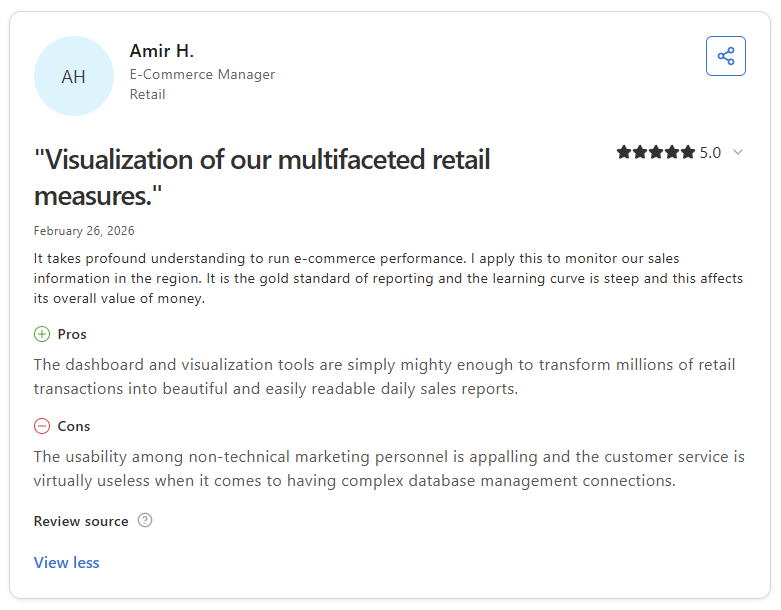
Pro: “The dashboard and visualization tools are simply mighty enough to transform millions of retail transactions into beautiful and easily readable daily sales reports.” - Amir H., Capterra
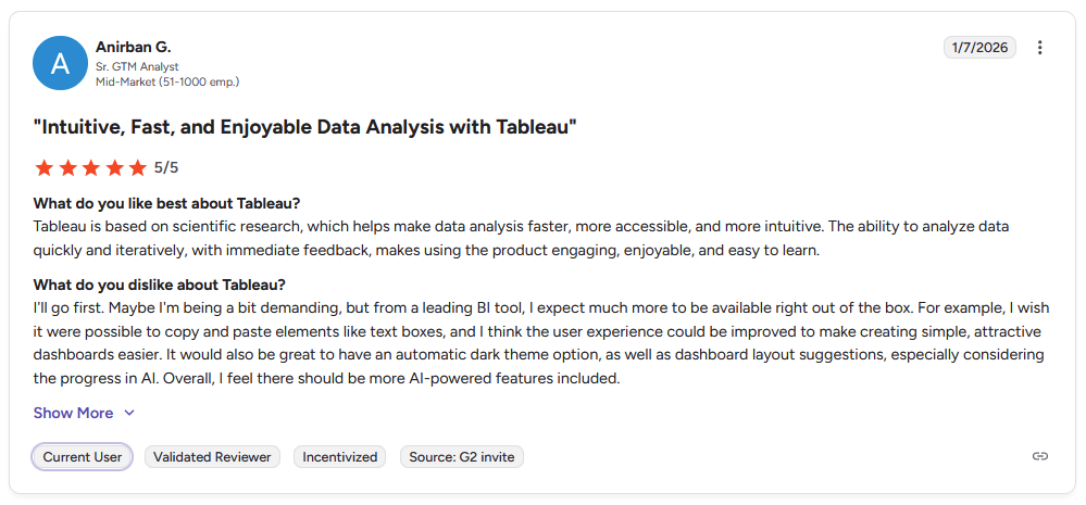
Con: “I wish it were possible to copy and paste elements like text boxes, and I think the user experience could be improved to make creating simple, attractive dashboards easier. … Overall, I feel there should be more AI-powered features included.” - Anirban G., G2
Pricing
Tableau starts at $75 per user per month for a Creator license.
Bottom line
Tableau's value shows up once you need to combine several data sources into one interactive view instead of a single straightforward chart. If you want something simpler to set up out of the box, Data Studio could make more sense.
Special mentions
These tools didn't make the main list, but each one fits a specific setup depending on your needs.
Here are 11 more tools worth a look:
- Google Sheets: A free spreadsheet tool that many small businesses already use for tracking. I built a sales tracker with pivot tables and simple charts, and the formulas handled weekly totals without any hiccups. The dashboard only refreshes when you (or a script) tell it to, so the numbers are only as current as your last edit.
- Microsoft Excel: The spreadsheet software most accountants and bookkeepers already know. I built a monthly expense dashboard using pivot tables, and the built-in charts covered the visuals without an add-in. The one snag came when 2 people edited the same file at once, creating version conflicts that a browser-based tool would avoid.
- Zite: This AI app builder turns a written prompt into a working dashboard, database included. Describing a client reporting app got me a working version in under an hour. Alerts tied to 2 metrics at once was a different story, and needed some manual cleanup to get right.
- Klipfolio: A dashboard tool built for marketing teams tracking KPIs across several channels. After I connected 3 ad accounts, the custom metric builder let me blend numbers across sources into a single view. Getting those formulas right takes some trial and error if you're not used to working with raw data fields.
- Grafana: Developers watching servers and apps in real-time built this open-source monitoring tool with their own needs in mind. My uptime and response-time dashboard refreshed fast enough to catch issues as they happened. The query language assumes an engineering background, so a non-technical teammate may find it unfamiliar territory.
- Metabase: An open source BI tool that a technical team can host and run without licensing costs. I used the visual query builder to put together my sales dashboard without writing SQL for most of it. Chart styling options are basic here, so dashboards tend to look more functional than polished.
- Whatagraph: This reporting tool is built for agencies sending client-facing updates on a regular schedule, so I tested it with that in mind. White-label templates saved a good chunk of design time on my campaign report. Anything outside advertising and social data starts to feel like a workaround, since the tool leans hard toward marketing metrics.
- Domo: A reporting tool for growing businesses that want executive-level dashboards with a mobile app attached. I blended revenue and inventory data, and the drag-and-drop card builder made it easy to reshape views for different stakeholders. Those same cards lost detail on the mobile screen.
- Mixpanel: A product analytics tool built for SaaS businesses that want to see how people use their app beyond basic traffic numbers. Tracking signups through a mock onboarding flow made the drop-off reporting easy to read at a glance. Without an app or software product to track, a business may not get much use out of it.
- Qlik Sense: This platform uses an associative data engine, so you can click through connections in your data without following a fixed path. Spotting relationships between regions and products in my sample dashboard was easy with the associative search, but some AI-assisted insights read more like suggestions than finished answers.
- Sisense: An analytics platform built for embedding dashboards directly inside your own product or client portal. My prototype embed rendered cleanly inside a mock web page connected to sample data. Keep in mind this is built for teams shipping analytics as a feature, which may be more than a business needs for its own internal dashboard.
Which dashboard software should you choose?
The right dashboard tool depends on what you're already using and how much setup time you have to spare.
Choose Data Studio if you:
- Already run ads or track traffic through Google Analytics
- Want a free tool with no per-user cost
- Need to share reports with clients or stakeholders through a simple link
Choose Zoho Analytics if you:
- Already use Zoho Books, Zoho CRM, or other Zoho apps
- Want built-in AI assistance for building reports
- Need a lower-cost option that still covers a wide range of integrations
Choose Power BI if you:
- Run your business on Microsoft 365 and Excel
- Need strong data modeling for more complex reporting
- Want enterprise-grade security as your data needs grow
Choose Airtable if you:
- Want a flexible database and dashboard combined in one tool
- Need to build custom workflows without writing code
- Are a small team without a dedicated data person
Choose Tableau if you:
- Need advanced, highly customized visualizations
- Want access to a large library of templates to start from
- Have complex data that basic dashboard tools can't handle well
Skip this category entirely if you:
- Only need to track a handful of numbers and a spreadsheet already does the job
- Want a tool built specifically for one function, like ad reporting or product analytics over general dashboards
- Don't have any data sources set up yet and need to get your systems in order first
Final verdict
Data Studio, Power BI, and the other tools on this list are strong picks if the goal is building and reading your own numbers internally. But once you're handing dashboards off to clients, most of these tools stop at the dashboard itself. They don't do anything for how your client sees it, logs in, or connects it to everything else you send them.
Assembly is built to close that gap: a branded space your clients log into to see the dashboards you've already built, alongside everything else they need from you.
Here’s how Assembly can help:
- Embed the dashboards you've already built: Assembly lets you drop in dashboards from Data Studio, Power BI, or any tool that supports embedding, so clients see live data without a separate login for each tool.
- Give clients one branded place to check in: Clients log in to a single space that reflects your brand, where their dashboard sits alongside their files, invoices, and project updates.
- Protect client data: Assembly maintains SOC 2 Type II compliance and supports GDPR, CCPA, and HIPAA requirements, so the data sitting inside those embedded dashboards stays secured.
If you're tired of your dashboards living in a tool your clients need a separate login for, get early access today.
Frequently asked questions
What is the best dashboard software for small businesses?
Some of the best dashboard software for small businesses include Data Studio and Zoho Analytics. Data Studio works well for free reporting, while Zoho Analytics fits businesses already using other Zoho apps. The right fit depends on what tools you already use and how much setup time you have.
What should you look for in dashboard software?
Look for data source integrations, ease of setup, and pricing that fits your budget as you scale. A good dashboard tool should connect to the software you already use, like your CRM or accounting platform, without heavy manual work. Customization options matter too, since a dashboard that's hard to adjust becomes hard to maintain.
What is the difference between a dashboard and a report?
A dashboard displays live, ongoing data in a single visual view, while a report is a static summary built for a specific point in time. Dashboards update automatically as new data comes in, so you're always looking at current numbers. Reports are often exported or shared as a fixed snapshot, useful for reviewing a specific period, like a month or quarter.