
9 best custom dashboard software tools tested & reviewed [2026]
Custom dashboard software pulls your data into one view built around your own metrics. I tested dozens, and here are the 9 best tools worth your time in 2026.

![9 best custom dashboard software tools tested & reviewed [2026]](https://storage.ghost.io/c/6f/87/6f878703-0e71-4ebd-8755-324628c2c39c/content/images/size/w2000/2026/08/wmremove-transformed--2-.jpeg)
Most dashboards get built once, then ignored. Custom dashboard software is supposed to fix that by putting your own metrics front and center, but the tools that promise this vary a lot in how well they actually deliver.
I connected data sources to every platform on this list, built dashboards from scratch where I could, and timed how long it took to get from login to something usable. Here are the 9 tools that held up, and which one fits your setup.
9 best custom dashboard software: TL;DR
- Domo: Best for enterprise teams that want data integration, dashboards, and AI insights in one platform.
- Microsoft Power BI: Best for teams already working inside Microsoft 365 and Azure.
- Tableau: Best for data analysts who need deep visualization control and complex data blending.
- Data Studio (formerly Looker Studio): Best for teams in the Google ecosystem that want a free reporting option.
- Klipfolio: Best for agencies that need fully branded dashboards for clients.
- Databox: Best for marketing and sales teams tracking KPIs across ad platforms and CRMs.
- Zoho Analytics: Best for small and midsize businesses already using Zoho apps.
- Metabase: Best for technical teams with existing databases that want a self-hosted option.
- Grafana: Best for DevOps and IT teams monitoring servers and infrastructure.
How I researched and tested these custom dashboard software tools
I tested every tool on this list by connecting data sources, building a dashboard from scratch, and clicking through every settings tab I could find. For tools I couldn't access directly, I worked through demos and documentation instead.
Here’s what I considered:
- Data connections: Native connections to your CRM, ad platforms, and spreadsheets save you a setup step every time you add a new source. Without them, you're stitching together a third-party sync just to get the same data on your screen.
- Setup time: I timed how long it took to go from login to a dashboard running my own data. Many demos load sample data by default, so I wanted to see the setup process without that shortcut.
- Customization: I checked how much control I got over layout, chart types, and calculated fields. I also looked into whether the finished dashboard could carry my own branding, or if the vendor's logo would be stuck on it no matter what.
- Ease of use: A few of these tools hand every change to a developer. The rest let anyone drag, drop, and publish without waiting on IT. I wanted that distinction spelled out clearly for each pick.
Most of these tools look similar at first glance. The differences I noticed only appeared after I added a second data source or tried to adjust permissions.
9 best custom dashboard software: at a glance
| 💻 Tool | 🎯 Best for | 🔥 Starting price (billed annually) | ⚡ Strengths |
|---|---|---|---|
| Domo | Enterprise teams needing full data governance | Usage-based pricing | 1,000+ connectors, natural language queries, strong governance |
| Microsoft Power BI | Teams using Microsoft 365 and Azure | $14/user/month | Deep Microsoft integration, low cost, large template marketplace |
| Tableau | Analysts building advanced visualizations | $75/user/month | Advanced charts, strong data blending, extensive learning resources |
| Data Studio (Looker Studio) | Free reporting in the Google ecosystem | Free | Free to use, native Google integrations, real-time collaboration |
| Klipfolio | Agencies building branded client dashboards | $120/month | Custom branding, flexible layouts, client portal support |
| Databox | Marketing and sales KPI tracking | $64/month | Fast setup, mobile app, pre-built marketing integrations |
| Zoho Analytics | Zoho users on a budget | $24/month | Affordable, Zia AI assistant, pre-built Zoho reports |
| Metabase | Technical teams with existing databases | $1080/year (5 users) | Free self-hosted option, SQL mode, embeddable dashboards |
| Grafana | DevOps and infrastructure monitoring | $19/month + usage | Open source core, real-time data, large plugin ecosystem |
1. Domo: Best for enterprise teams needing full data governance
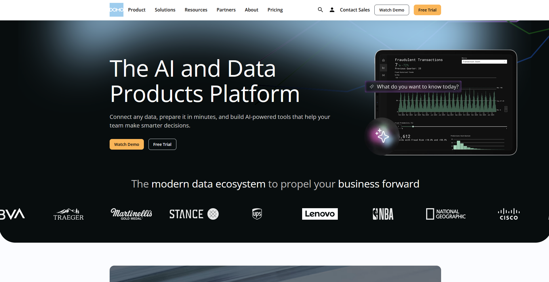
- What it does: Domo is a business intelligence platform that connects to over 1,000 data sources and turns that data into dashboards, alerts, and governed reports across an organization.
- Best for: Enterprise teams that need centralized data governance across departments and business units.
I connected a sample dataset across three data sources to see how far Domo's row-level permissions go.
After setting access rules for a specific department, I logged in as an outside user and pulled the same report. The restricted rows didn't appear at all, confirming that the permissions held even with access to the underlying dataset.
The natural language search struggled with that same layered setup, returning the wrong chart until I simplified my question.
Key features
- Natural language queries: Type a question in plain English, and Domo returns a chart or summary pulled from your connected data sources.
- Governance controls: Set data access permissions at the user, group, or row level across the organization.
- App marketplace and connectors: Connect to over 1,000 data sources and apps through Domo's pre-built integration library.
Domo pros and cons
What users say
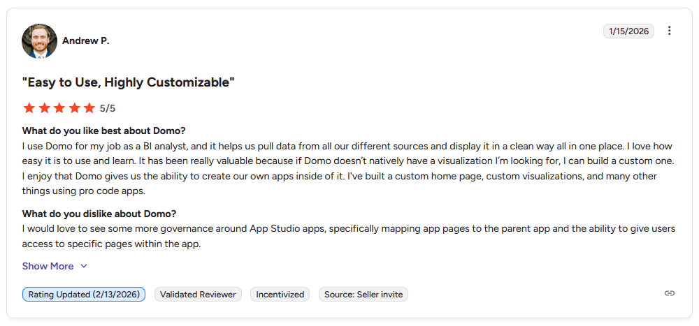
Pro: “I use Domo for my job as a BI analyst, and it helps us pull data from all our different sources and display it in a clean way, all in one place. If Domo doesn't natively have a visualization I'm looking for, I can build a custom one. I enjoy that Domo gives us the ability to create our own apps inside of it.” - Andrew P., G2
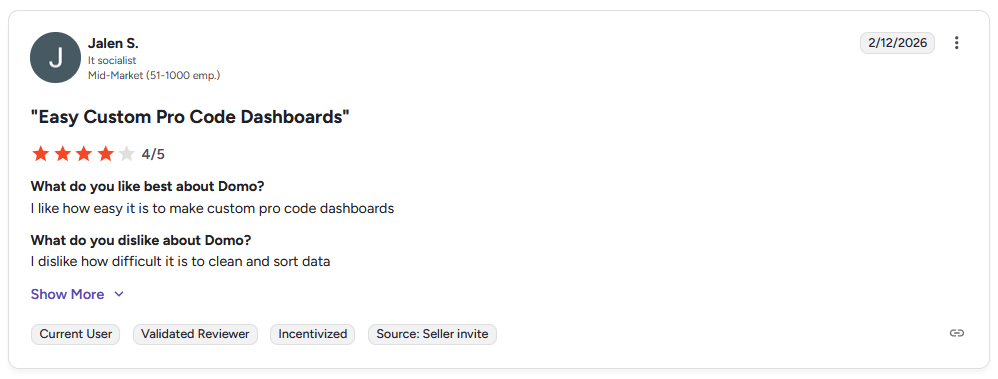
Con: “I dislike how difficult it is to clean and sort data.” - Jalen S., G2
Pricing
Domo uses usage-based pricing.
Bottom line
Domo's strength shows up in how it handles permissions across large datasets shared by multiple departments. If your team is smaller and doesn't need that level of access control, Data Studio could be worth a look.
2. Microsoft Power BI: Best for teams already working in Microsoft 365 and Azure
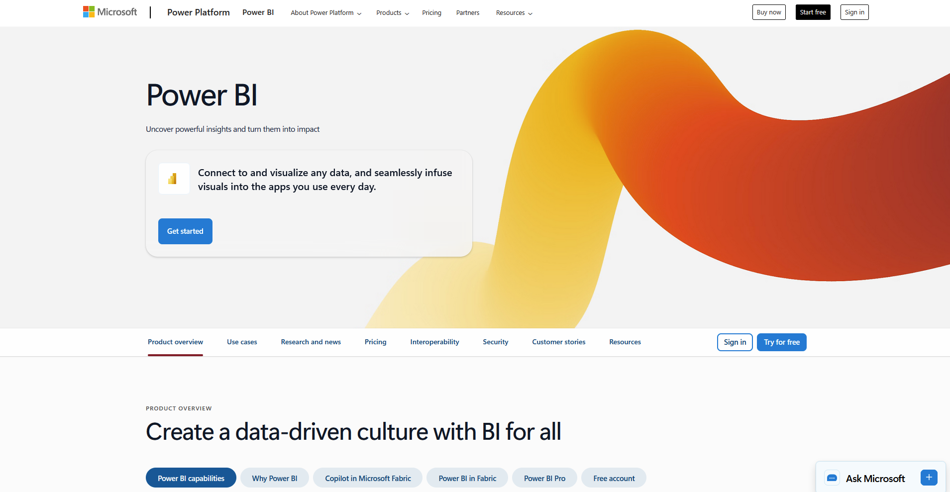
- What it does: Microsoft Power BI is a business intelligence tool that turns data from Excel, Azure, and other Microsoft sources into interactive reports and dashboards.
- Best for: Teams already working inside Microsoft 365 and Azure who want reporting tools built into that same environment.
I built a report using an Excel file and an Azure data source to see how well Power BI handles data already in Microsoft's ecosystem.
Both sources synced without a separate connector, and refreshing my sample report pulled updated Azure numbers within minutes. That kind of native handoff matters if your team already stores data across Microsoft products.
Sourcing data from outside that ecosystem takes more setup, since those connections often need a gateway to work reliably.
Key features
- Native Microsoft integration: Pull data directly from Excel, Azure, Dynamics 365, and other Microsoft products without third-party connectors.
- Template marketplace: Choose from a library of pre-built report templates for common business use cases.
- Custom visuals: Add visuals built by Microsoft or outside developers beyond the default chart types.
Pros and cons
What users say
Pro: “One of the best things about Power BI is how intuitive it is. Even without formal training, I was able to start building dashboards right away.” - Oriana C., G2
Con: “If you already have a seasoned [Power BI] expert on your team, then you’ll be positioned to start seeing the benefits a lot faster. However, if you or someone else is starting the setup with no prior experience, there is a pretty massive learning curve.” - Matt B., Capterra
Pricing
Microsoft Power BI starts at $14 per user per month.
Bottom line
Power BI's biggest advantage comes from how much of your existing Microsoft data it can read without additional setup. If most of your data lives outside Microsoft's ecosystem, Domo might be a better fit.
3. Tableau: Best for analysts building complex visualizations
- What it does: Tableau is a data visualization tool that turns raw data into interactive charts and dashboards, with a focus on advanced chart types and data blending.
- Best for: Analysts building complex visualizations that need more chart flexibility than standard reporting tools offer.
Tableau's reputation as one of the more advanced visualization tools made me want to test how far its chart library stretches.
I built a dashboard from a sample sales dataset and tried moving past a standard bar chart to see what else was available. Tableau offered a geographic map and a statistical distribution chart for the same data, showing patterns a basic chart might have missed otherwise.
Formatting a new dashboard to look polished took me longer, since many of the advanced chart types need manual adjustment to read clearly.
Key features
- Advanced chart types: Build visualizations beyond standard bar and line charts, including maps, statistical plots, and custom chart types.
- Data blending: Combine data from multiple sources into a single view without needing to merge the underlying datasets first.
- Learning resource library: Access Tableau's training materials and community resources for building more advanced dashboards.
Pros and cons
What users say
Pro: “The dashboard and visualization tools are simply mighty enough to transform millions of retail transactions into beautiful and easily readable daily sales reports.” - Amir H., Capterra
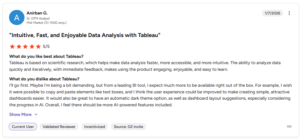
Con: “I wish it were possible to copy and paste elements like text boxes, and I think the user experience could be improved to make creating simple, attractive dashboards easier. … Overall, I feel there should be more AI-powered features included.” - Anirban G., G2
Pricing
Tableau starts at $75 per user per month for a Creator license.
Bottom line
Tableau's advantage comes from the depth of its chart library rather than how quickly you can get a dashboard running. If you want a faster setup with less of a learning curve, Microsoft Power BI might be a better choice.
4. Data Studio: Best for free reporting in the Google ecosystem
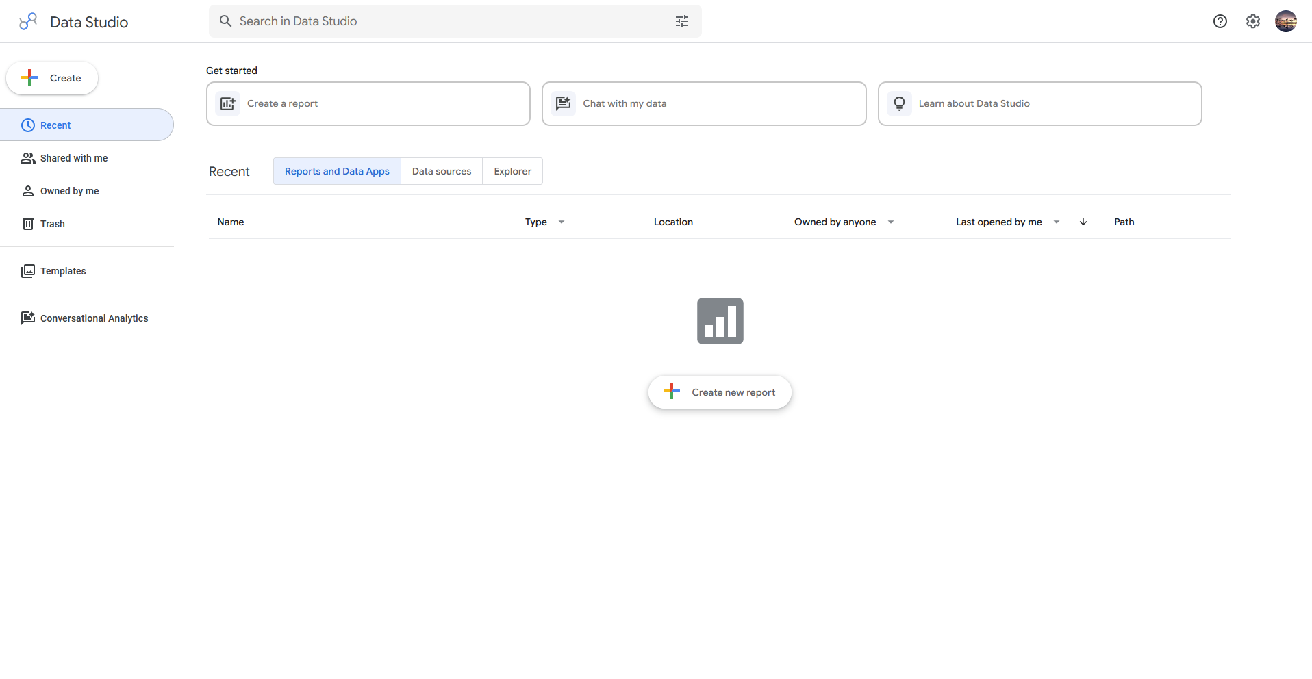
- What it does: Data Studio (formerly Looker Studio) is a reporting tool that turns data from Google Analytics, Google Sheets, and other Google products into shareable dashboards.
- Best for: Teams that want free reporting built around Google Analytics, Sheets, and other Google products.
Data Studio's price tag made me curious about what a free tool could handle, so I connected a Google Analytics account and a Sheets file to the same report.
Both sources linked without asking for a paid plan or extra setup, and a teammate viewing the report at the same time could see my edits update in real time. That shared access matters if more than one person needs to work on the same report without emailing versions back and forth.
The chart customization stayed fairly basic when I tried to match a specific brand look, since the styling options don't go much beyond a handful of preset fonts and colors.
Key features
- Google ecosystem integration: Connect directly to Google Analytics, Google Sheets, Google Ads, and other Google products without third-party connectors.
- Real-time collaboration: Work on the same report with teammates simultaneously, similar to Google Docs or Sheets.
- Free access: Use the core reporting tool without a paid plan or seat limits (a paid Data Studio Pro tier exists for teams that need extra security and management controls)
Pros and cons
What users say
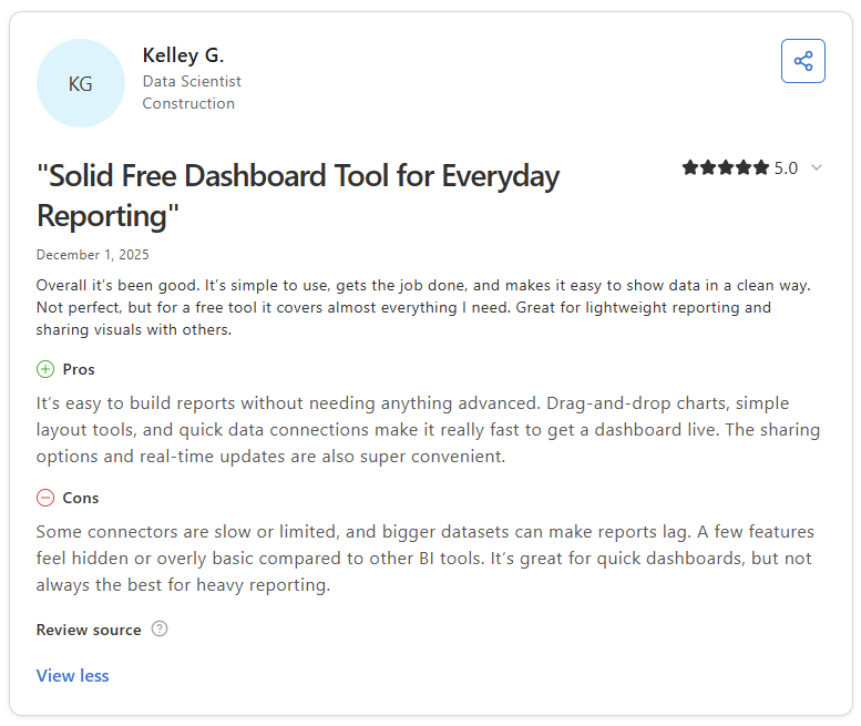
Pro: “It’s easy to build reports without needing anything advanced. Drag-and-drop charts, simple layout tools, and quick data connections make it really fast to get a dashboard live.” - Kelley G., Capterra

Con: “[Data] Studio can feel limited when it comes to more advanced data modeling and complex calculations. Performance may slow down with larger datasets, and some connectors can be unreliable or end up requiring workarounds.” - Candy N., G2
Pricing
Data Studio is free to use.
Bottom line
Data Studio's advantage comes from how much you can build without paying for a seat or a plan. If you need deeper chart customization for a specific brand look, Tableau might suit you better.
5. Klipfolio: Best for agencies building branded client dashboards
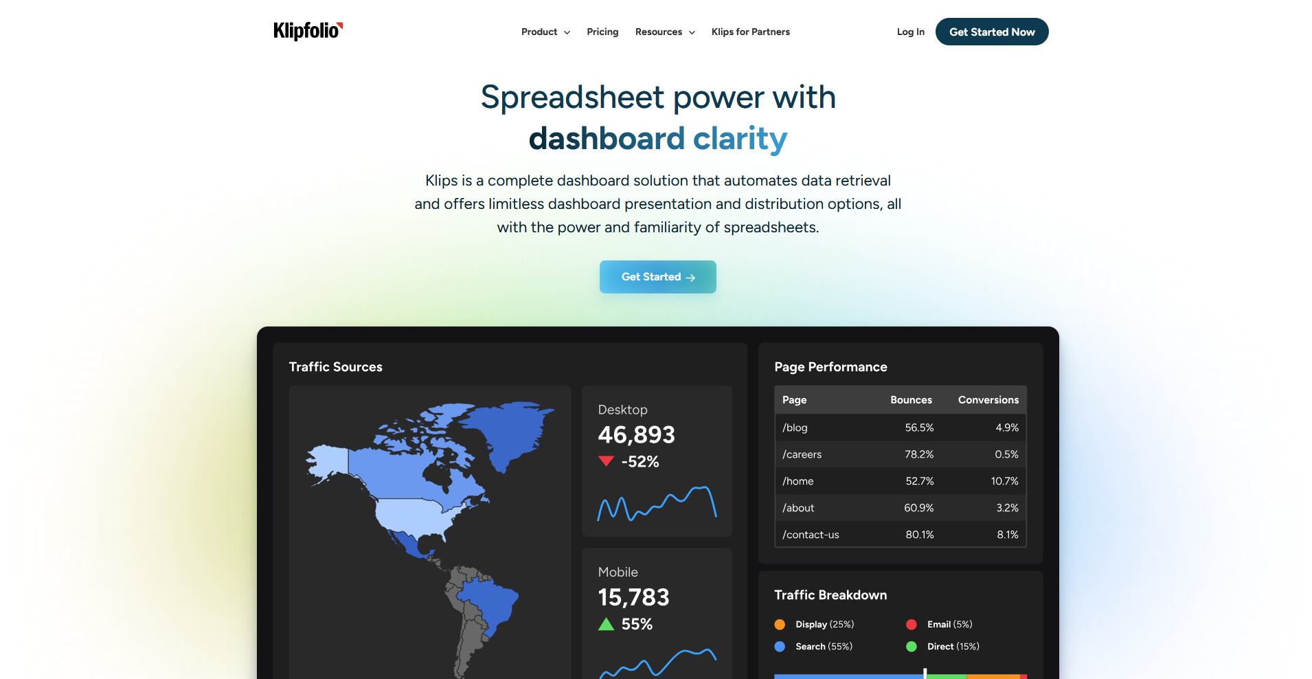
- What it does: Klipfolio is a dashboard tool that lets agencies build and white label client facing reports with custom branding.
- Best for: Agencies building branded client dashboards that need to look like an extension of their own business.
I wanted to test how far Klipfolio's branding options go, so I built a sample client dashboard and swapped in a custom logo, color palette, and domain.
The finished report showed no visible trace of Klipfolio's branding anywhere in the client view, right down to the login screen. Clients viewing it would have no way to tell that the dashboard came from anywhere but the agency itself.
But there's a wrinkle: a couple of my data connections needed manual field mapping before the numbers lined up with what I expected.
Key features
- Custom branding: Apply your own logo, colors, and domain across every client facing dashboard.
- Flexible layouts: Build dashboards from a blank canvas rather than a fixed template structure.
- Client portal support: Give individual clients their own login to view only their assigned dashboards.
Pros and cons
What users say
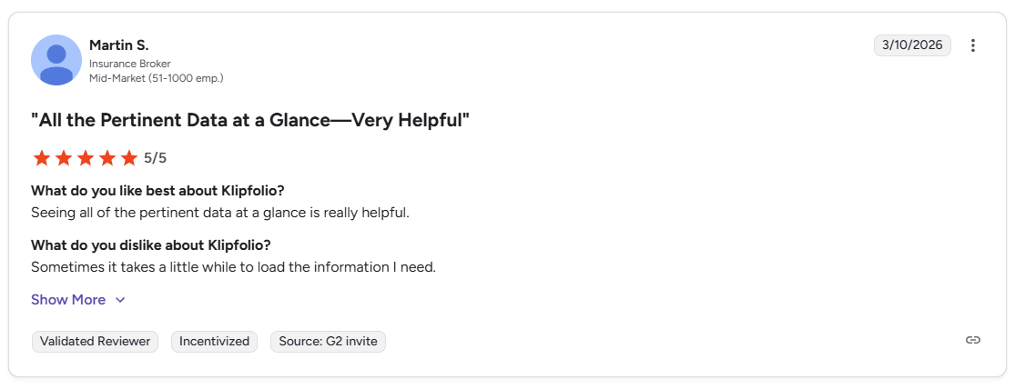
Pro: “Seeing all of the pertinent data at a glance is really helpful.” - Martin S., G2
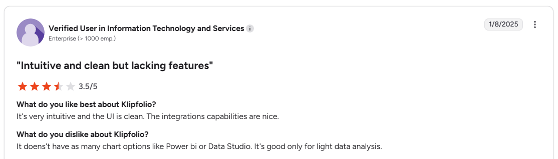
Con: “It doesn't have as many chart options like Power BI or Data Studio. It's good only for light data analysis.” - Verified User, G2
Pricing
Klipfolio starts at $120 per month.
Bottom line
Klipfolio's advantage comes from how completely a dashboard can be rebranded to look like the agency's own product. If you want free reporting without the branding work, Data Studio could be worth considering.
Special mentions
These tools didn't make the main list, but each one covers a specific case that might fit your setup better, depending on your budget and how much dashboard building you want to handle yourself.
Here are 4 more custom dashboard tools worth a look:
- Databox: A dashboard tool for tracking marketing and sales KPIs, with updates that push to your phone through its mobile app. I pulled a pre-built Google Ads template and had a spend and conversion dashboard running in minutes. Once your reporting needs extend beyond marketing and sales, the dashboard options can feel a bit limited.
- Zoho Analytics: A reporting platform built to plug into the rest of the Zoho suite. I put its Zia AI assistant to work building charts from prompts, and it handled simple asks well but stumbled on requests with multiple filters stacked together. The pre-built report templates also lose their appeal if you're not already running other Zoho apps.
- Metabase: A dashboard tool built for technical teams. It offers SQL mode alongside embeddable dashboard views pulled from your own database. I embedded a dashboard into a separate internal page, and it loaded live data on refresh with no separate export or update step needed. The chart styling options are basic next to tools like Tableau.
- Grafana: A monitoring and dashboard tool for real-time data, popular with teams tracking infrastructure or server metrics as they happen. I streamed live server CPU data into a panel and watched it update within a second or two, holding steady through the session. Static business reports don't need that speed, so it goes unused.
Which custom dashboard tool should you choose?
The right dashboard tool depends on who's building it, how technical your data setup is, and whether the dashboard stays internal or gets shared outside your team.
Choose Domo if you:
- Need one platform that handles data integration, dashboards, and governance without stitching multiple tools together
- Want AI-powered natural language queries so your team can ask questions without waiting on an analyst
- Run an enterprise deployment that needs strong security and audit controls
Choose Microsoft Power BI if you:
- Already work inside Microsoft 365, Teams, and Azure
- Want a lower starting price than most other BI platforms on this list
- Have people on your team who already know Excel and want a familiar starting point
Choose Tableau if you:
- Have analysts on staff who need advanced chart types and deep data blending
- Work with large, complex datasets that need serious visual exploration
- Can invest the time to train your team on a steeper learning curve
Choose Data Studio (formerly Looker Studio) if you:
- Already pull most of your data from Google Ads, Google Analytics, or BigQuery
- ant a free dashboard tool with no seat limits on the standard plan
- Need to collaborate on a report in real time with your team
Choose Klipfolio if you:
- Run an agency and need dashboards branded for individual clients
- Want a lot of control over layout and custom styling
- Manage several client accounts and need role-based permissions to keep data separated
Skip this category entirely if you:
- Only need a spreadsheet with a few charts and don't have multiple data sources to combine
- Are looking for a full client portal with billing, messaging, and file sharing built in
- Need to track tasks or projects and don't have KPIs defined yet to dashboard against
Final verdict
Every tool on this list builds a solid dashboard, and some go further by letting you share it. Domo and Power BI support embedding, Klipfolio wraps dashboards in a client portal, and Data Studio gives you a link to send. But even the ones built with sharing in mind stop at the dashboard - billing, messaging, and file sharing still need a separate tool.
Assembly gives your dashboard a client-facing home. You can build a custom dashboard app tied to your business, or bring in a dashboard from a platform like Looker Studio, Databox, or Power BI, then place it alongside the files, updates, and messages clients already use to work with your team.
Here's how Assembly can help:
- Client-facing by default: Build a custom dashboard app your clients can access directly, styled to match your business
- Keep everything in one place: Set up dynamic client homepages that surface the right dashboard and content for each account based on custom field tags, so you don't have to rebuild the same view by hand for every client.
- Protect client data: Assembly maintains SOC 2 Type II compliance and supports GDPR, CCPA, and HIPAA compliance.
Assembly may not be the right fit if your dashboard needs to stay entirely internal or requires the depth of a dedicated BI platform. For agencies and service teams that want clients to log into their own branded dashboard, get early access.
Frequently asked questions
What is the best custom dashboard software tool?
Some of the best custom dashboard software tools include Domo and Data Studio (formerly Looker Studio). Domo fits enterprise teams that need data integration and governance in one platform. Data Studio fits teams already working with Google data that want a free option.
What is custom dashboard software?
Custom dashboard software pulls data from multiple sources and displays it in charts, tables, and filters you configure yourself. You choose the metrics, layout, and data sources instead of working from a fixed template. Most tools connect to your CRM, ad platforms, or spreadsheets to build a live view of your business.
Can you build a dashboard without knowing SQL?
Yes, you can build a dashboard without knowing SQL. Tools like Data Studio and Zoho Analytics use drag-and-drop builders designed for non-technical people. SQL becomes useful for advanced tools like Metabase if you want custom queries beyond the built-in options.